Custom Fields
After adding a Custom Field to a form, users can build fully customized field controls simply by chatting with AI. AI automatically generates the code, allowing you to create custom layouts, styles, and interactions without writing code. If you're familiar with React and Tailwind CSS, you can also write the code yourself or refine the code generated by AI.
Getting Started
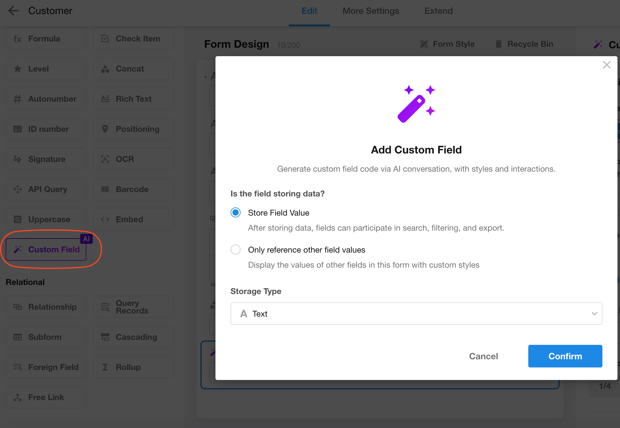
Add a Custom Field
When creating a custom field, choose whether the field should store its own value.
For example:
- A Color Picker should save the selected color value, so choose Store Field Value.
- A Video Player that plays a video URL stored in another field does not need to store its own value. Instead, it references the value of the Video URL field for rendering, so choose Reference Other Field Values Only.
Edit Code by Chatting with AI
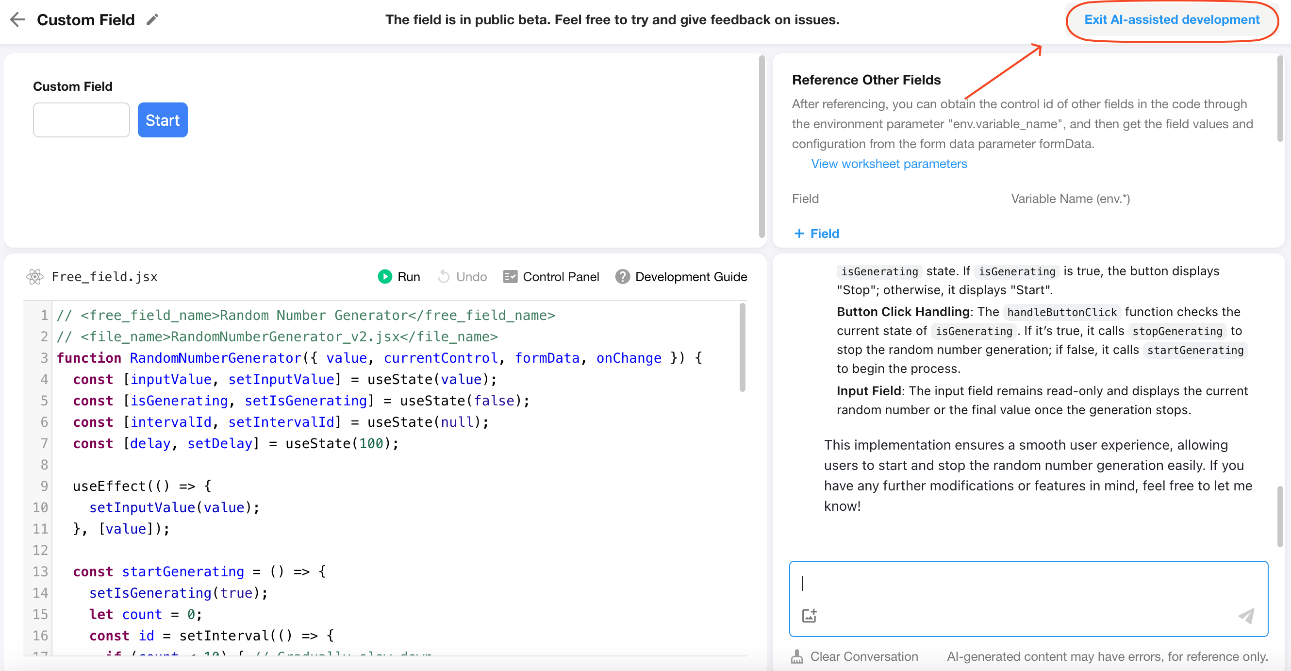
After a custom field is added, the Custom Field Editor opens automatically. As shown below, the editor consists of five areas:
- Chat Panel – Describe the field's appearance, layout, and interactions to AI.
- Online Code Editor – Once AI understands your request, it generates the frontend code here. You can also edit the code manually and click Run to preview it. If errors occur, open the Console to view error messages or ask AI to fix them.
- Live Preview – AI automatically runs the generated code so you can preview the field's appearance and behavior in real time. If you modify the code manually, click Run to refresh the preview.
- Referenced Fields – Add other fields from the current form as environment variables. In your code, you can access their values using
formData[env.<fieldVariableName>]. - Mock Data – When your custom field references other fields, you can load an existing record to preview the field with real data. You can also simulate mobile and read-only modes to verify how the field behaves under different conditions.

For most common scenarios, you don't need to edit the code manually—simply describe your requirements to AI. If the generated result isn't quite what you expect, continue the conversation to have AI refine the code, improve the functionality, or fix any issues.
Because this is a lightweight online coding environment, importing third-party libraries is not supported.
To help AI generate the desired custom field in a single conversation—or with minimal follow-up—provide requirements that are as specific and detailed as possible.
The following examples show two ways to describe the same requirement:
Example 1 (Not Recommended)
Generate an online video player that can play MP4 files from the Video URL field.
Example 2 (Recommended)
Generate a video player that plays videos from the Video URL field. The player should fill the available display area without showing scrollbars, use a black background, and have slightly rounded corners. The video should automatically scale to fit entirely within the player. If the video URL does not end with
.mp4, display the message "No playable video available" centered in the player.
The second prompt provides AI with much more context, allowing it to generate the desired field more accurately and with fewer iterations. In contrast, the first prompt is likely to require multiple rounds of refinement before achieving the expected result.
Exit and Save
After you finish editing the code, click Exit AI-assisted Development in the upper-right corner, then save the form.
Examples
Build a Random Number Generator
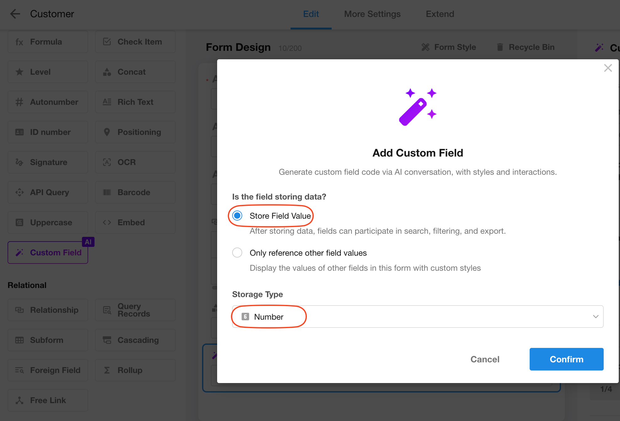
Field Type: Number
Prompt:
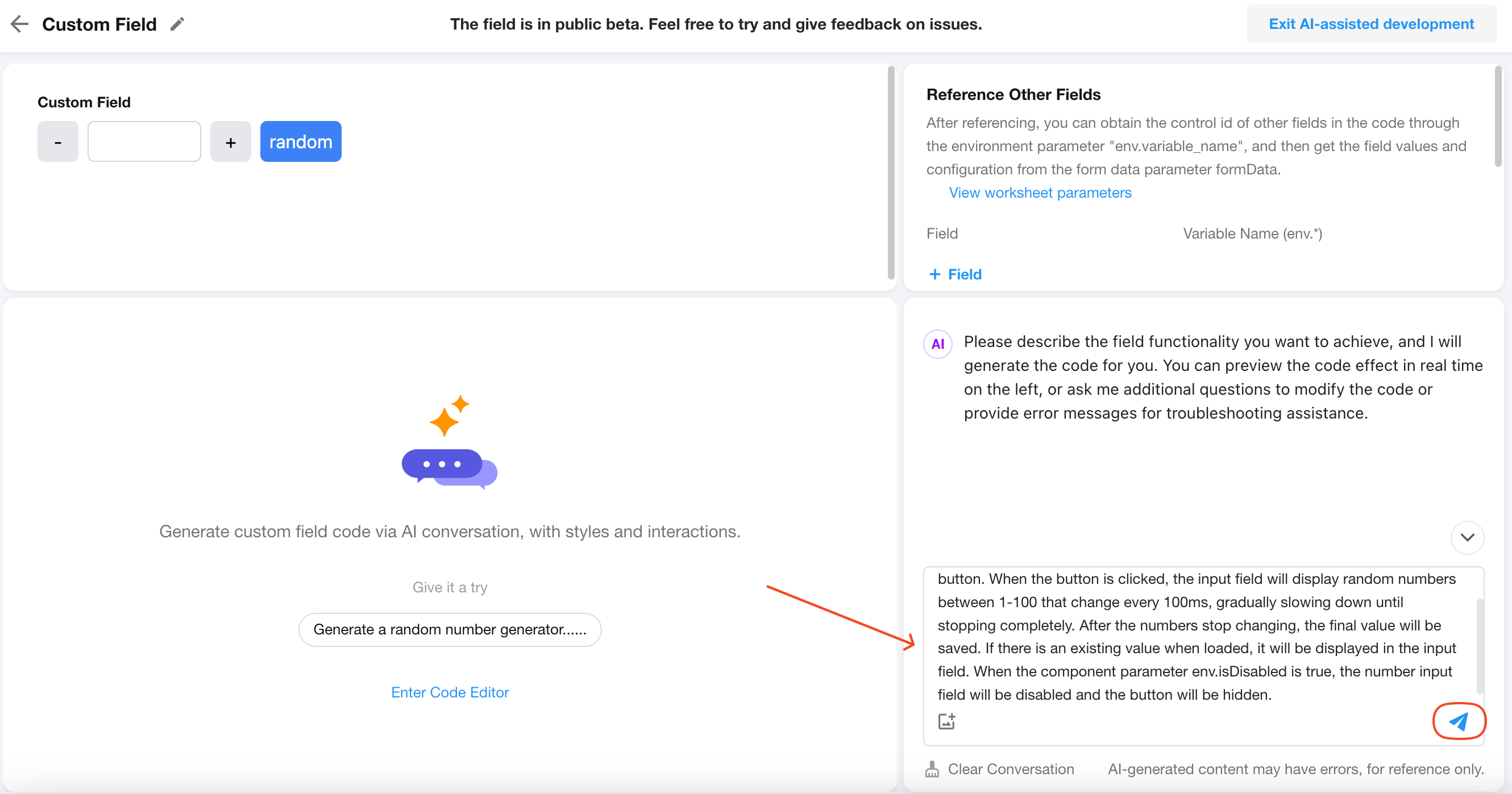
Generate a random number generator with a number input and a button. When the button is clicked, the input should rapidly display random numbers between 1 and 100 at 100 ms intervals before gradually slowing down and stopping. Save the final value after the animation ends. If the field already contains a value, display it when the component loads. When env.isDisabled is true, disable the number input and hide the button.
Example:
-
Add a custom field, select the Number field type, and enable Store Field Value.
-
Paste the prompt into the chat panel and press Enter.
-
After the code is generated, click Exit AI-assisted Development, save the form, and create a record to test the field.
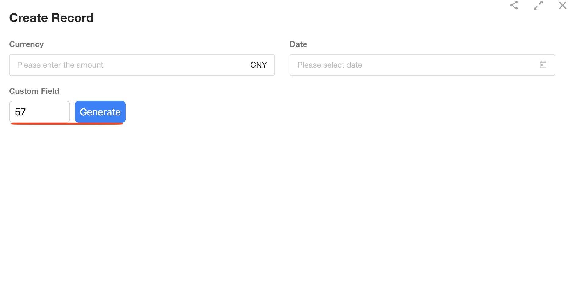
-
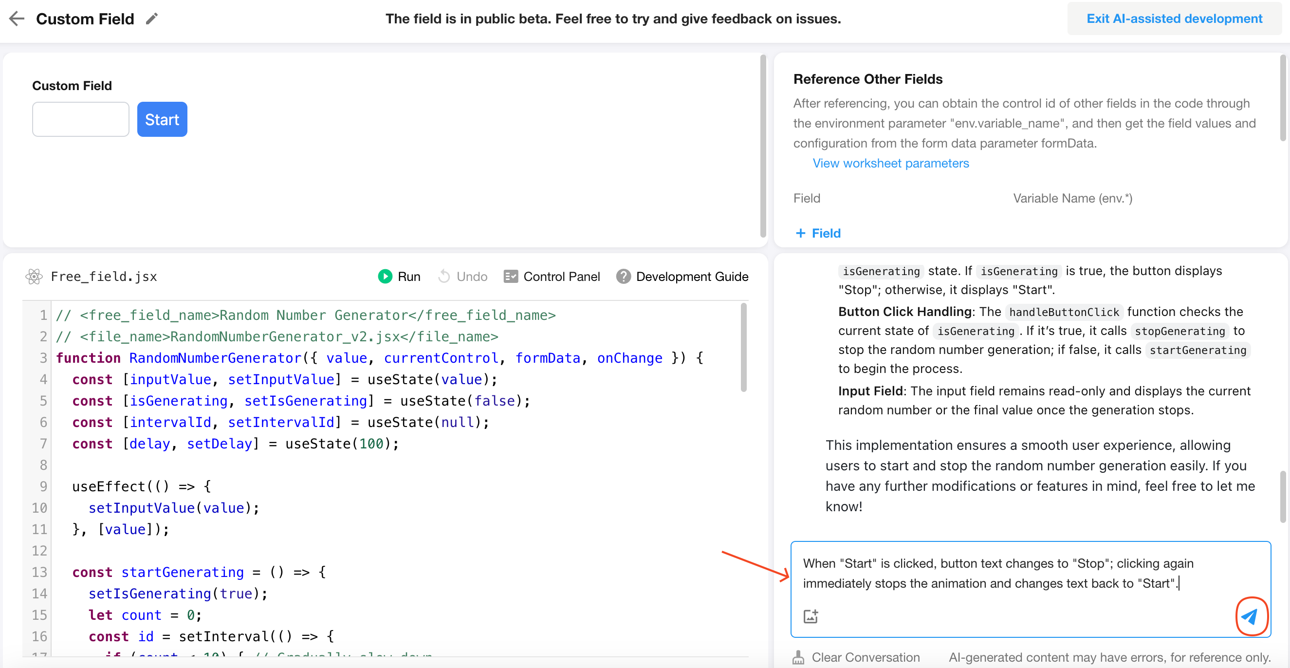
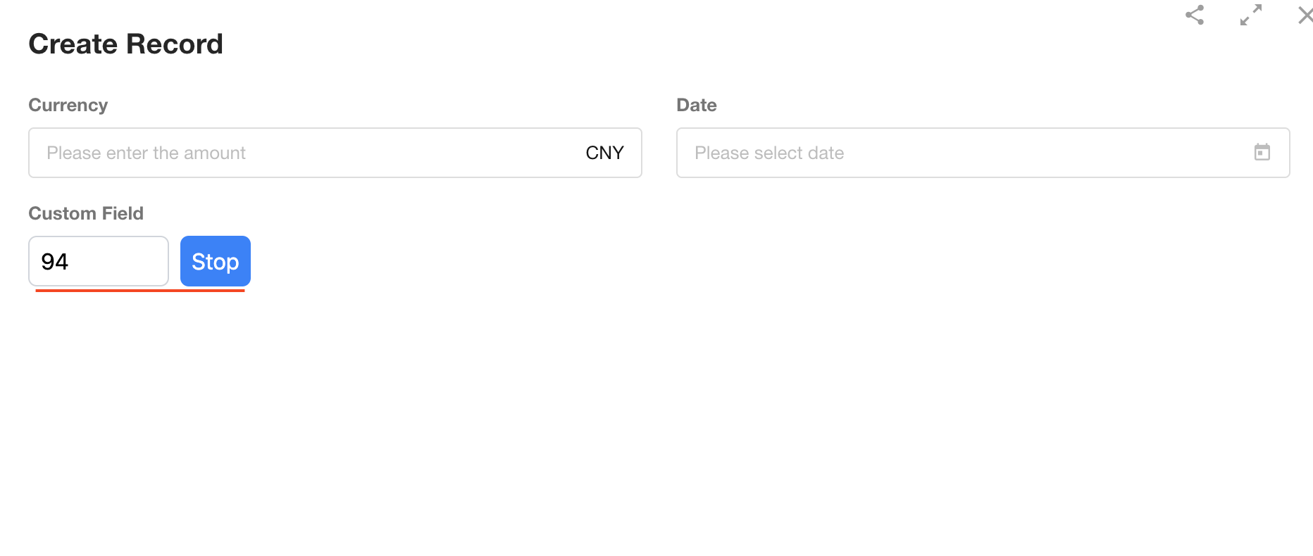
Refine the behavior so that after clicking Start, the button label changes to Stop. Clicking the button again should immediately stop the animation and change the label back to Start.
Send this requirement to the chat panel, and AI will update the code accordingly.
-
Exit AI-assisted Development, save the form again, and create another record to verify the updated behavior.
Build a Color Picker
Field Type: Text
Prompt:
Generate a color picker. After the user selects a color, save it in the format #XXXXXX. If the field already contains a value, display the saved color when the component loads. When env.isDisabled is true, disable the color picker.
Build a Capsule-style Date Picker
Field Type: Date
Prompt:
Generate a seven-day date picker starting from Monday of the current week. Display each date as a capsule-style button. Save the selected date after the user makes a selection. If the field already contains a value, display the week containing that date and automatically select it. When env.isDisabled is true, disable the date picker.
Build a Digital Clock
Field Type: Time
Prompt:
Generate a modern, tech-inspired digital clock that displays hours and minutes. Users can adjust the hour and minute independently. Whenever either value changes, save the time in the format 00:00. If the field already contains a value, display it when the component loads. When env.isDisabled is true, disable editing and display the clock in read-only mode.
Was this document helpful?