40 Controls
Fields with similar data characteristics are packaged into controls. Each control provides corresponding data validation rules and configuration options.
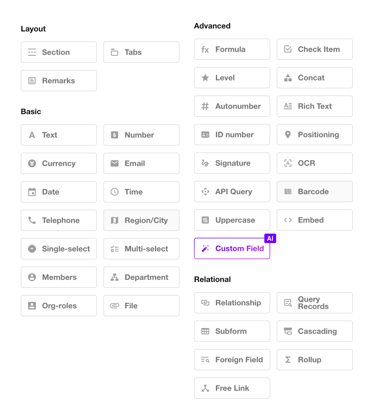
We provide 40 types of controls to support various business data scenarios. Selecting the appropriate control based on the data type is essential for accurate data collection, referencing, and analysis.
1. Worksheets, Fields, and Controls
Worksheets and Fields:
A worksheet is used to store a collection of business data. Each record in a worksheet represents a business object, and each object contains multiple attributes.
For example, an order object may contain attributes such as order number, contract date, and order amount. In a worksheet that stores these objects, these attributes are represented as fields, such as the Order Number field, Contract Date field, and Order Amount field.
Fields and Controls:
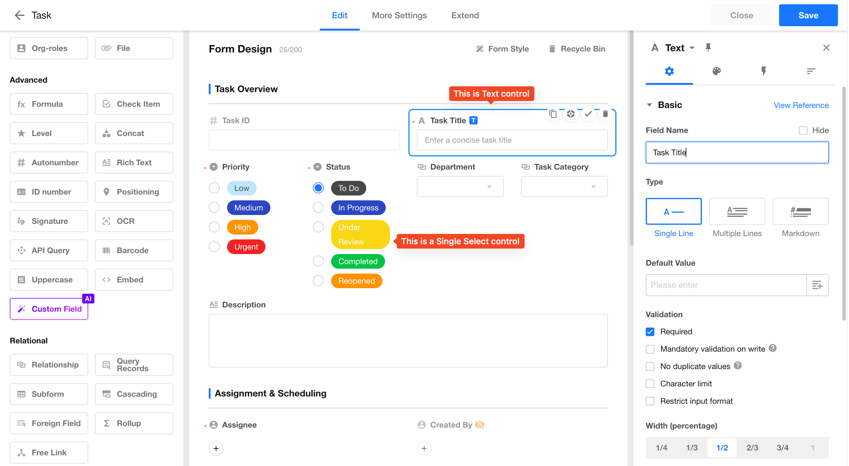
To ensure consistent data formatting and accurate input, predefined field types are provided as controls, such as Date, Email, and Currency controls.
When adding a field, select the appropriate control based on the field data type.
2. Introduction to 40 Controls
Text
-
Supports storing names, IDs, bank account numbers, meeting notes, order details, and other text-based information.
-
Supports single-line and multi-line text input. For multi-line text fields, you can configure the minimum and maximum height.
-
Supports Markdown syntax. When editing field content, you can use Markdown syntax, and the formatted result will be displayed when viewing records.
-
Supports input format validation using regular expressions.
-
Supports setting default values.
-
Supports configuring field width:
- 1/4 row width
- 1/3 row width
- 1/2 row width
- Full row width
-
Supports unique values to prevent duplicate entries.
-
Supports character count limits (minimum and maximum number of characters).
-
Supports scanning barcodes or QR codes to input content into the text field.
-
Supports link parsing. Recognized links in text can be clicked to open the corresponding webpage.
-
Supports sorting Chinese content by Pinyin.
By default, Chinese text is sorted by character order rather than Pinyin order. When Sort by Pinyin is enabled, the system creates a hidden field that converts Chinese characters into Pinyin and uses this field for sorting.
-
Supports configuring whether links in text should be automatically recognized and opened when clicked.
Number and Currency
-
Supports configuring units and decimal places.
-
Supports setting default values.
-
Supports displaying units before or after values (prefix or suffix).
-
Supports setting value limits.
-
Supports thousand separators.
-
Supports displaying numbers with up to 16 digits (including decimal places). The integer part supports up to 14 digits.
- Because number and currency fields store integer values exceeding 16 digits using scientific notation, the stored value may differ from the original input. For long numeric values that are not used for calculations, such as bank card numbers or business IDs, use a Text control instead. Mobile numbers should use a Phone control.
Differences between Number and Currency controls:
-
Number fields support percentage display.
-
Number fields support progress bar display and stepper input.
-
Currency fields support selecting currency types and currency units.
-
The Uppercase control can only be associated with Currency fields.
Email
The Email control validates email address formats. Only addresses matching the standard format xxx@xx.xx can be saved.
Examples:
tony@md.com123@qq.com
Date
-
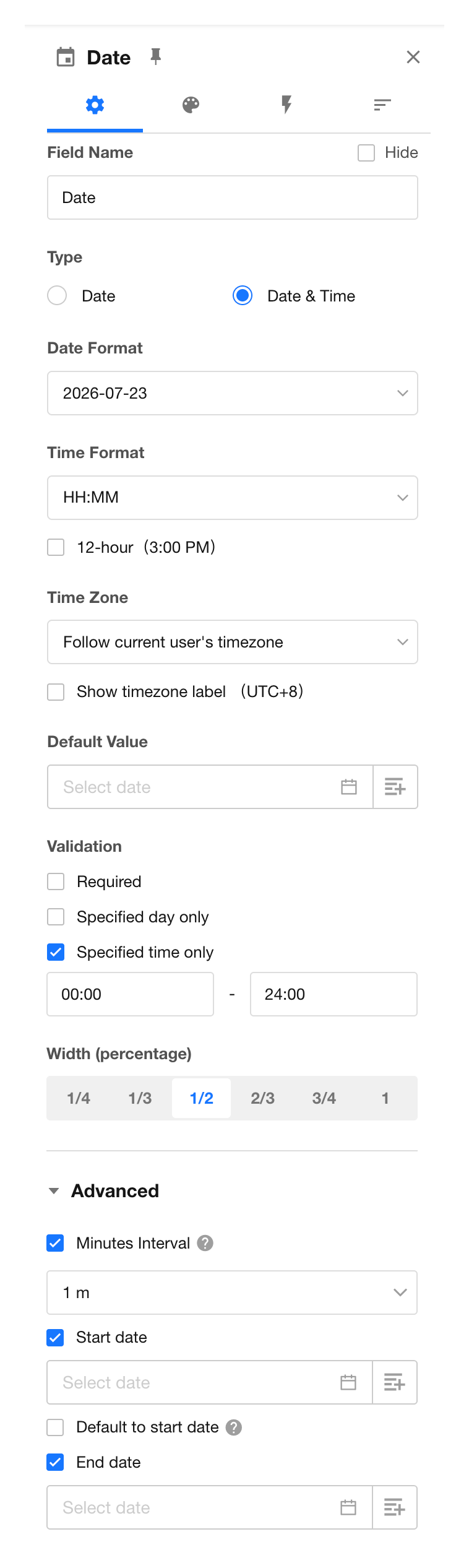
Supports two field types:
- Date
- Date & Time
-
Supports six display formats:
- Year
- Year-Month
- Year-Month-Day
- Year-Month-Day Hour
- Year-Month-Day Hour:Minute
- Year-Month-Day Hour:Minute:Second
-
Supports setting default date and time values.
-
Supports selecting and displaying dates based on:
- User time zone
- Application time zone
-
Supports date and time selection restrictions:
-
Weekday restrictions
Restrict selectable days. For example, allow selection only on weekdays.
-
Time range restrictions
Restrict selectable time periods. For example, allow selection only between 9:00 and 18:00.
-
Time interval settings
Configure selectable intervals:
- A 1-minute interval allows selecting any time.
- A 1-hour interval allows selecting only full hours.
-
Start date settings
Dates before the specified start date cannot be selected.
After setting a start date, the date picker automatically focuses on the start date when opened.
-
End date settings
Dates after the specified end date cannot be selected.
-
-
Supports multiple date display formats.
In addition to commonly used formats such as ISO, US, EU, and Chinese formats, custom date display formats are also supported.
Date and Time Format Requirements for Values Written Through Workflows, APIs, Functions, or Imports
The following formats are supported:
YYYY年MM月DD日 HH:mm:ssYYYY-MM-DD HH:mm:ssYYYY/MM/DD HH:mm:ssMM/DD/YYYY HH:mm:ss
Notes:
-
The
DD/MM/YYYYformat is not supported. Values in this format are interpreted and saved asMM/DD/YYYY. -
The
YYYYMMDDformat is not supported. Values written in this format will be saved as empty or will clear the existing value. -
When setting default values through functions, only the Year-Month-Day format is currently supported.
-
Month, day, hour, minute, and second values can be entered with or without leading zeros.
-
Month, day, hour, minute, and second values must be within valid ranges. Invalid values will result in empty values or clearing the existing value.
Time
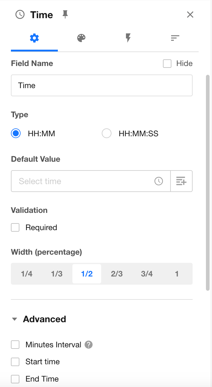
The Time control stores time values without dates. It supports the following display formats:
- Hour:Minute
- Hour:Minute:Second
Additional configuration options:
-
Supports setting minute intervals.
For example:
- A 1-minute interval allows selecting any time.
- A 1-hour interval allows selecting only full hours.
-
Supports setting a start time.
Times before the specified start time cannot be selected.
-
Supports setting an end time.
Times after the specified end time cannot be selected.
Import Format Rules
-
If the minute or second value exceeds 59, the value will be saved as 59.
-
If the hour value exceeds 23, the value will be saved as empty.
The format
24:00:00is not supported.
Telephone
-
Supports format validation for both mobile phone numbers and landline numbers. If you need to collect both types of numbers, add two separate Phone controls.
-
For mobile phone numbers, you can configure a default country/region code or specify the available country/region codes that users can select. Newly created Phone fields use the country/region code configured in Organization Settings by default.
-
When the value of a Phone field is used in a workflow, the phone number always includes the country/region code.
Region/City
The Region/City control supports global multi-level region selection, enabling efficient data entry, accurate filtering, and visual data analysis.
Single Select and Multi Select
Predefine option values in advance, allowing users to select from available options when entering data.
-
Supports three display styles:
- Dropdown
- Flat layout
- Progress bar
-
Supports adding, deleting, reordering, and setting default options.
-
Supports configuring colors for options.
-
Supports selecting data sets as option values.
Converting Between Single Select and Multi Select Fields
If a record already contains multiple selected values, switching the field type from Multi Select to Single Select retains the existing values.
However, when the field value is edited afterward, users can only select one option.
Member
Used to select organization members, contacts, friends, or external users.
You can configure default selected users, including:
- The record creator
- A specific user
Users selected in a Member field can receive notifications.
Department
Used to select departments configured in the organization.
You can set the default value to the department of the record creator.
File
The File control allows you to upload multiple files, such as documents and images, directly to records.
Positioning
The Positioning control allows users to capture geographic location information. It supports location retrieval on both mobile apps and web browsers (GPS must be enabled on mobile devices).
The control can display the location on a map, as well as show the corresponding longitude and latitude coordinates.
-
Users can choose their preferred map provider based on their requirements. View Map Settings
-
The mobile app supports retrieving the user's current longitude and latitude coordinates (using the WGS84 coordinate system).
-
AMap supports selecting and displaying overseas maps. HAP Server users need to purchase overseas map services separately.
-
Positioning fields support writing values through workflows and APIs.
The format for writing values to a Positioning field is:
{"x": "-122.419416","y": "37.774929","title": "San Francisco Office","address": "123 Market Street, San Francisco, CA 94105, USA"}
Where:
x represents the longitude. y represents the latitude. title and address are optional parameters and can be left empty.
Formula
The Formula control allows you to calculate values based on one or more field values.
Check Item
The Check Item control supports three display styles:
- Checkbox
- Switch
- Yes/No
When creating a record, you can set a default value for the field.
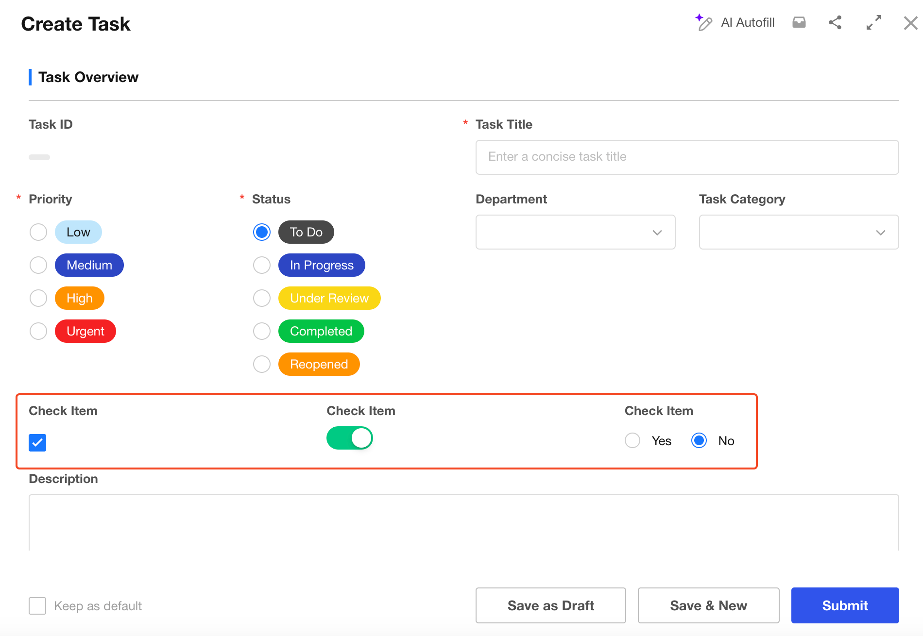
You can assign values to Check Item fields through functions, workflows, APIs, or Excel imports.
-
Assign values using default value functions
A function result of
trueindicates that the checkbox is selected, whilefalseindicates that it is not selected.Examples:
IF('Score'>60,TRUE(),FALSE())orIF('Score'>60,true,false) -
Assign values through workflows or Excel imports
You can assign values to Check item fields using Text or Number fields:
trueor1indicates that the checkbox is selected.falseor0indicates that the checkbox is not selected. -
Assign values through APIs
When assigning values through APIs:
1indicates that the checkbox is selected.0indicates that the checkbox is not selected.
Level
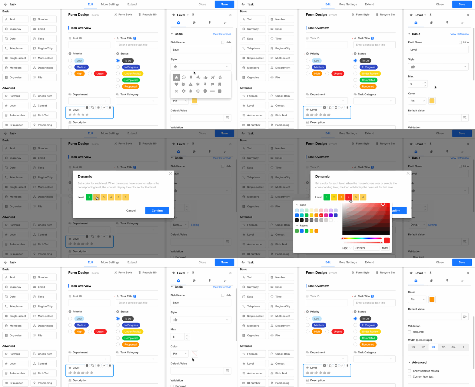
The Level control provides a visual way to display values such as progress, priority, satisfaction levels, and other rating-based information.
-
Supports multiple display styles, including stars (★), hearts (♥), and other customizable icons.
-
Allows you to define the rating range:
- Maximum value: 10
- Minimum value: 1
-
Allows you to customize the color for each rating level.
For example:
- Ratings below 3 can be displayed in dark red.
- Ratings below 6 can be displayed in light red.
- Ratings above 6 can be displayed in green.
-
Allows you to define a description for each rating level. The description is displayed when users hover over the rating value.
Concat
The Concat control works similarly to the CONCATENATE function in Excel. It combines the values from multiple fields into a single value.
For example, you can combine values from fields such as first name, last name, or order information to generate a new field value.
Auto Number
The Auto Number control automatically assigns a unique sequential number to each new record.
You can also customize the numbering format based on your business requirements.
Rich Text
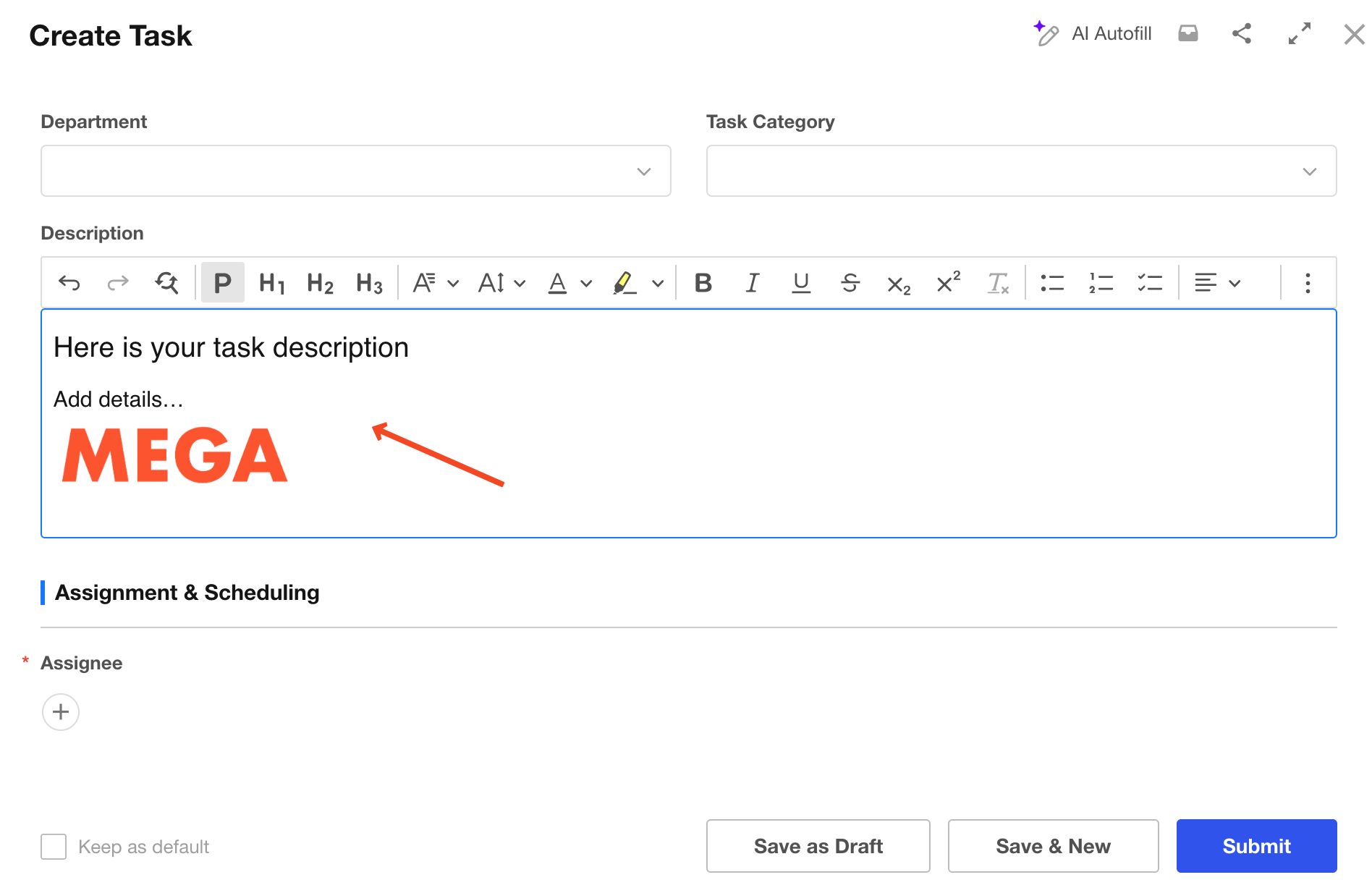
The Rich Text control supports advanced text formatting and is suitable for storing long-form content, such as descriptions, instructions, meeting notes, and other detailed information.
It provides a simple text editor and supports images.
- Supports rich text formatting.
- Supports adding images.
- A maximum of 5 Rich Text fields can be added to a worksheet.
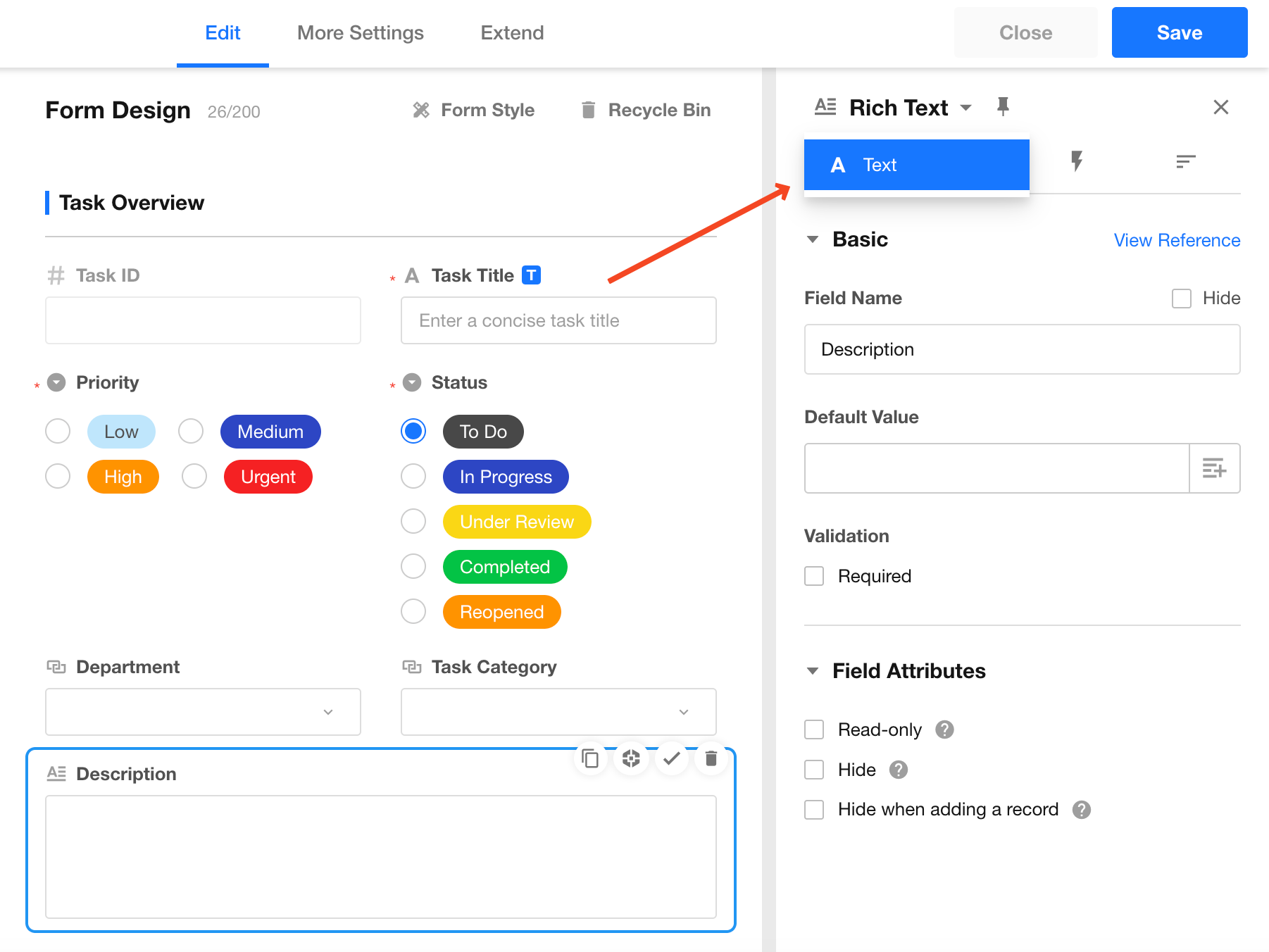
A Rich Text field can be converted to a Text field. After conversion, the field will be converted to a multi-line text field by default.
ID Number
The ID Number control supports format validation for the following document types:
- National ID card
- Passport
- Mainland Travel Permit for Hong Kong and Macao Residents
- Mainland Travel Permit for Taiwan Residents
For National ID cards:
- Only 18-digit ID numbers are supported, including residence permits for Hong Kong, Macao, and Taiwan residents.
- Supports setting the field as a unique value.
- Supports setting the field as required.
Signature
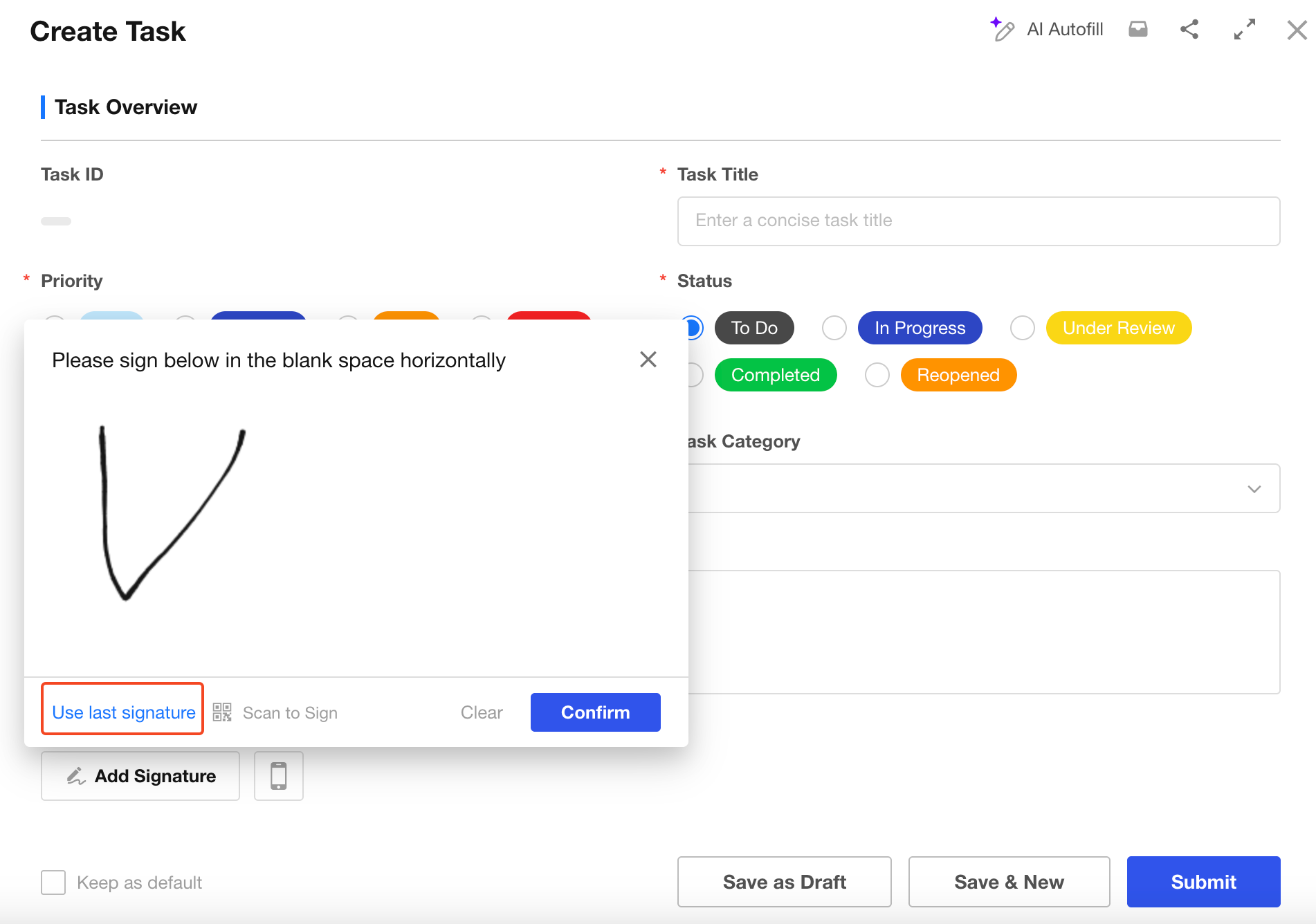
The Signature control allows users to collect handwritten signatures digitally.
- Users can sign using a mouse on a computer.
- Users can sign manually in the mobile app.
Additional features:
-
Reuse previous signatures
Users can reuse their most recent signature. For the same user, the latest signature is shared across different Signature fields and workflow approval signatures. -
Print signatures
Signatures support printing. The actual signature data is saved as an image. -
Write signatures through workflows
Signature values can be populated through workflows.
OCR
The OCR control can quickly and accurately recognize text information from images and automatically populate the corresponding fields.
Currently supported recognition types include:
- Text recognition
- Invoice recognition
- ID card recognition
Custom Field
The Custom Field allows you to create fully customizable field controls with the help of AI.
By describing the desired field style and interaction behavior through an AI conversation, AI can automatically generate the required code to create a custom field control.
If you are familiar with frontend frameworks such as React and Tailwind CSS, you can also write your own code or further customize the AI-generated code to implement advanced field controls.
Relationship
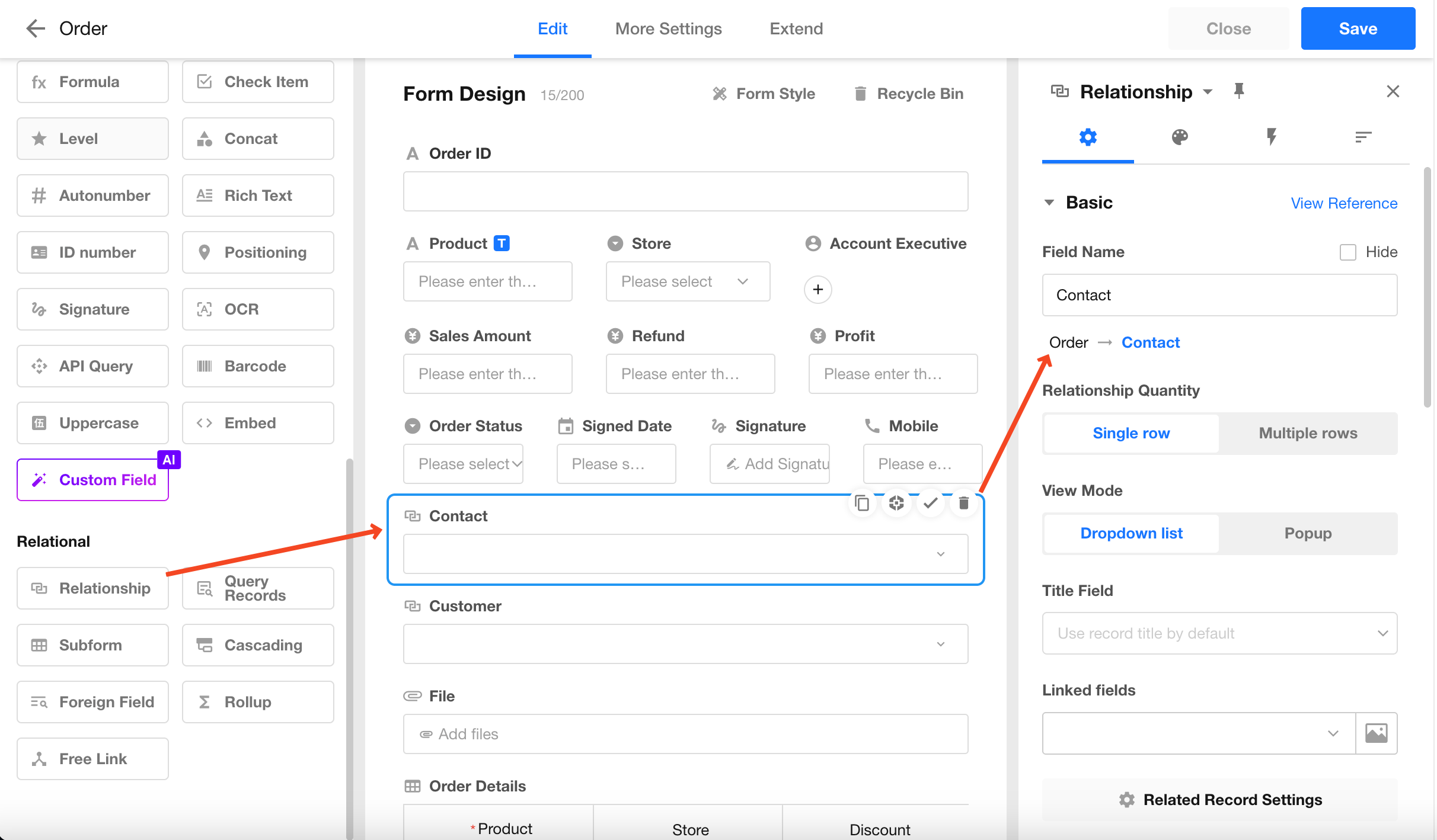
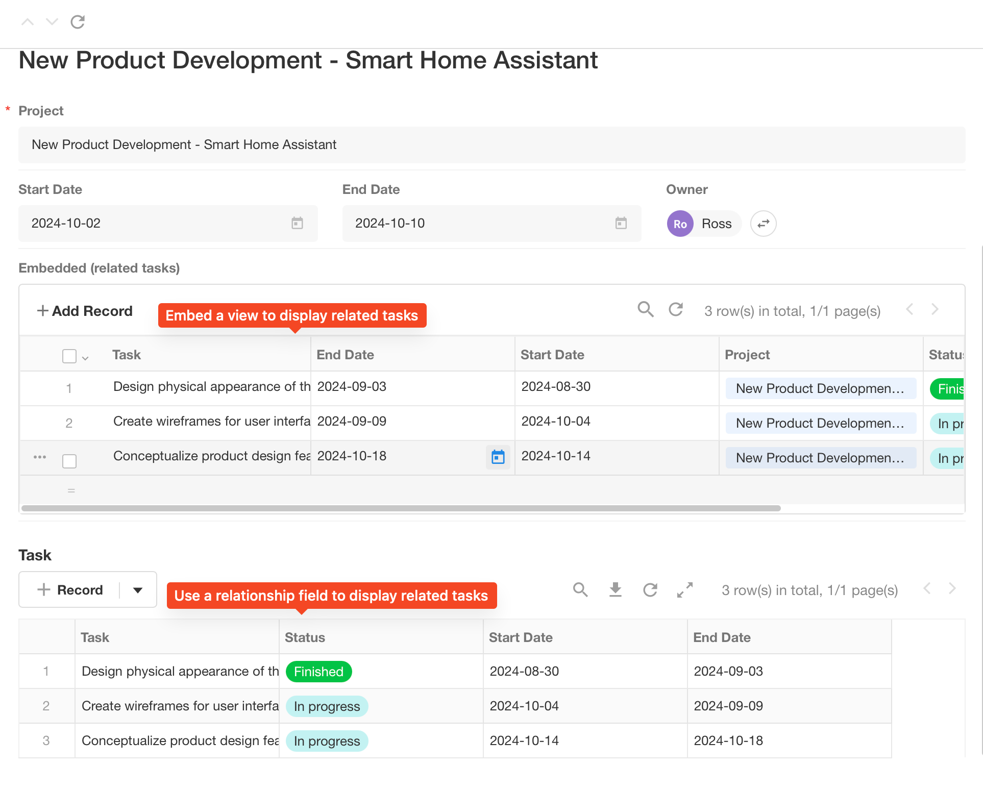
The Relationship field allows you to associate records from another worksheet or the current worksheet, enabling data synchronization and avoiding duplicate data entry or isolated data.
For example, in an Order worksheet, each order requires contact information. If the contact details have already been stored in a Contact worksheet, you can directly associate the order record with the corresponding contact record instead of entering the same information repeatedly.
Foreign Field
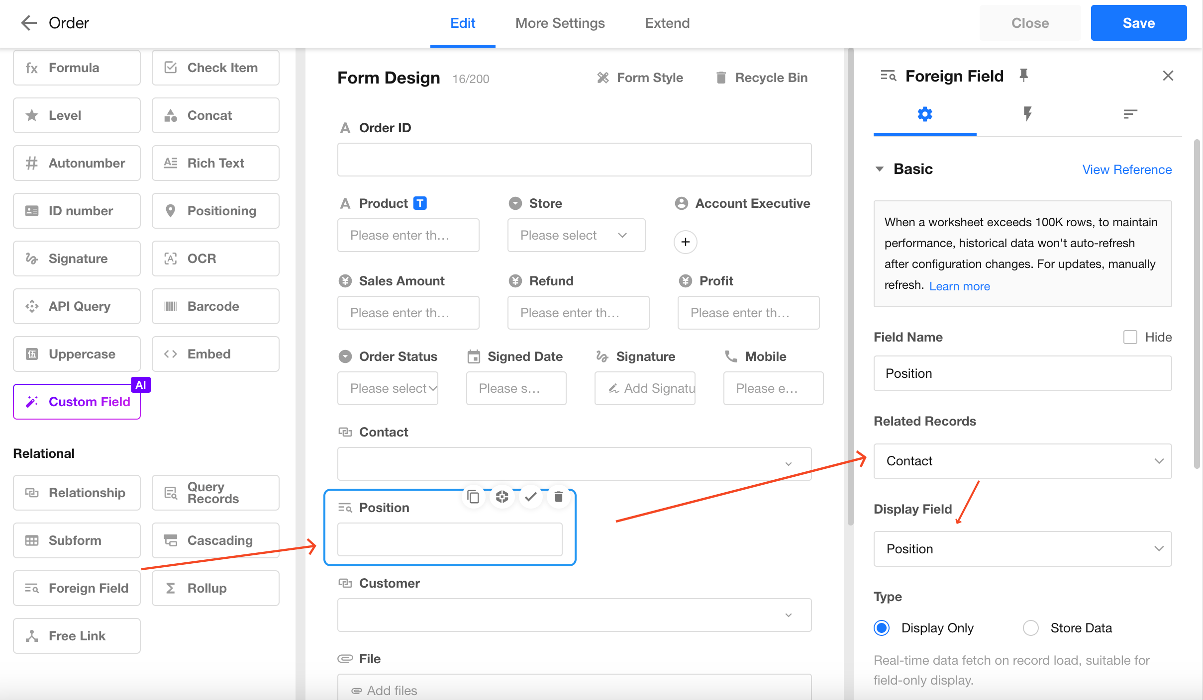
The Foreign Field allows you to display specific fields from an associated worksheet.
For example, when an order record is associated with a contact record, you may also want to display the contact's job title. You can use a Foreign Field to automatically display the job title from the related contact record.
Subform
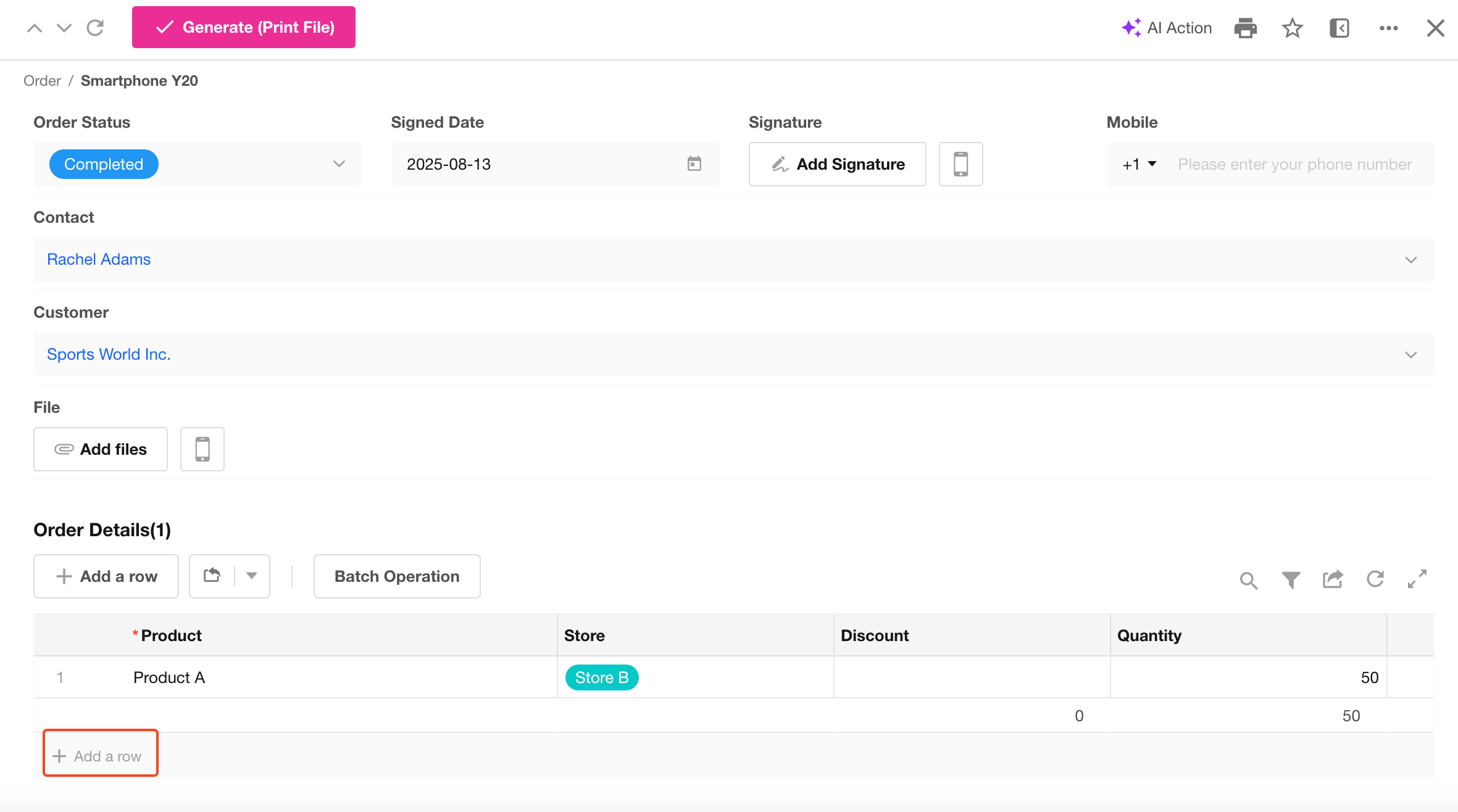
A Subform can be understood as a table within a worksheet. It is suitable for storing business data that is generated from a primary business object and does not have independent meaning outside that object.
Cascading
A Cascading Field dynamically displays available options based on the value selected in the previous level.
It supports multi-level relationships, such as two-level and three-level cascading selections. The data source is a worksheet that contains hierarchical data associated with the current worksheet.
Rollup
A Rollup control is used to calculate aggregated values from related records or subforms.
For example, an order record may contain a subform (Order Details) that stores sales details for each product. You can use a Rollup control to automatically calculate the total amount of products in the order.
Section and Tab
The Section and Tab controls allow you to organize fields into separate groups, making the form structure clearer and easier to navigate.
They are commonly used to provide additional instructions or explanations, or to divide a form into different sections based on business requirements.
Fields within sections can be collapsed or expanded to improve the form layout and user experience.
-
Tab
The Tab control groups related fields into separate tabs, allowing users to switch between different content areas.
-
Section
The Section control divides fields into independent sections within a form. Each section can be expanded or collapsed as needed.
Remark
The Remark control provides instructions or additional information to help users correctly complete a form.
It supports rich text content, allowing you to add formatted text, images, and other explanatory content.
The content displayed in the Remark control is read-only for users and cannot be modified.
Free Link
The Free Link control allows you to add related collaboration items, including tasks, projects, and calendars.
This connection is one-way:
- Users can click the connection from a worksheet record to open the related item (such as a task or calendar).
- The related item cannot be accessed in the reverse direction to open the original worksheet record.
Uppercase
The Uppercase control automatically displays the uppercase text representation of an amount.
- Select an amount field to associate with this control. The corresponding amount in words will be generated automatically.
- Supports:
- Amount fields
- Rollup fields based on amount fields
- Formula fields
Embed
The Embed field allows you to embed external links, charts, and views into a form.
You can pass values from other fields in the current form as parameters, enabling customized content display and interactive elements directly within the form.
In addition, the Embed field can be used as the cover image of a Gallery View.
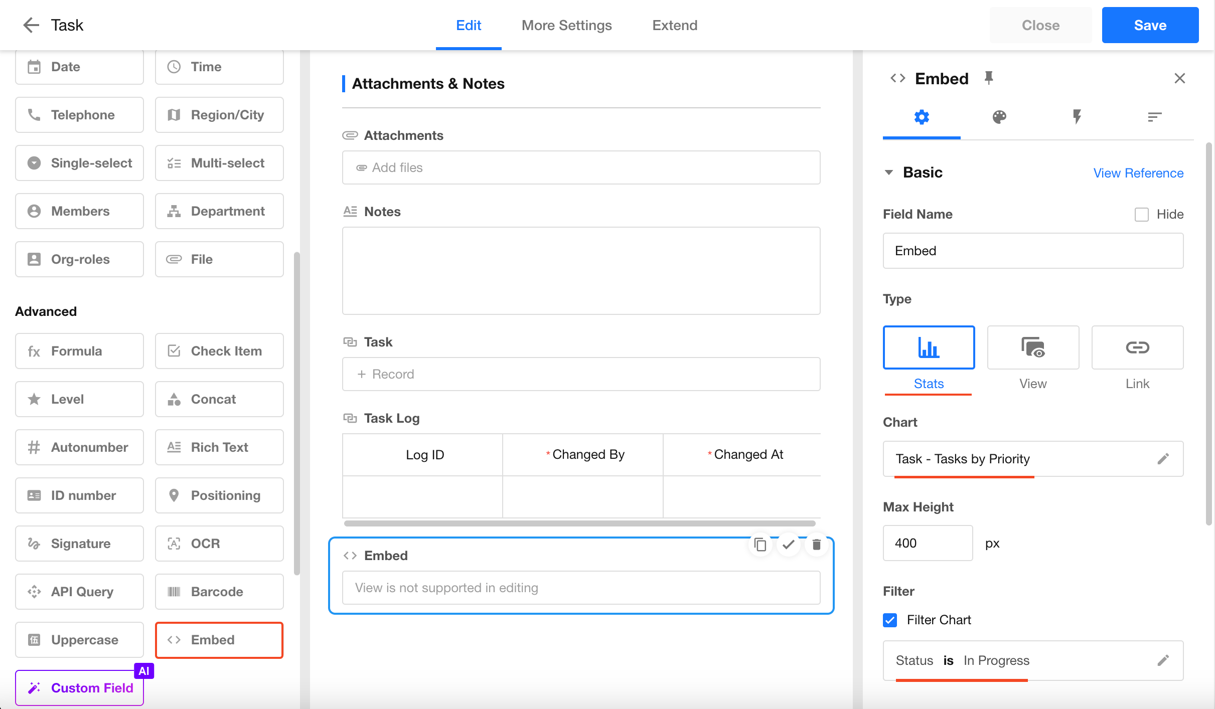
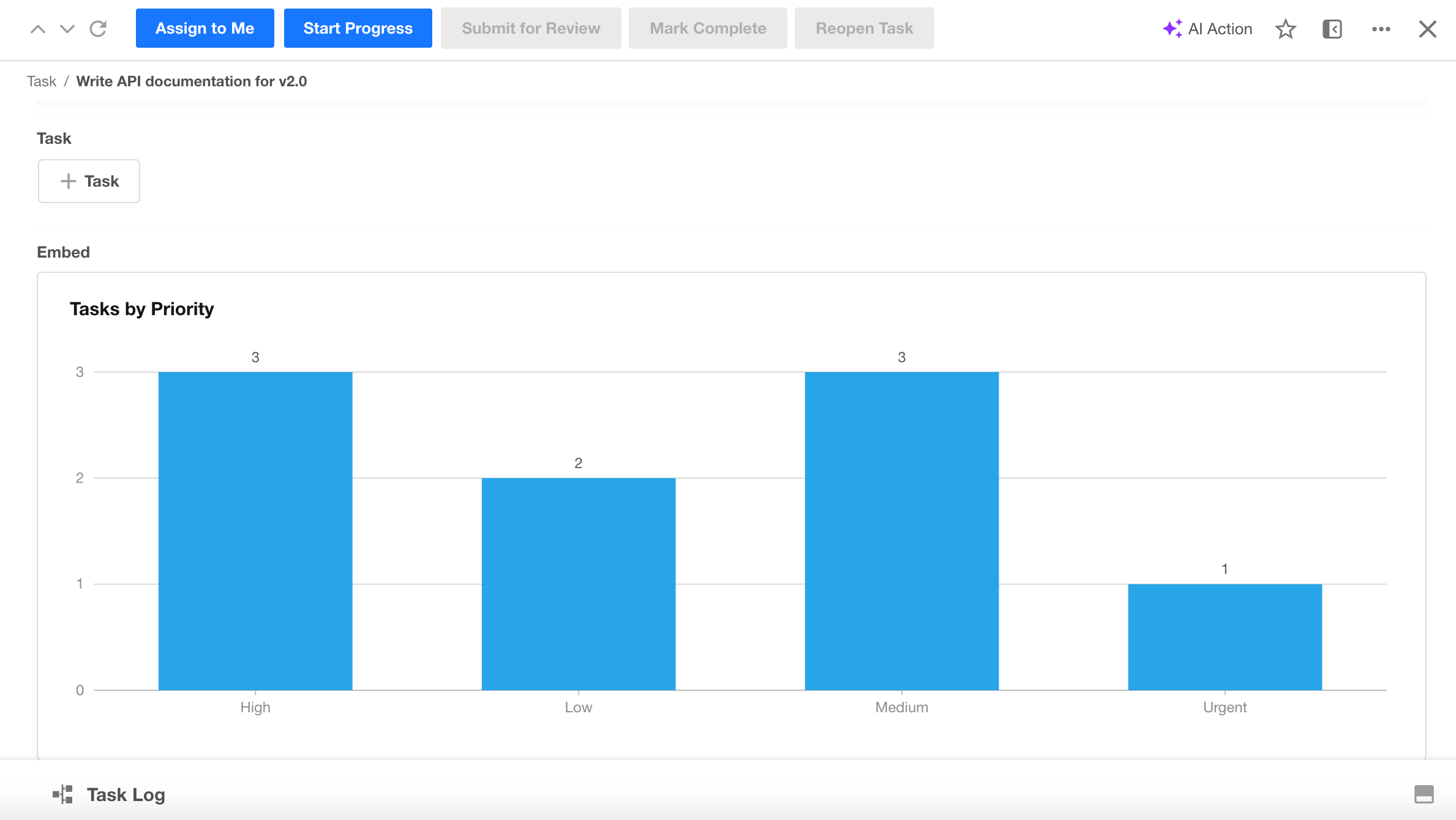
1. Embed a Chart
Use this option to display a chart within a form.
Configuration:
Result:
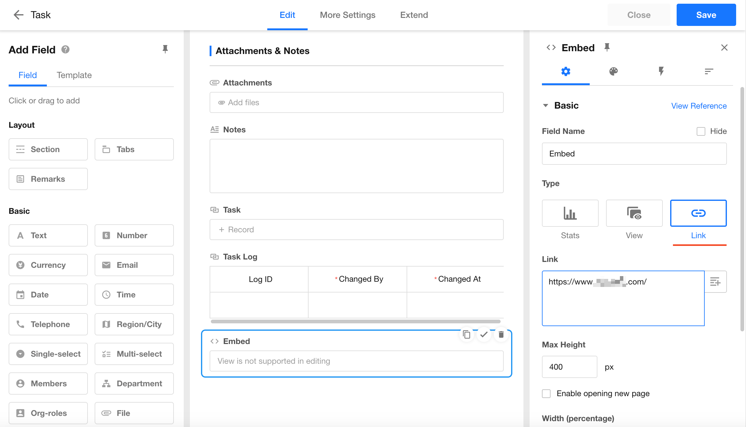
2. Embed a Link
Use this option to embed an external webpage or link within a form.
Configuration:
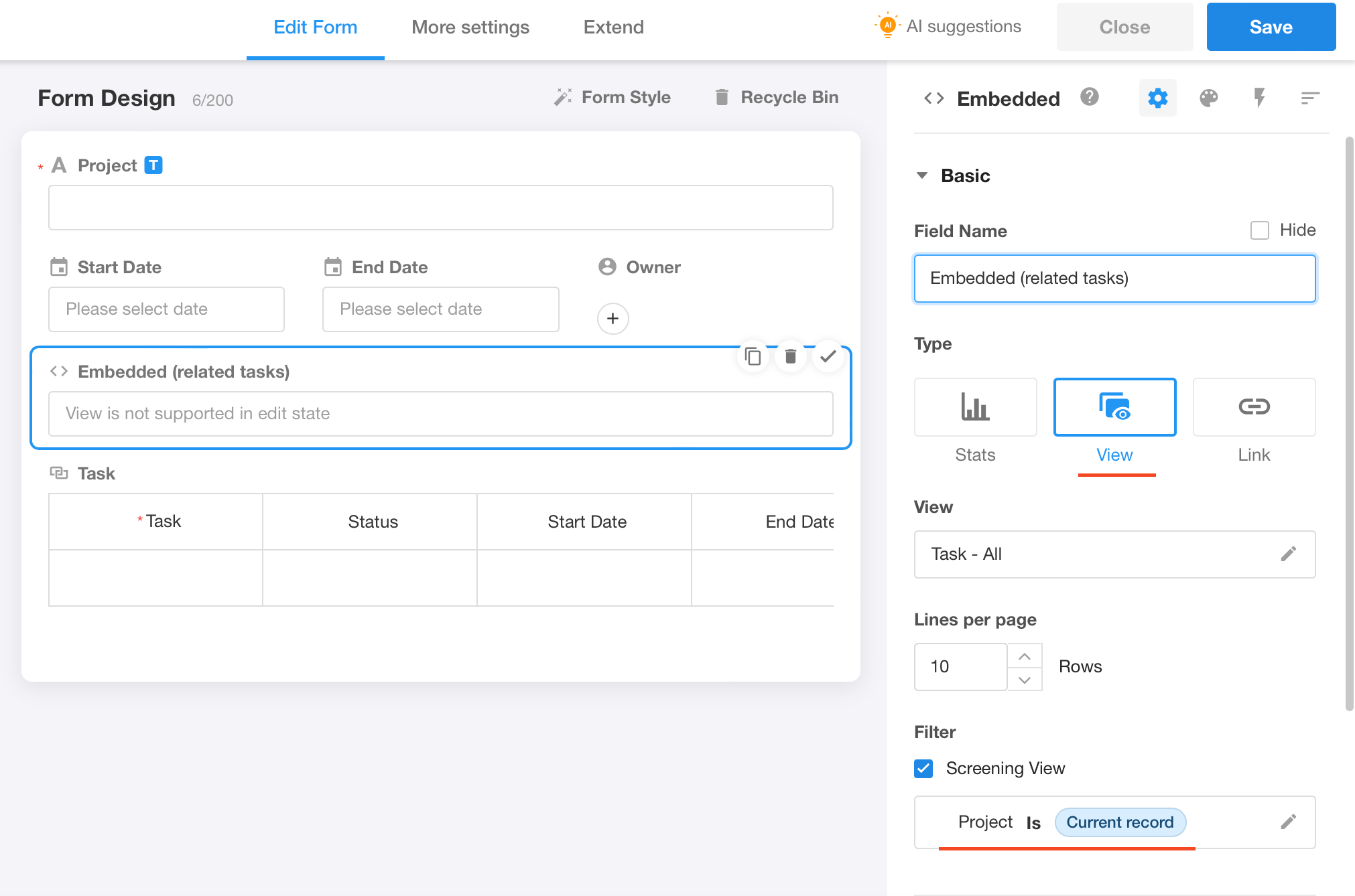
3. Embed a View
Use this option to display an existing view directly within a form.
Configuration:
Result:
Was this document helpful?