Symmetric Bar Chart Creation Guide
1. Overview
A symmetric bar chart is used to compare two related or opposing metrics. The chart is centered on a baseline, with each metric extending in opposite directions (left/right or up/down), enabling clear visual comparison.
Common use cases:
- Store performance analysis: Compare revenue and refunds across stores to identify high-risk locations.
- Inventory flow comparison: Compare inbound and outbound quantities across warehouses to monitor turnover.
2. Example: Comparing Store Revenue and Refunds
Using a Retail Management worksheet as an example, the goal is to compare each store’s revenue and refund amounts for the current quarter.
A symmetric bar chart requires two independent metrics. Confirm your worksheet structure and choose the appropriate configuration:
-
Structure A: Two-field design (Recommended)
If your worksheet already includes two fields (e.g.,Sales AmountandRefund), you can configure the chart directly. This example uses this structure. -
Structure B: Single field + type
If both revenue and refunds are stored in a singleAmountfield and differentiated only byOrder Type, a symmetric chart cannot be generated directly.Recommended approach:
Use a formula field to split refund values (e.g.,IF(Type = 'Refund', Amount, 0)), or use a rollup field in to pre-calculate both metrics.
Step 1: Filter Data
Before configuring the chart, define the data scope.
-
Action: In the Data Source, select all records and add a filter: set
Sales Dateto This Quarter. -
Key point: Filtering ensures all calculations focus only on the current quarter, avoiding interference from historical data.
Step 2: Define Analysis Dimensions
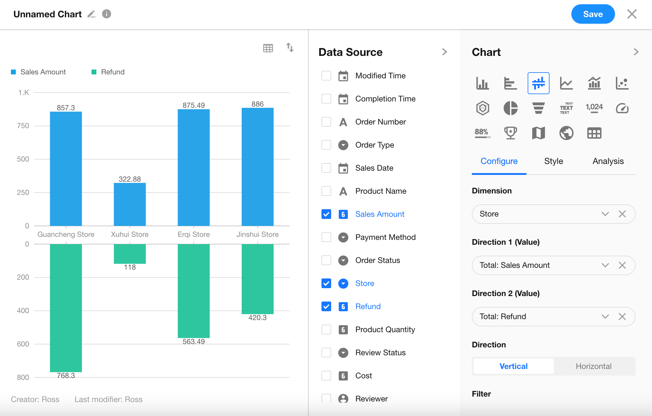
After selecting a symmetric bar chart, configure the axes.
-
Set Dimension: In Dimension, select the
Storefield. -
Set Metrics (Value):
- Direction 1 (Value): Select
Sales Amount, aggregation method Sum. - Direction 2 (Value): Select
Refund, aggregation method Sum.
At this point, bars will be aligned along the central axis, distributed by store.
- Direction 1 (Value): Select
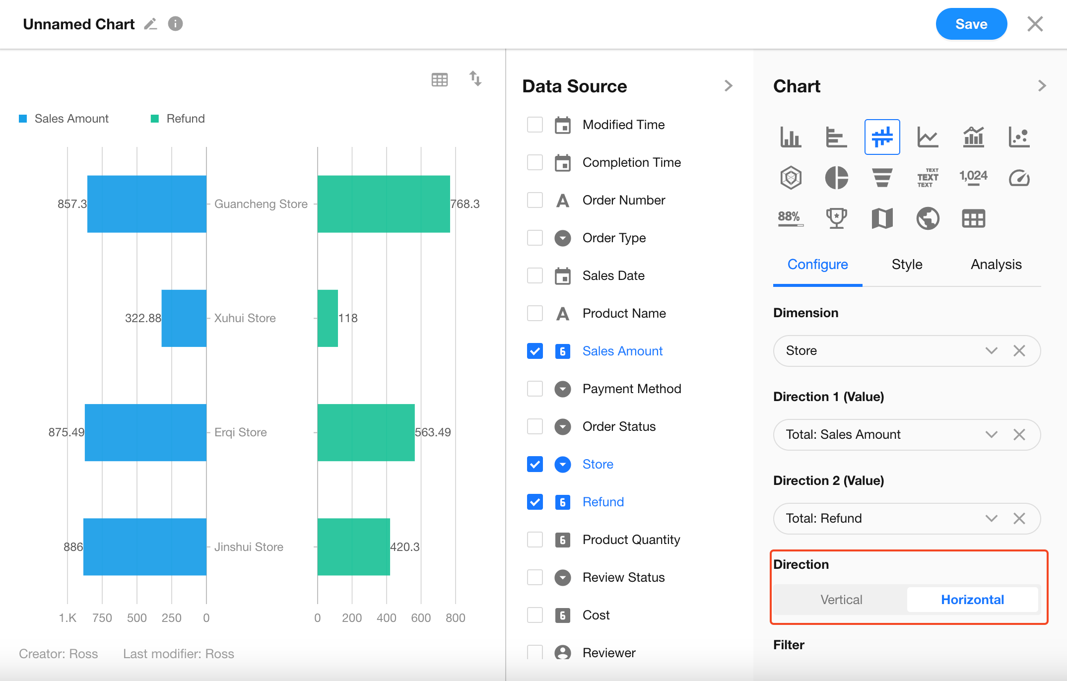
Step 3: Configure Advanced Features
Leverage the chart’s specific features to enhance clarity:
-
Switch Orientation: In the configuration panel, locate the Direction option.
- Vertical: Metrics are compared above and below the central axis.
- Horizontal (Recommended): Metrics extend left and right, making it easier to view store rankings.
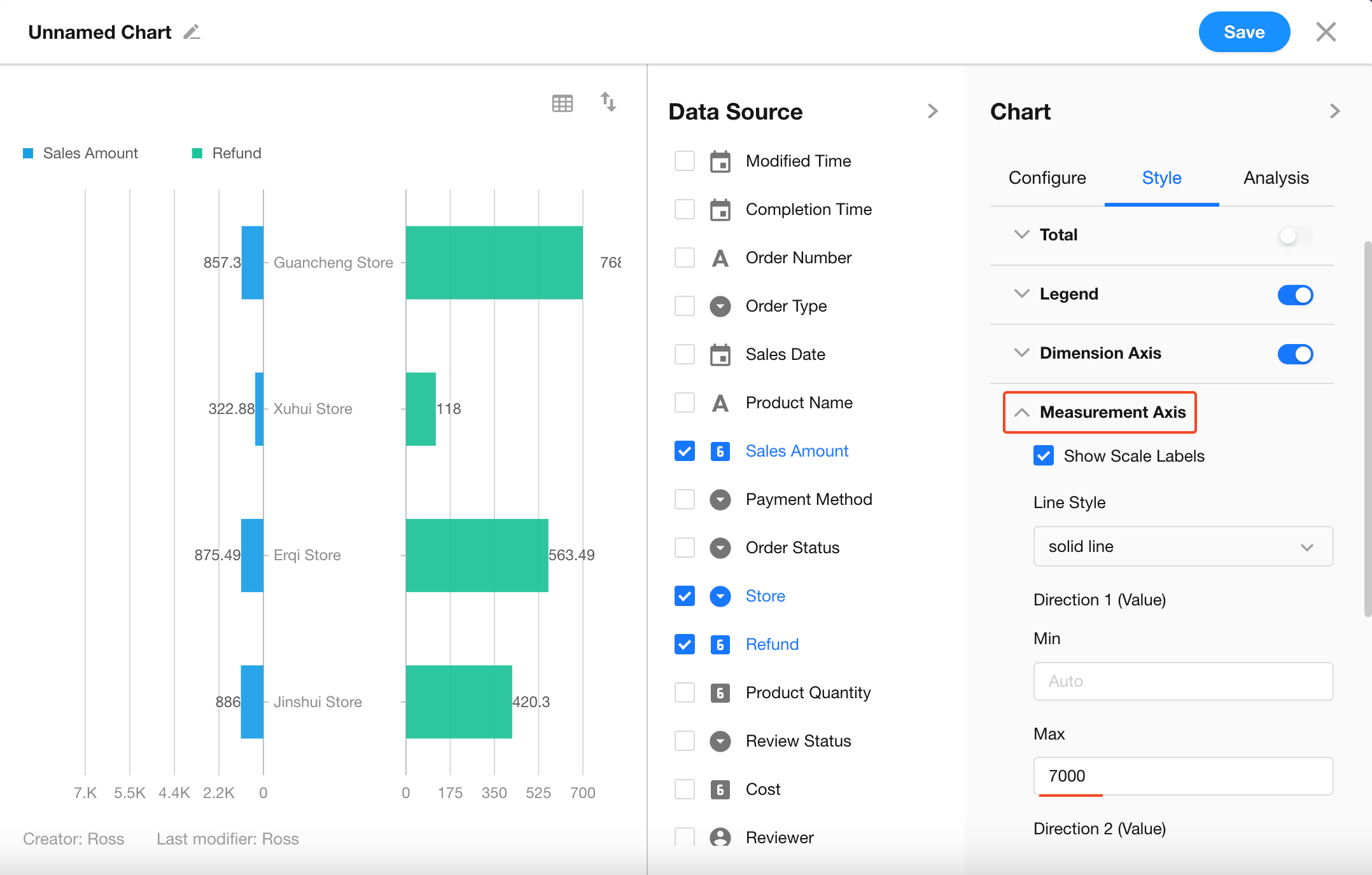
-
Customize Axis Scale: In Style > Measurement Axis, manually set the maximum values for Direction 1 and Direction 2.
Tip: Setting equal maximum values on both sides provides a more accurate visual comparison of refunds relative to revenue.
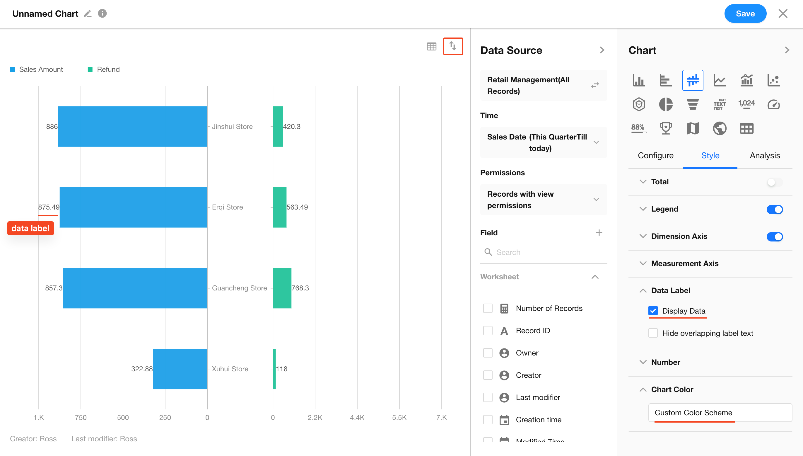
Step 4: Style Settings
-
Color Coding: In style settings, assign blue to Direction 1 and red to Direction 2.
-
Data Labels: Enable Show Value Labels to display values at the end of each bar.
-
Sorting Logic: It is recommended to sort by Direction 1 (Sales Amount) in descending order, so top-performing stores appear first.
3. FAQ
-
Q: Why does my chart look like a standard grouped bar chart?
- A: Ensure that the chart type is set to symmetric bar chart.
-
Q: If a store has no refunds in a given month, will the chart break?
- A: No. Set Empty Value Display to Show as 0 to maintain symmetry.
-
Q: What if the two metrics have very different scales (e.g., order count vs. order amount)?
- A: Symmetric bar charts use a shared scale, so it is best to compare metrics of similar magnitude. If the difference is too large, consider using a Dual-Axis Chart instead.
Was this document helpful?