Line Chart Creation Guide
Overview
A line chart connects data points with straight or curved lines, making it easy to visualize trends, patterns, and fluctuations over time or other continuous dimensions.
Common use cases:
- Performance trend analysis: Track monthly sales growth or decline throughout the year.
- Periodic fluctuation monitoring: Analyze hourly or daily data to identify peak and low periods.
- Multi-metric comparison: Compare trends of metrics such as sales and profit within the same chart.
2. Example: Annual Sales and Profit Trend Analysis
Using the Retails Management worksheet as an example, the goal is to analyze monthly trends in Sales Amount and Profit throughout the current year.
Compared to column charts, line charts are better for analyzing slopes. The steepness of the line allows managers to intuitively assess whether business growth is accelerating or slowing down.
Step 1: Filter Data
Before configuring the chart, ensure the time range is accurate.
-
Action: In the Data Source, select all records and add a filter: set
Sales Dateto This Year. -
Key point: Ensure the dataset covers the full annual cycle to observe seasonal patterns.
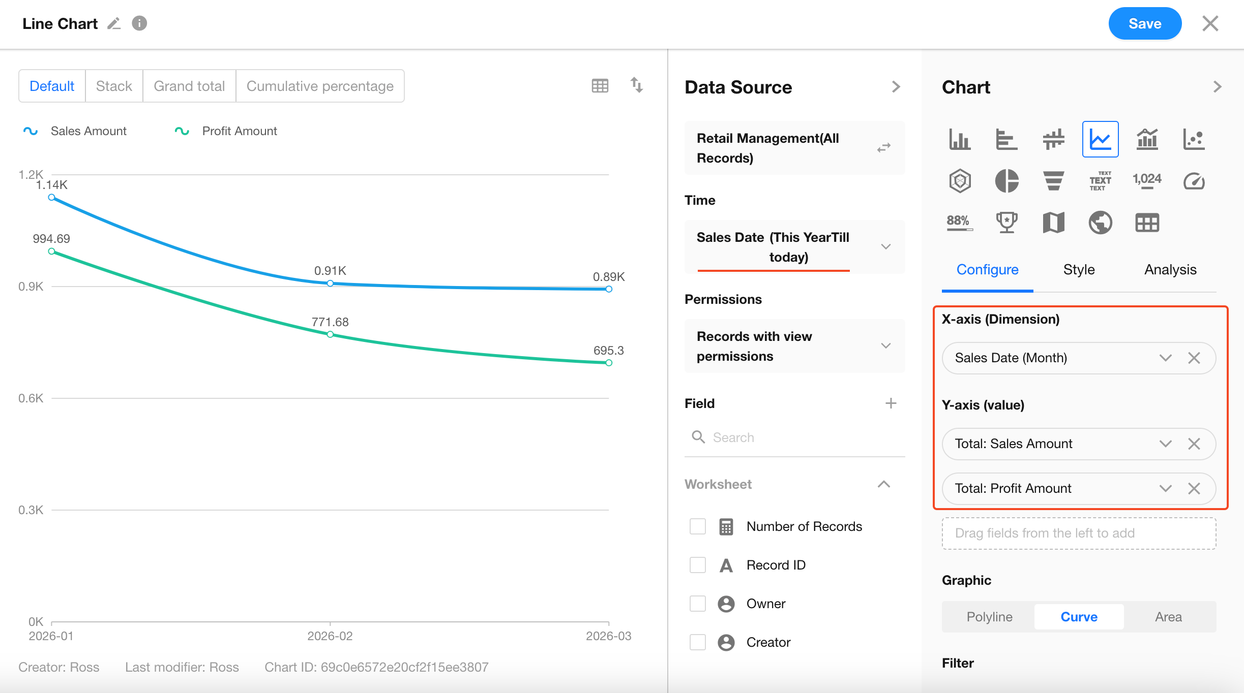
Step 2: Define Analysis Dimensions
-
Set X-axis (Dimension): Select
Sales Date.- Granularity: Set to Month (use Day for more granular analysis).
-
Set Y-axis (Values):
- Metric 1: Select
Sales Amount, aggregation method Sum. - Metric 2: Select
Profit, aggregation method Sum.
At this point, two lines will appear, allowing direct comparison of their trends.
- Metric 1: Select
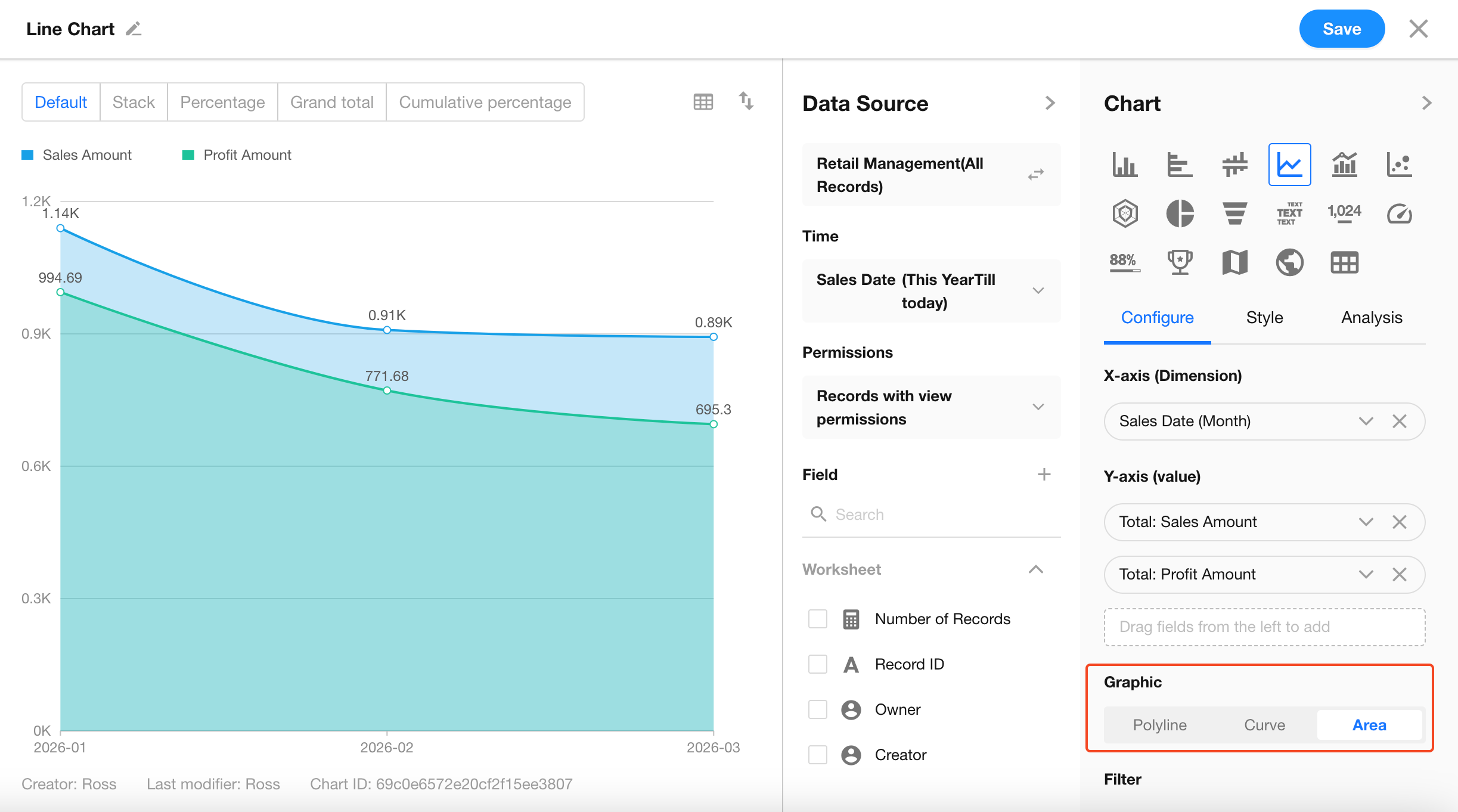
Step 3: Configure Chart Style
Line charts offer multiple display styles to meet different visualization needs:
-
Line / Curve Toggle
In Configuration > Graphic, choose between Line (sharp and clear) or Curve (smooth and visually appealing). -
Area Chart Display
When Area is selected, the space beneath the line is filled with color.Suitable for emphasizing the scale or cumulative magnitude of values.
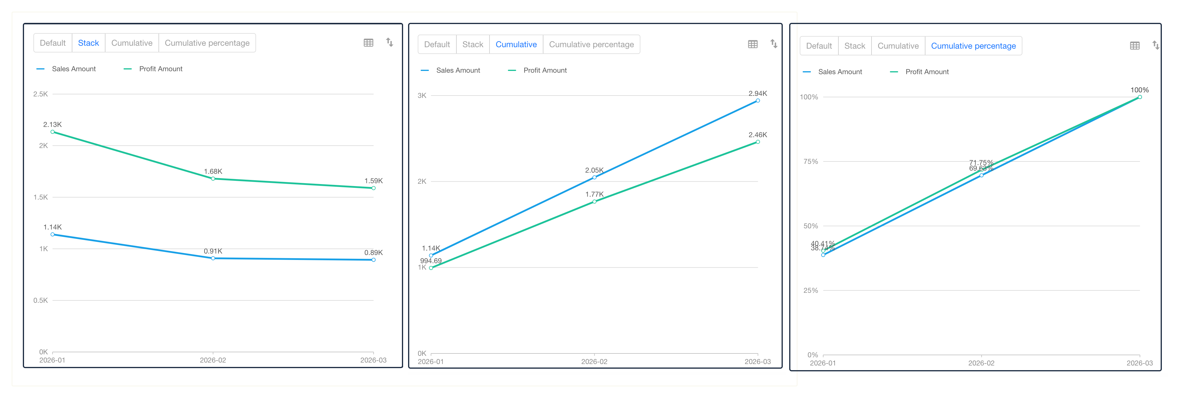
Step 4: Stack / Cumulative / Cumulative Percentage
In the chart preview toolbar, you can switch calculation modes to support different analysis goals:
-
Stack Mode
- Effect: Multiple metrics (e.g., sales and profit) are stacked upward, with the top line representing the total.
- Use case: Analyze overall trends and the contribution of each component.
-
Cumulative Mode (Common)
- Effect: Each period’s value is added to all previous periods.
- Use case: Monitor progress toward annual targets. The line will show a steadily increasing trend, with the endpoint representing the total.
-
Cumulative Percentage
- Effect: Displays cumulative values as a percentage of the total target (0%–100%).
- Use case: Easily identify when key milestones (e.g., 50% or 80%) are reached.
FAQ
-
Q: What is the difference between a line chart and an area chart?
- A: Line charts focus on trend changes, while area charts emphasize magnitude and scale. When using multiple metrics with area charts, consider adjusting transparency to prevent overlapping colors from obscuring lines.
-
Q: The X-axis labels are too crowded. What can I do?
- A: You can enable auto-rotate X-axis labels in style settings or adjust the date display format (e.g., show only months).
Was this document helpful?