Radar Chart
A radar chart is a two-dimensional chart used to display multivariate data, where three or more quantitative variables are plotted on axes originating from the same central point. The relative position and angle of each axis are typically not meaningful.
Below is an example of how to create a radar chart.
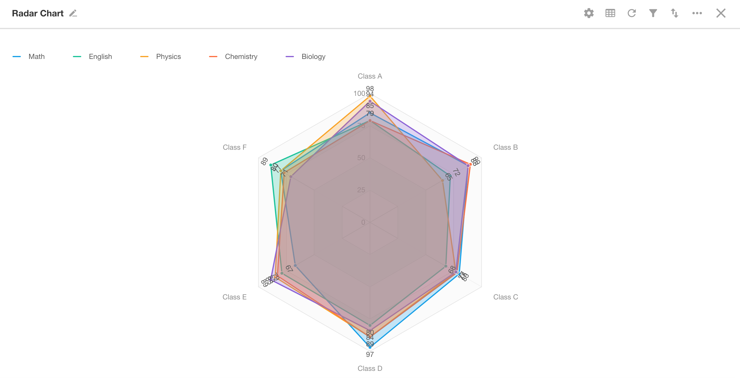
Example: Create a radar chart to compare the average scores of five subjects across six classes
Data Scope: Average scores of five subjects for six classes
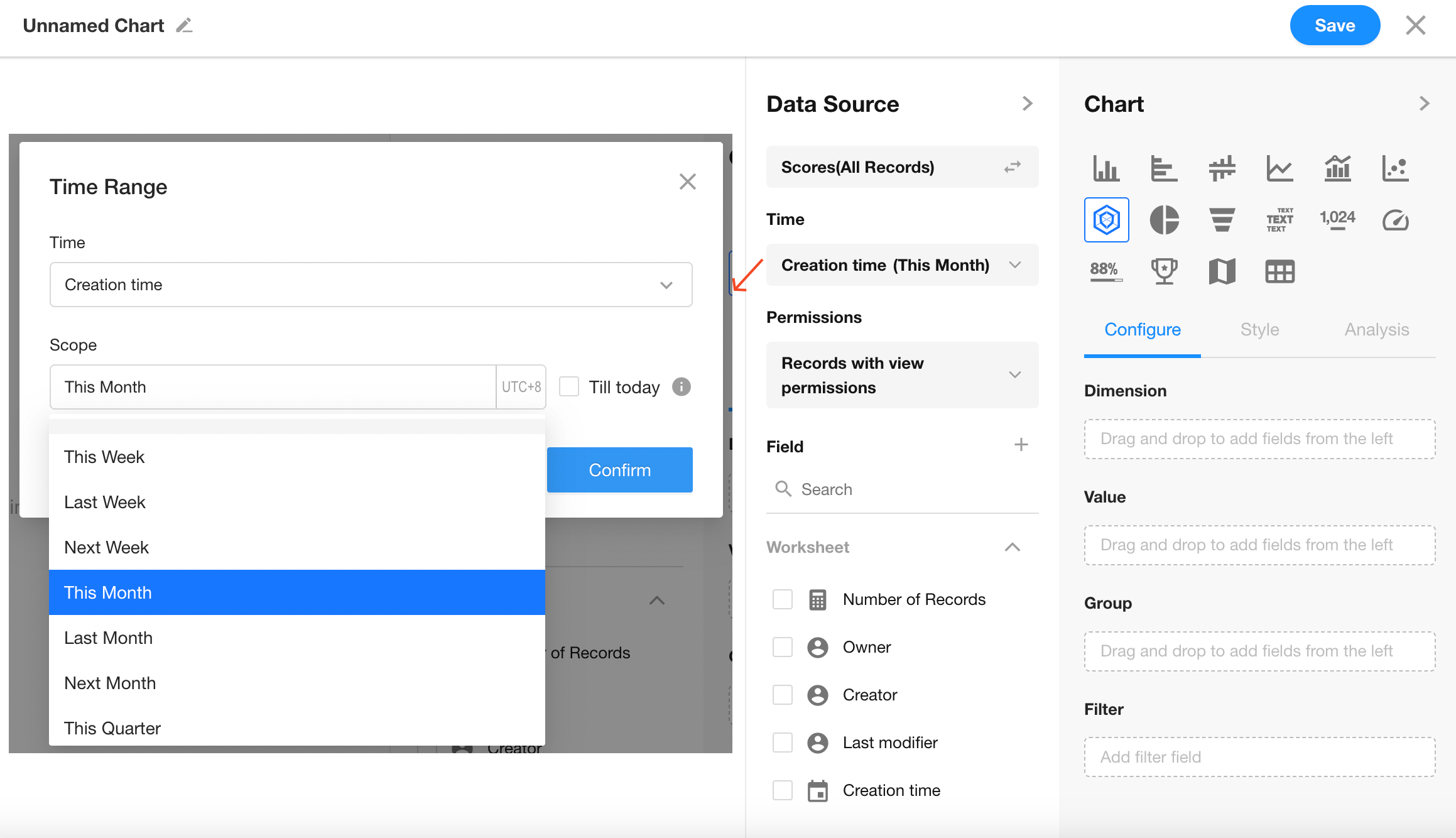
Time Filter: Created in the current month
Chart Configuration
1. Create a New Chart
2. Set the Record Filter
Filter records in the "Grade Statistics" worksheet where "Creation Time" is within the current month.
3. Select Chart Type: Radar Chart
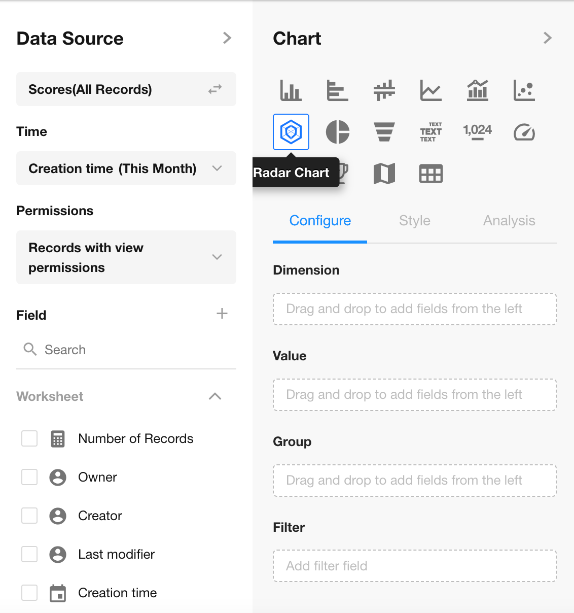
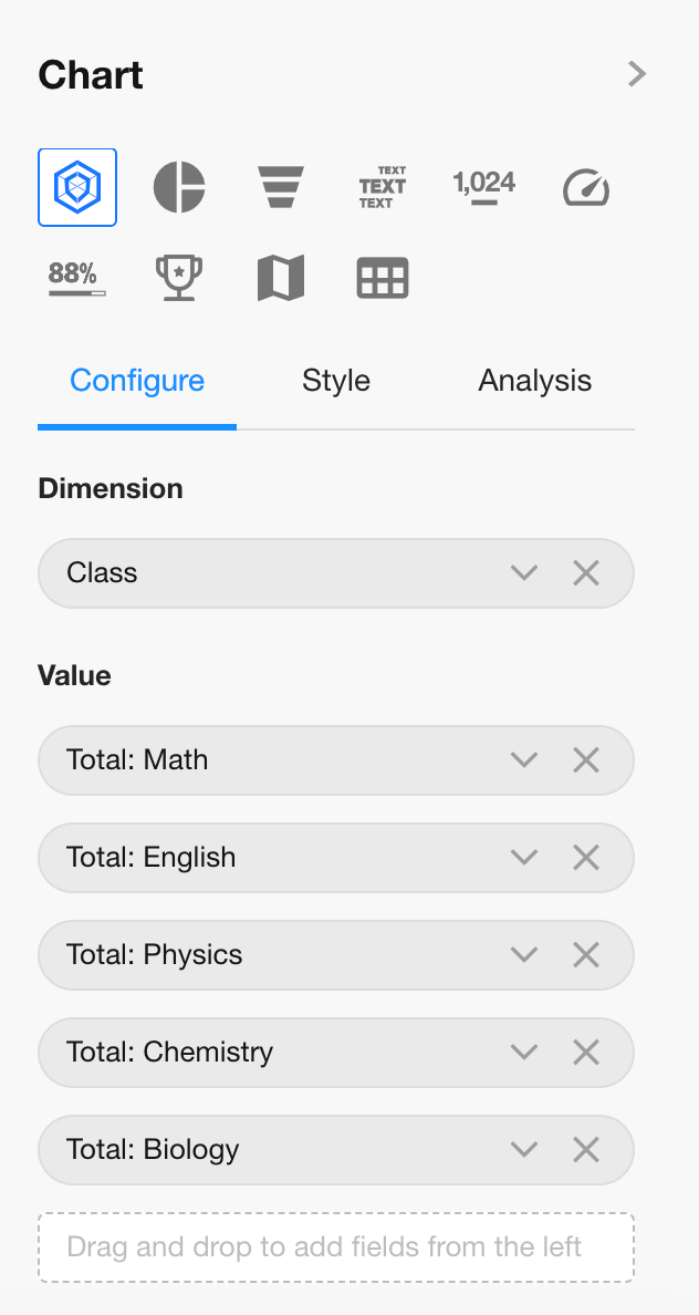
4. Set Dimension and Metrics
Dimension: "Class" field
Metrics: Five subject fields (e.g., Math, English, etc.)
- Only one field can be selected as the dimension;
- One or more numeric fields can be selected as metrics
5. Save the Chart Configuration
Additional Styles
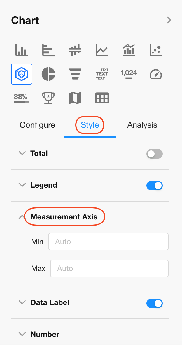
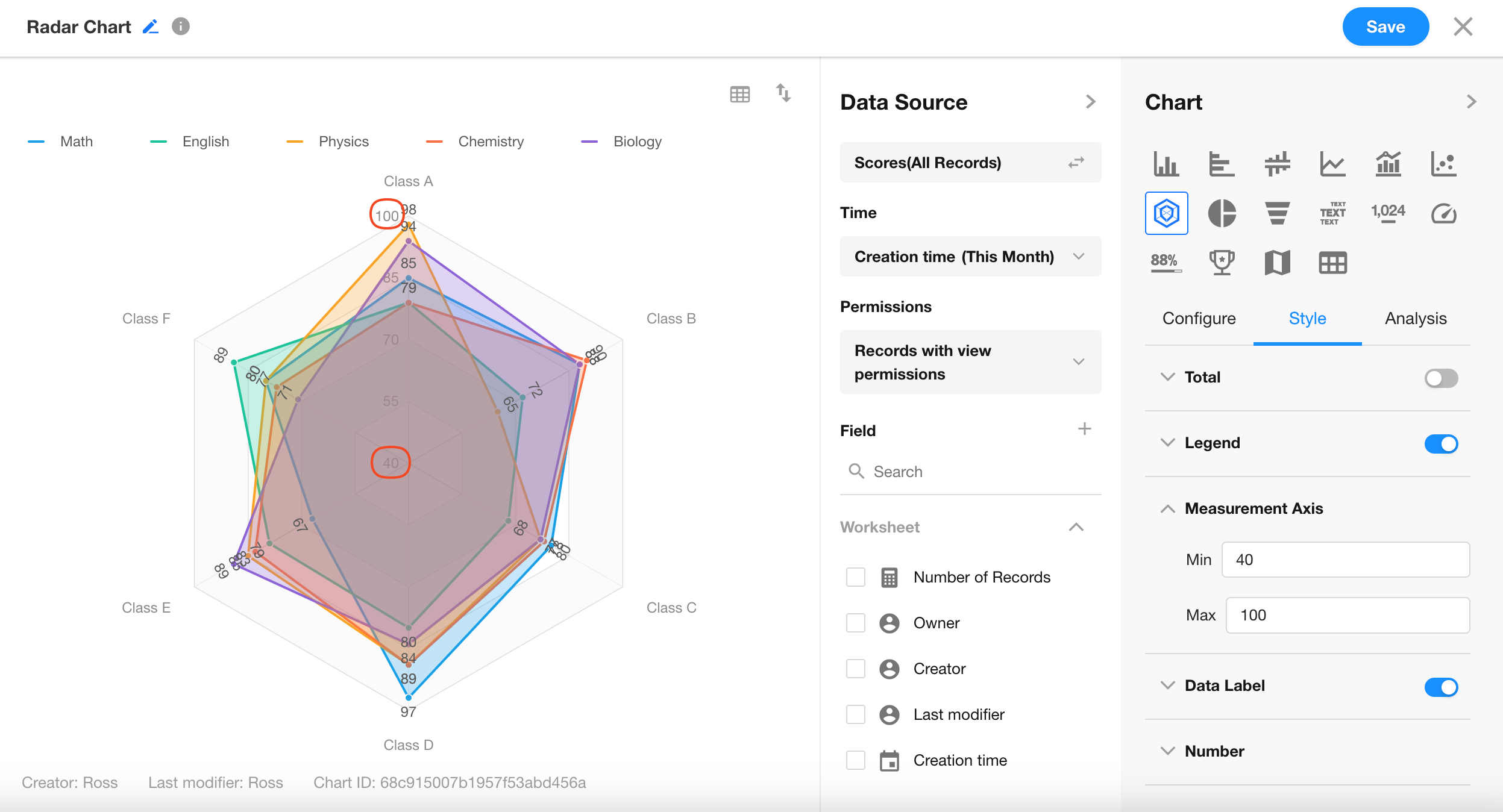
6. Axis Range Settings
You can customize the minimum and maximum values for the measurement axes.
For example, setting the minimum to 40 and maximum to 100:
Was this document helpful?