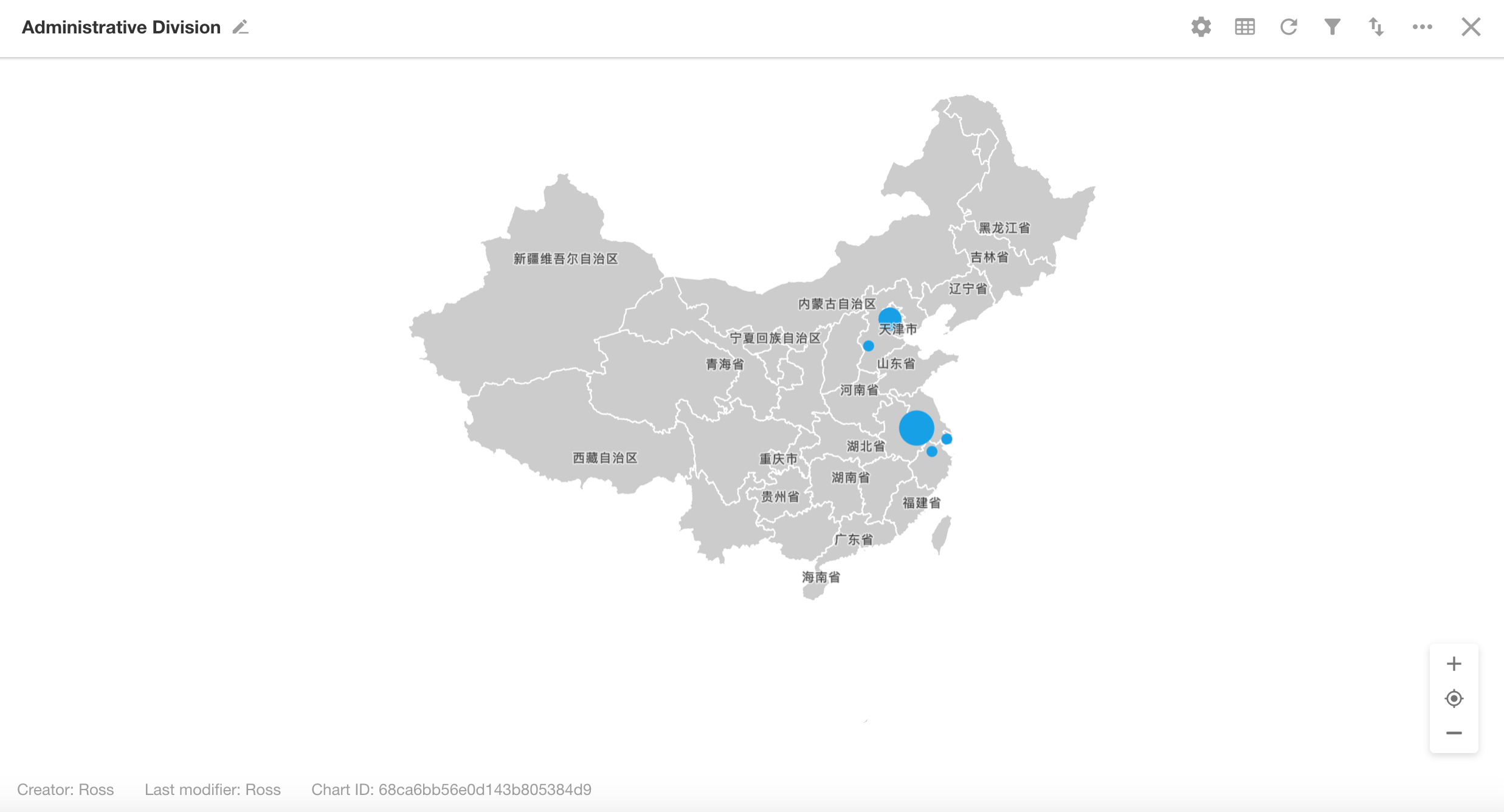
Administrative Division
An administrative division chart is a type of statistical chart displayed as a map. It uses visual elements such as color fill or bubbles to indicate the distribution and magnitude of metrics across geographic regions. These charts are widely used for visualizing data like regional sales distribution, economic growth indices, supermarket locations, and more.
Below is an example of how to create an administrative division chart.
Example: Create an administrative division chart in the Orders worksheet to visualize the regional distribution of product sales for the current month
View: "All" view
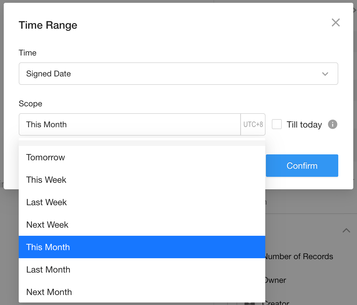
Date Field: Signed Date
Date Range: Current month
Chart Configuration
1. Create a New Chart
2. Set Record Scope
Choose whether to apply the chart to a specific view or to all records (default).
Filter records where "Signed Date" is within the current month.
Additional filter conditions can be added as needed.
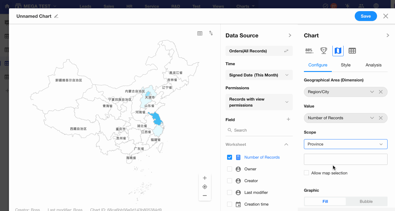
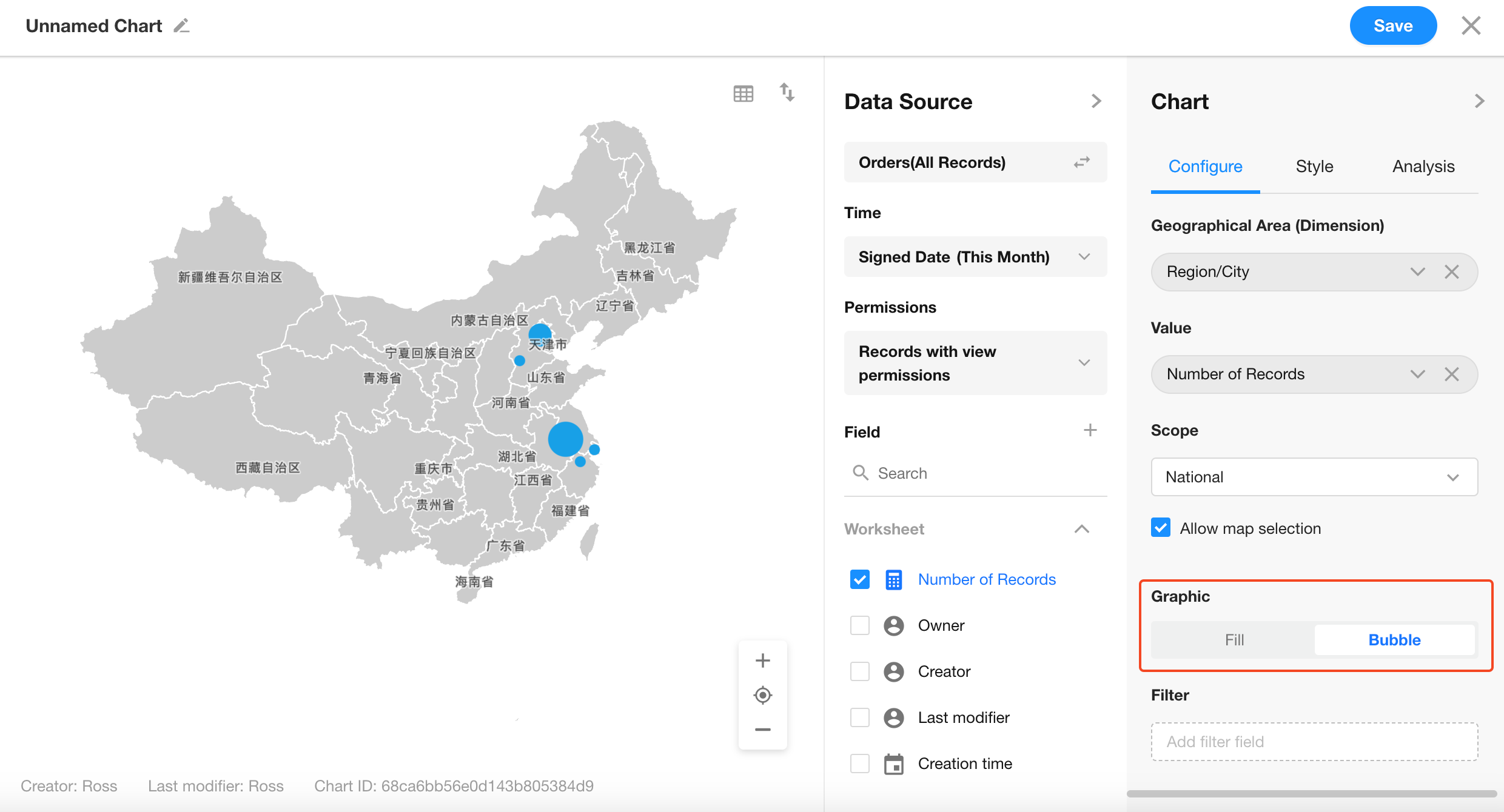
3. Select Chart Type: "Administrative Division"
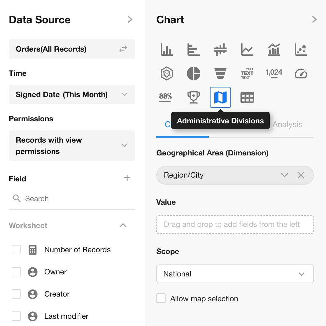
4. Dimension & Value Settings
Dimension: Select the Region field
Value: Number of records
Scope: Defaults to national level. You can select from National, Province, or City levels. If Province or City is selected, an additional region selector will appear.
5. Enable Drill-Down
When enabled, users can click the chart to drill down to the next geographic level. Drill-down is not supported when the current scope is City.
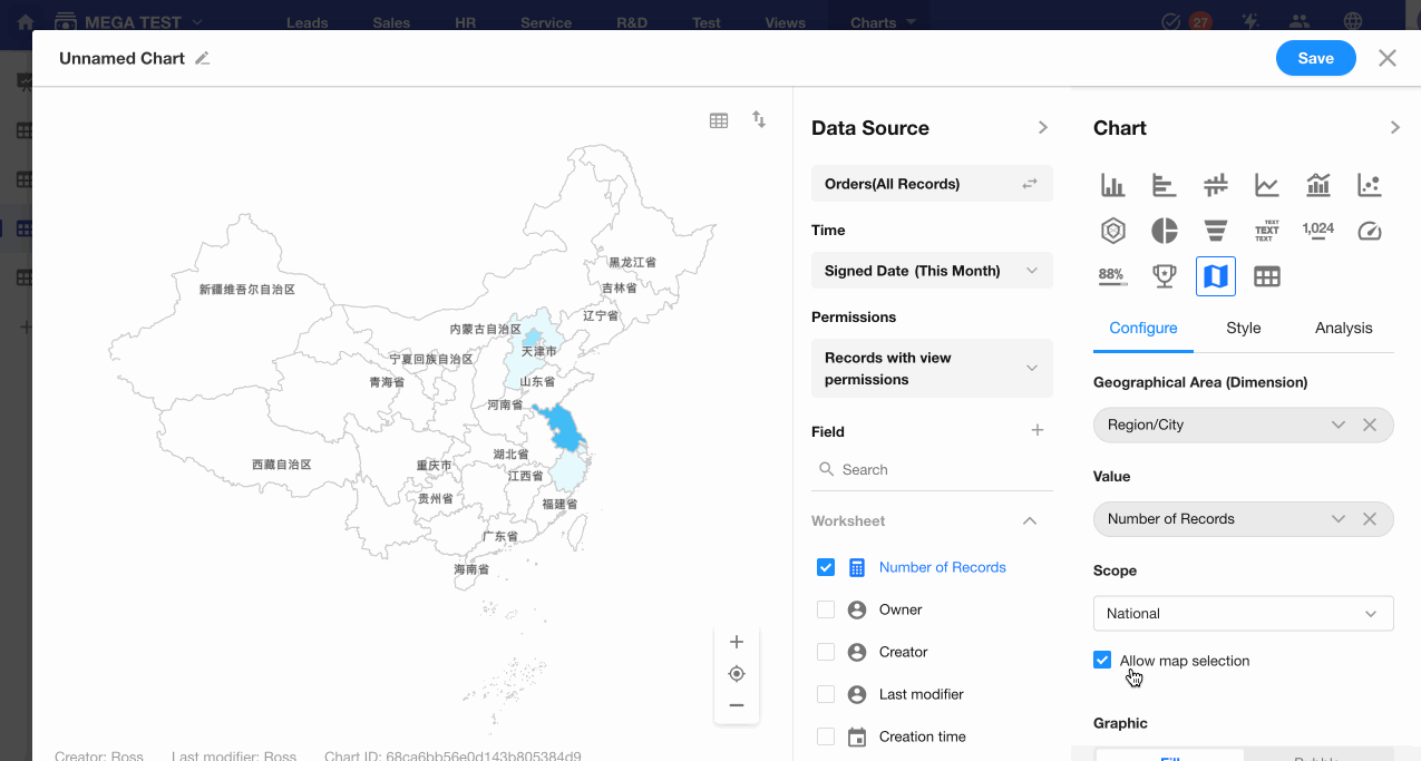
6. Chart Style
You can switch between filled map and bubble map styles.
7. Save the Chart
Click "Save" to apply and generate the chart.
Was this document helpful?