General Configuration for Charts
Different chart types vary in presentation, but the creation and configuration process is largely the same.
This article introduces the common configuration for charts. Each chart-specific document will focus only on use cases and unique configuration options.
A typical chart configuration includes:
Create chart → Select data range → Choose chart type → Configure dimensions and metrics → Set chart style → Save chart
1. Create a Chart
1. Create a New Chart
In the worksheet toolbar, select Chart > Public or Personal Chart > + to create a chart.
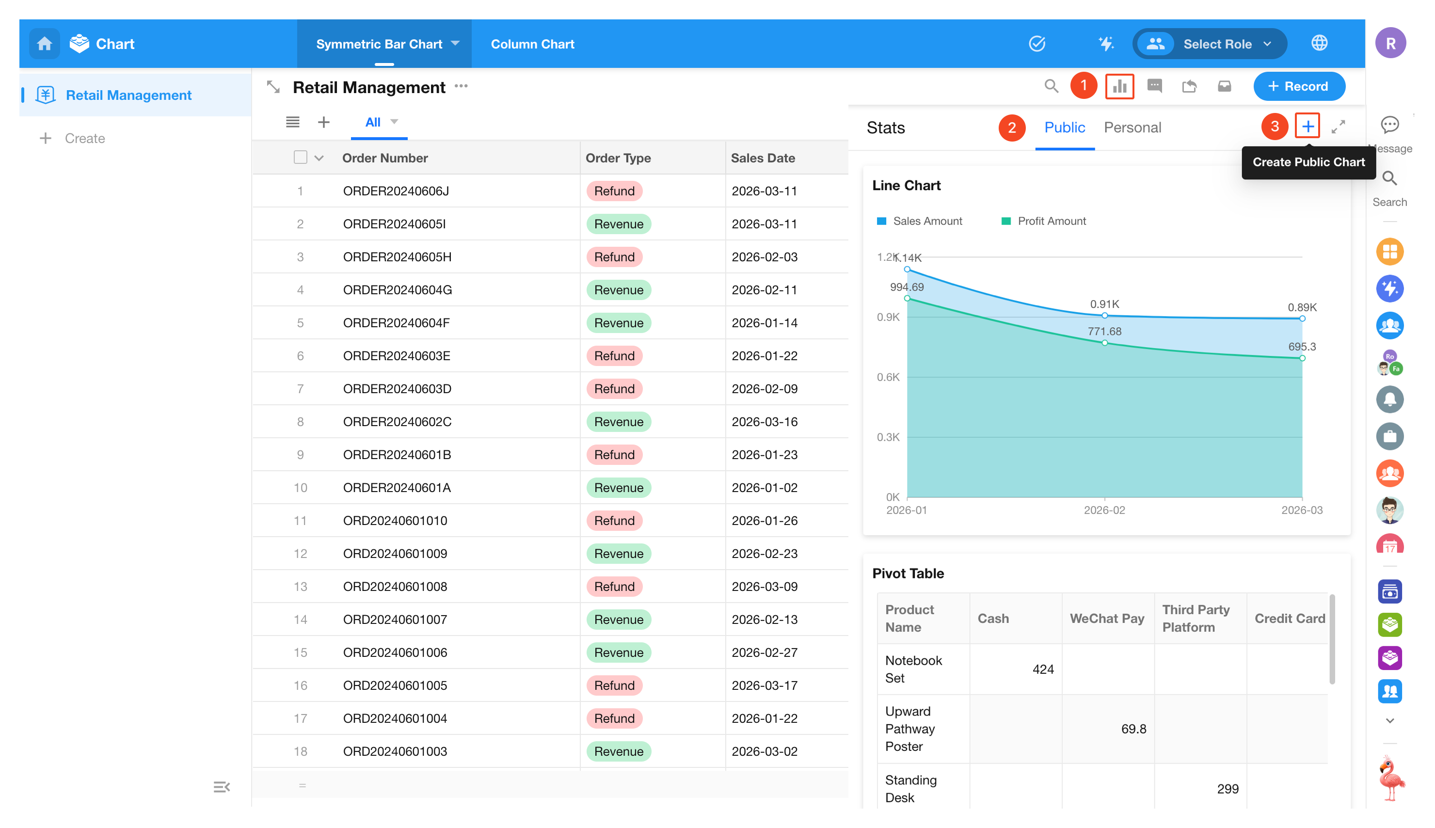
When creating a chart, you can set its visibility:
- Public chart: Visible to all users who can access the worksheet
- Personal chart: Visible only to the creator
It is recommended to first create a personal chart for configuration and testing, then switch it to a public chart once finalized.
2. Set Data Range
Charts require a defined data range. You can precisely configure it using the following four methods:
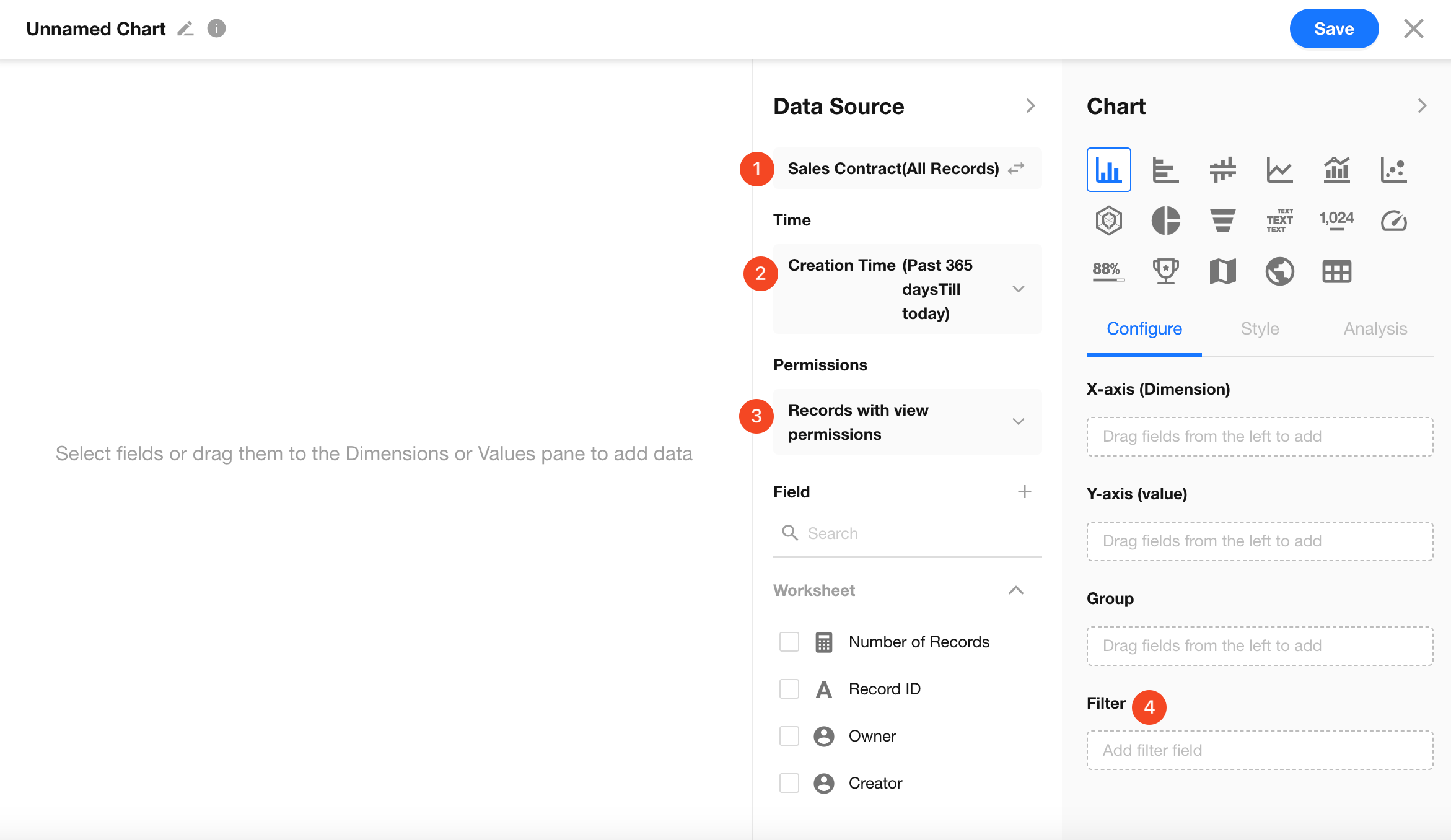
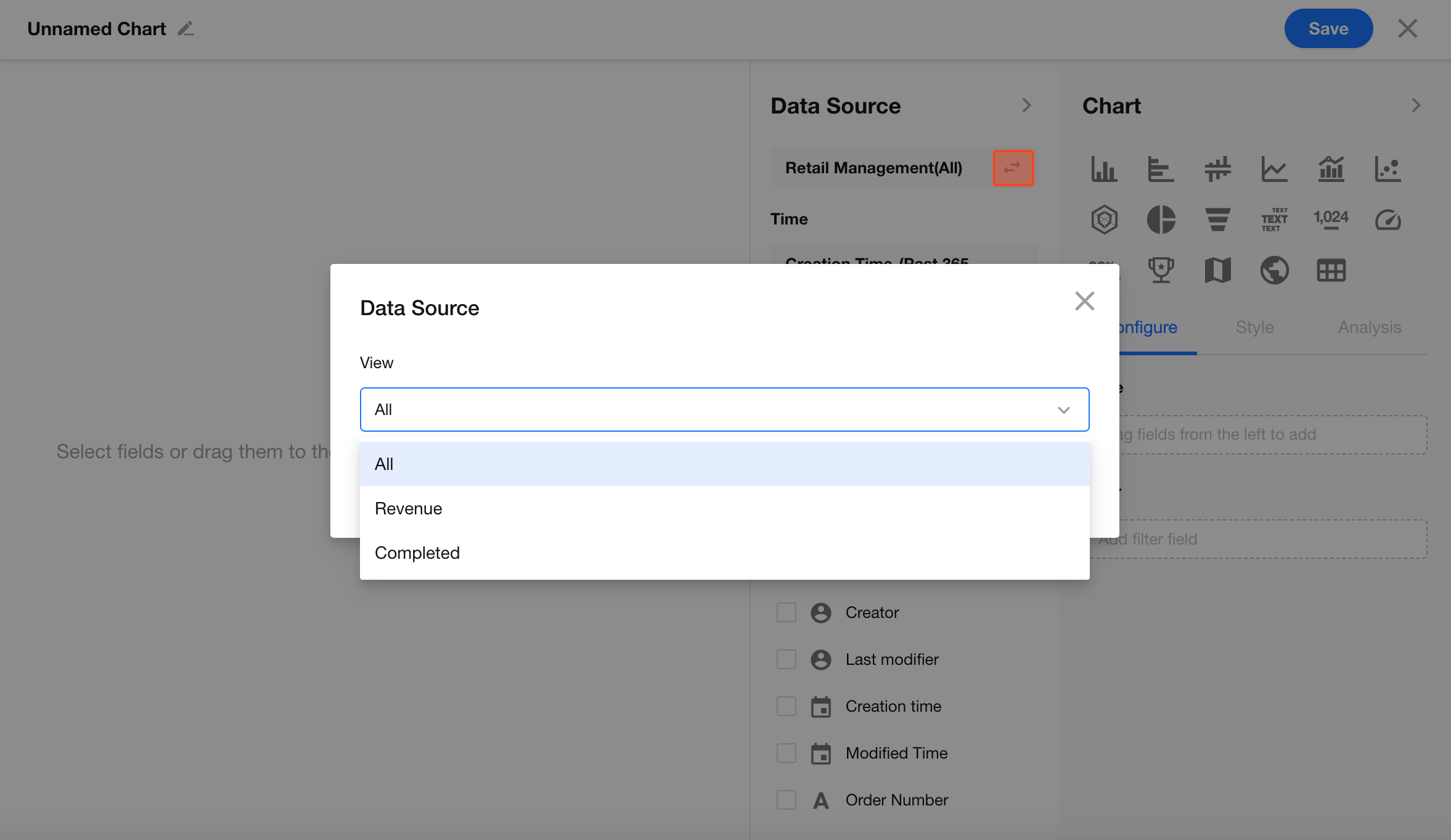
2.1 Data Source
By default, charts include all records in the current worksheet. You can also select a specific view to quickly filter the data source.
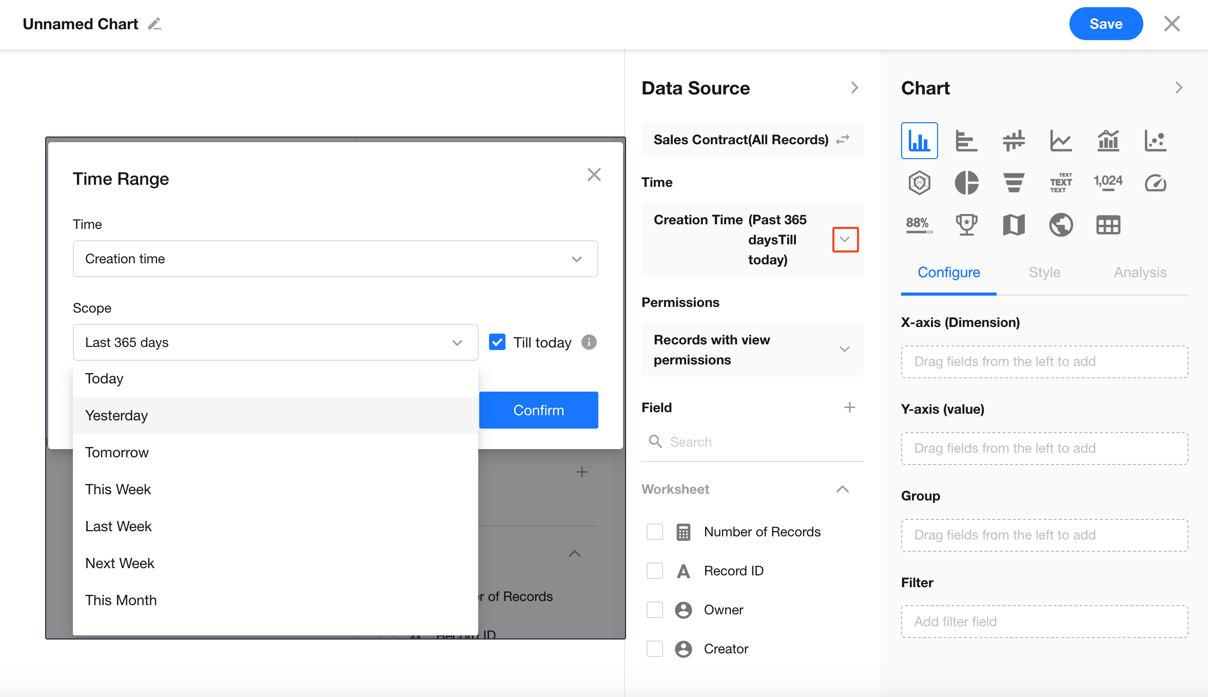
2.2 Time Range
If records include date/time fields, you can define a time range for the data.
-
Common options include:
Today, Yesterday, This Week, Last Week, This Month, This Year, or a custom range -
Time can be based on:
Created time, updated time, or a custom date field
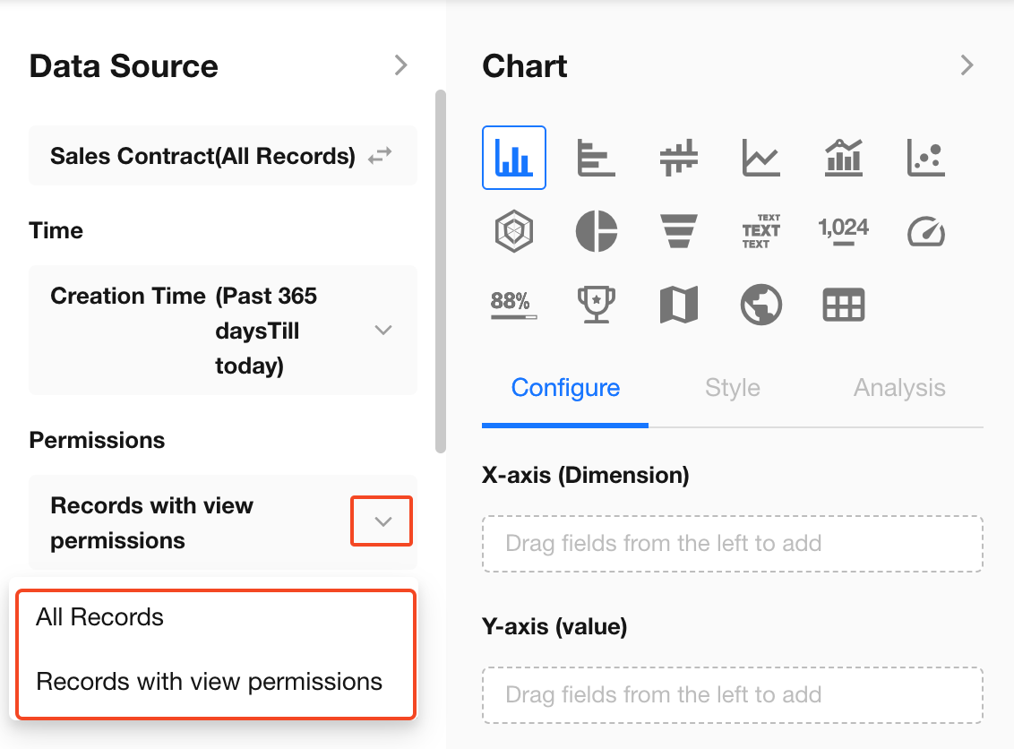
2.3 Permissions
Chart data can be calculated based on:
- All records: All users who can access the chart see the same results
- Records with view permission (default): Users can only analyze data they have permission to view
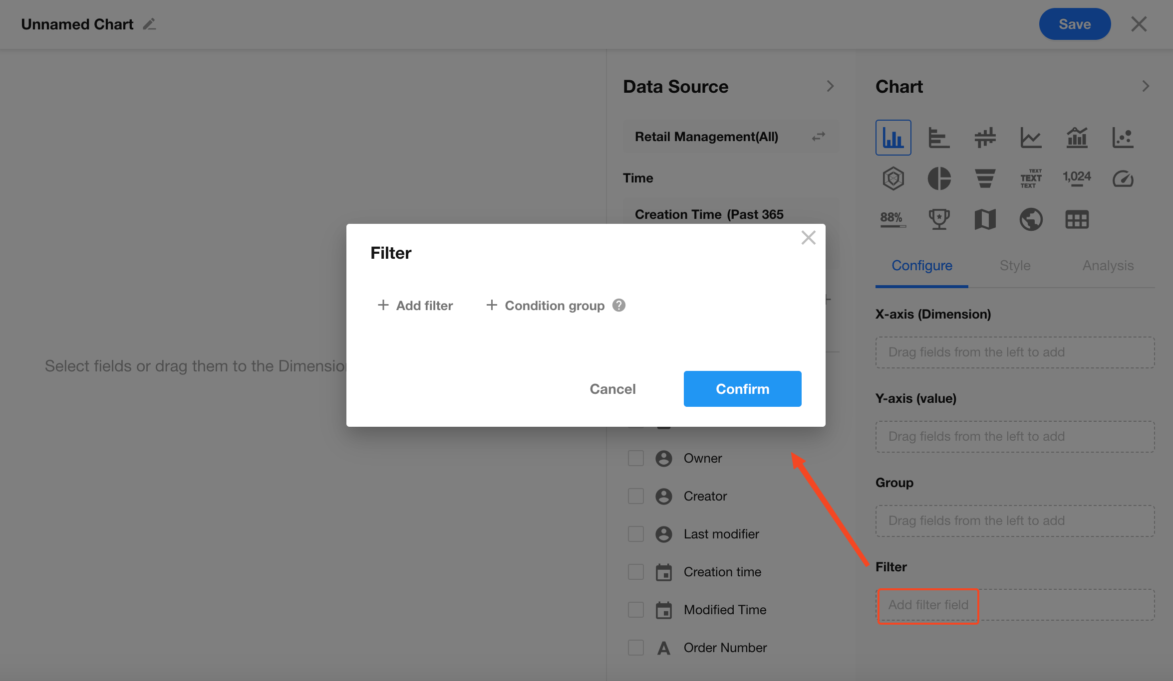
2.4 Filters
In addition to view and time range filters, you can further refine data using filters for more precise analysis.
Examples:
- Only include orders with status “Completed”
- Only include customers from a specific region
Click Add Filter Field to configure filters.
Data Volume Limits
There is no limit on the number of records processed, but chart rendering is limited by the number of data points (legends):
- Pie chart, word cloud: up to 500 items
- Column, bar, and line charts: up to 10,000 items
- Pivot table: no more than 10,000 aggregated cells
- Other charts: up to 5,000 items
If limits are exceeded, you may see messages such as:
“Unable to generate chart. The dataset is too large. Please add a time range or filters.”
or
“The dataset is too large to render. Please refine the range or filters, or contact the application admin.”
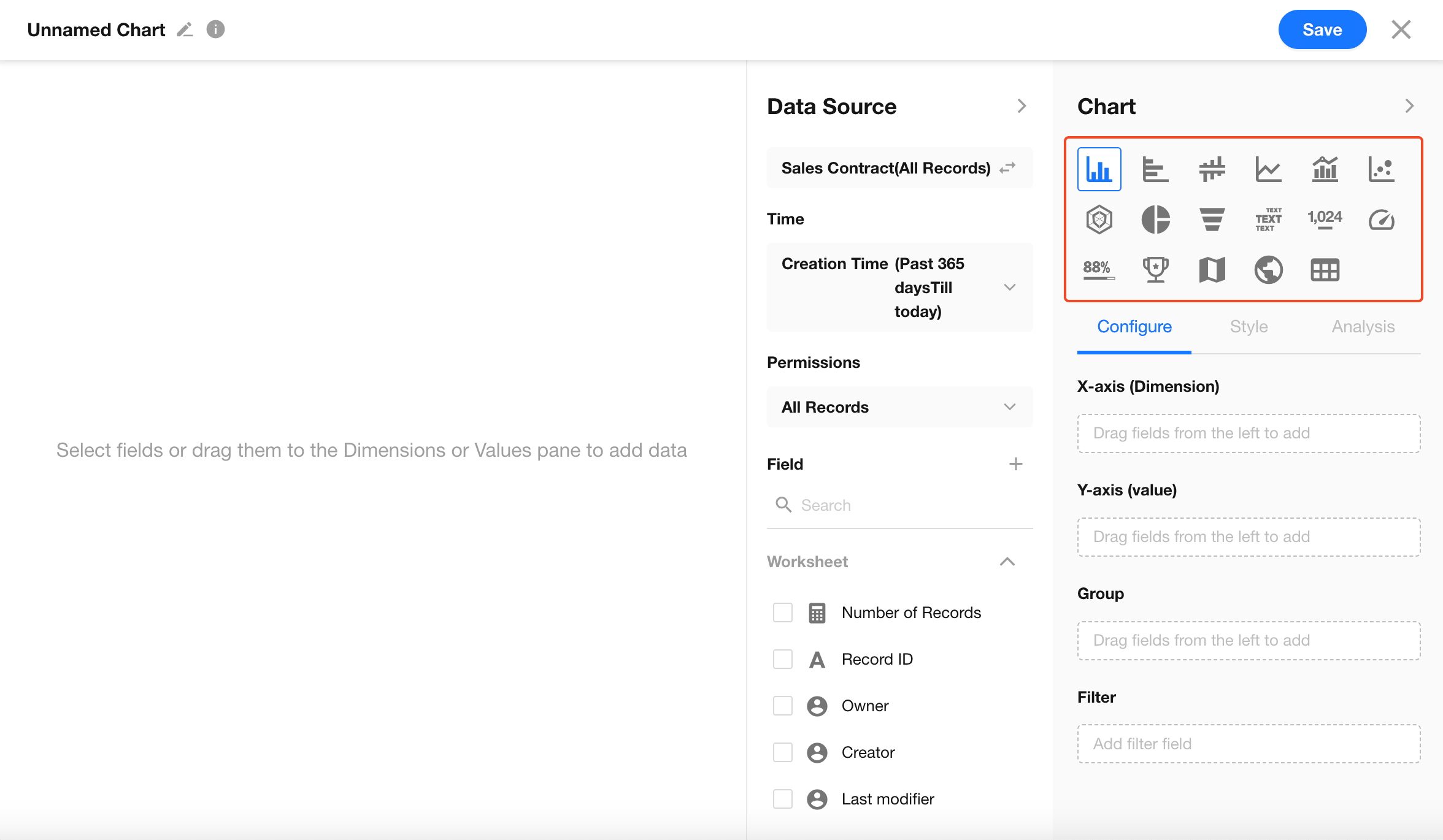
3. Select Chart Type
HAP supports the following chart types:
Column chart, horizontal bar chart, symmetric bar chart, line chart, dual-axis chart, scatter diagram, radar chart, pie chart, funnel chart, word cloud, number chart, dashboard, progress bar, ranking list, map, administrative divisions, pivot table.
Each chart type requires different configuration settings.
4. Configure Dimensions and Metrics
Charts typically require two types of data:
- Dimension: Used to categorize or group data (e.g., department, city, date)
- Metric (value): The numerical value to calculate (e.g., sales amount, order count, number of users)
By combining different dimensions and metrics, you can generate various chart types to meet different analysis needs.
Example: Column chart
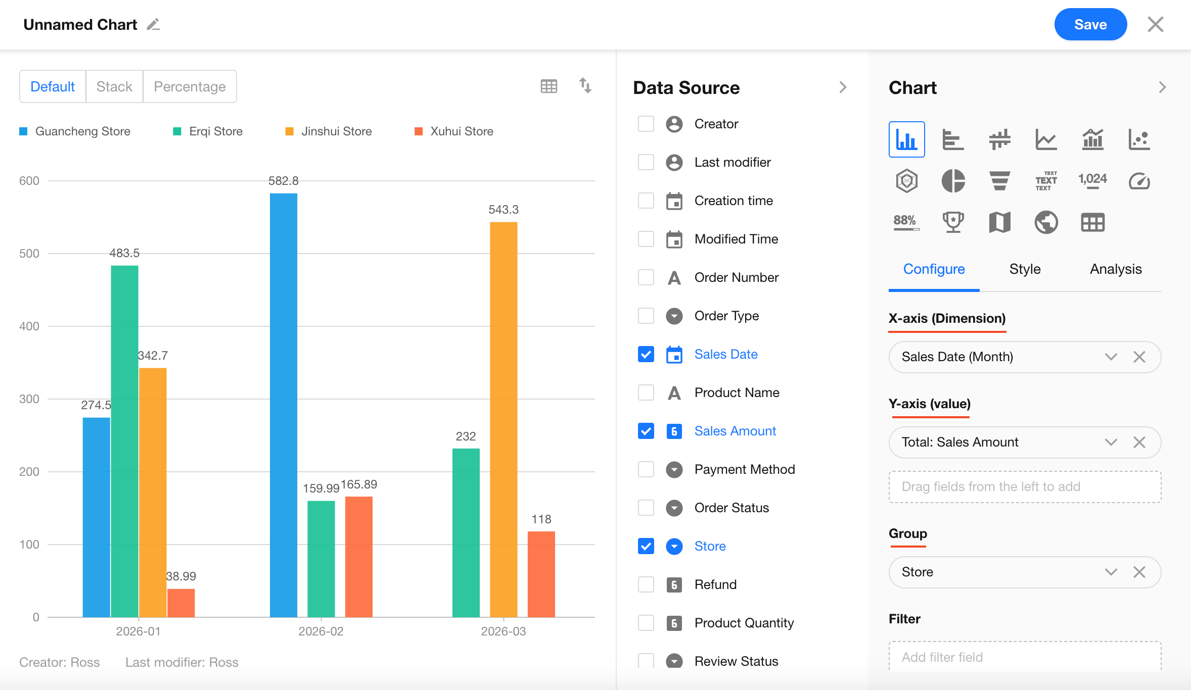
4.1 Dimension (X-axis)
The X-axis defines how data is categorized.
Purpose: Displays categories such as department, date, or product type.
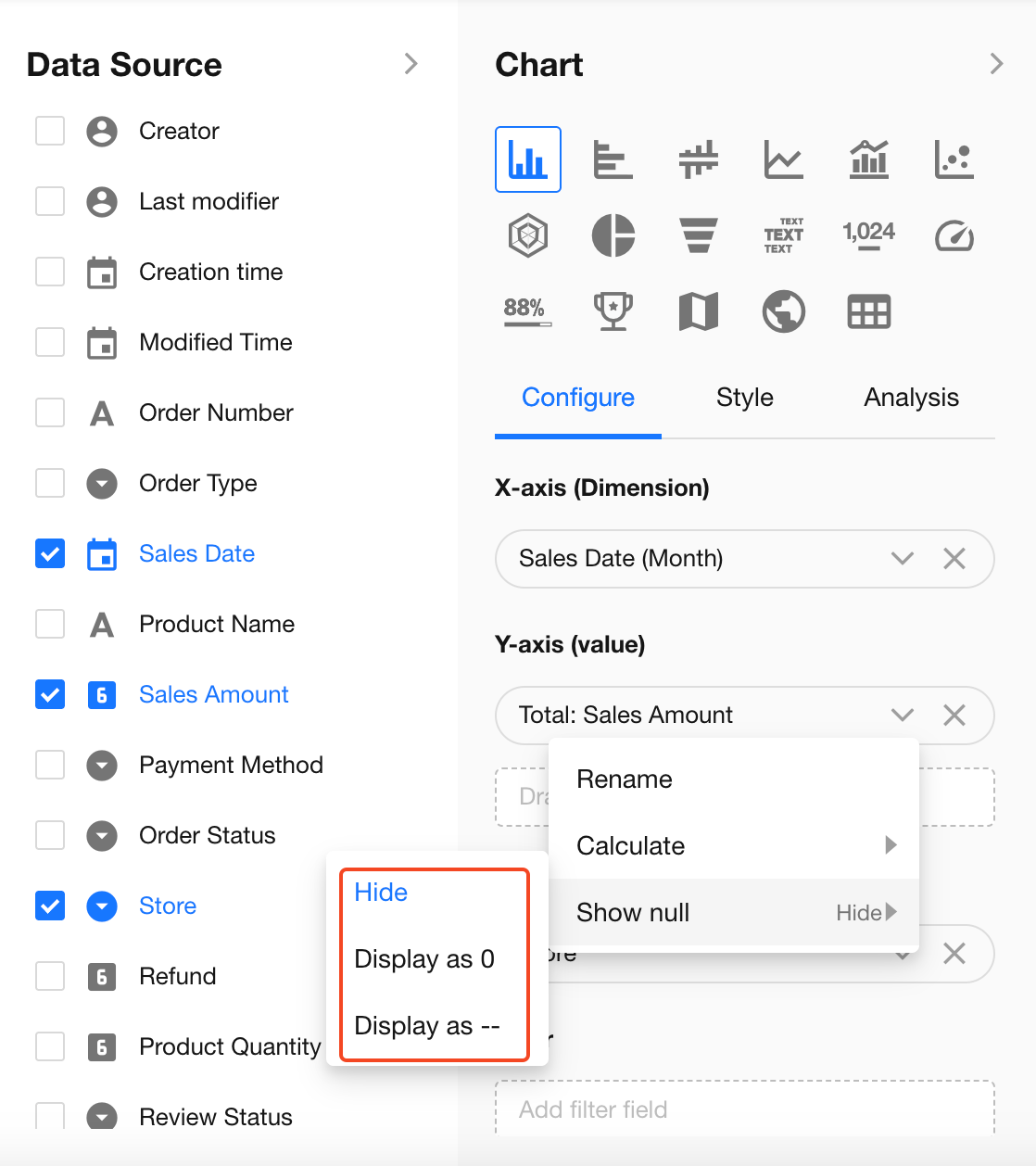
4.2 Metric (Y-axis)
The Y-axis defines how data is calculated.
Numeric fields: Support aggregation functions such as sum, max, min, average, count, and distinct count.
Non-numeric fields: Support only count (total records) and distinct count.
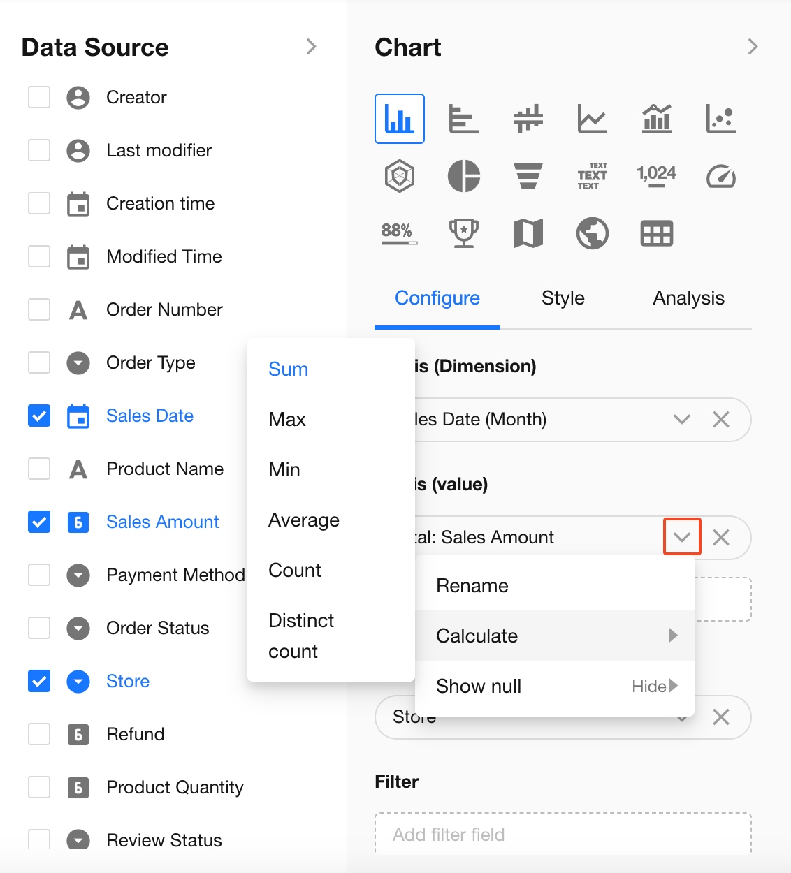
When the Y-axis result is empty, you can define how null values are displayed: Hide, Show as 0, or Show as "-".
4.3 Grouping
Use grouping to compare data across subcategories within the same dimension.
-
Purpose: Split X-axis data into subgroups for comparison
-
Example:
Set X-axis to “Sales Date” (grouped by month) and grouping to “Salesperson” to compare performance across different months.
5. Configure Chart Style
Under the Style settings, you can customize how the chart is displayed to better match your business needs and improve readability.
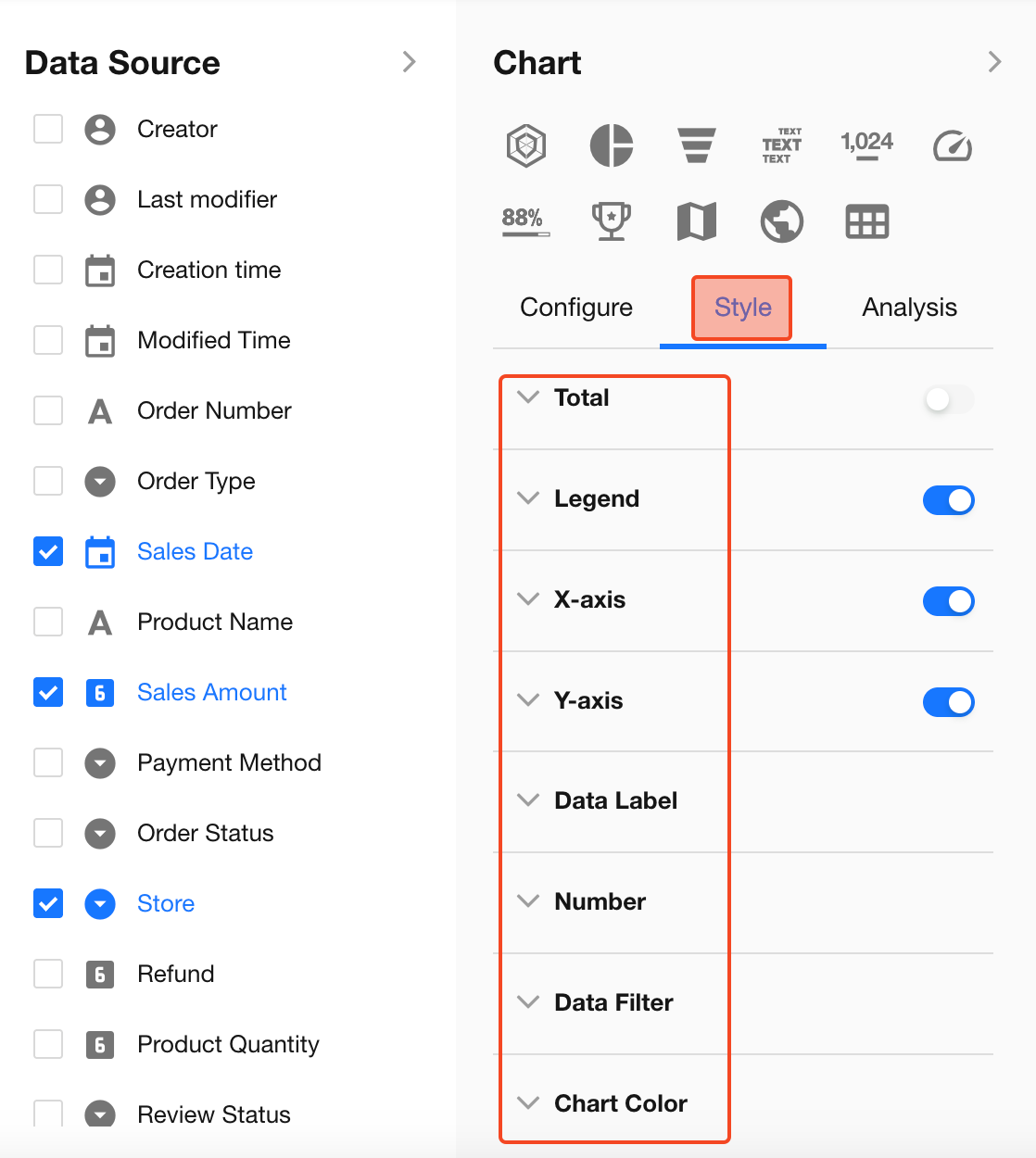
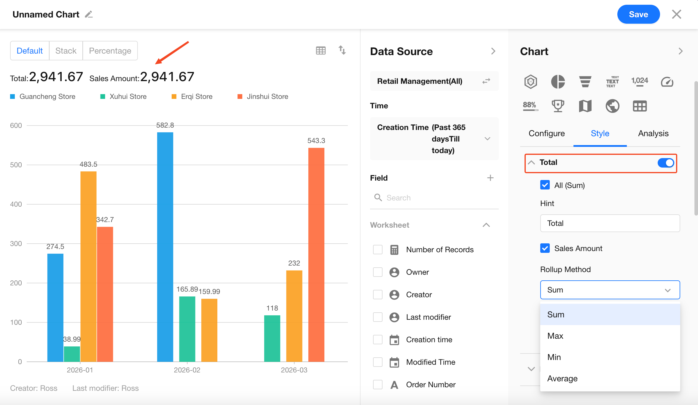
5.1 Total
Controls whether a summary overview is displayed above the chart.
- Toggle: When enabled, a total is shown at the top of the chart
- Total (Sum): Calculates the sum of all Y-axis metrics (optional)
- Y-axis Metric Aggregation: Supports secondary aggregation methods such as sum, average, max, and min
- Label: You can customize the display label (e.g., change “Total” to “Total Order Amount”)
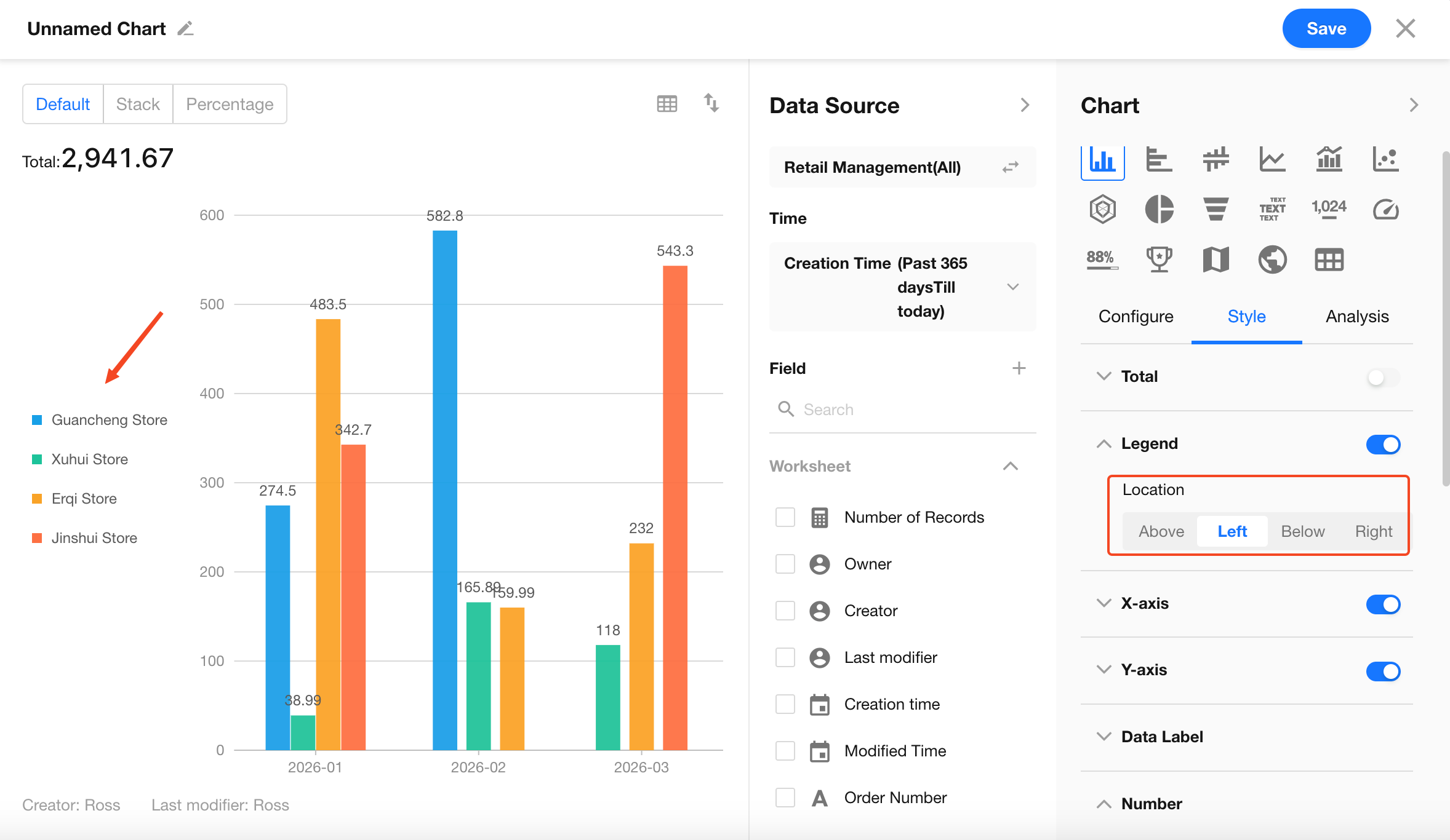
5.2 Legend
The legend is used to distinguish multiple data series. Its appearance varies by chart type:
-
Category indicator:
- In column and pie charts, legends correspond to color blocks
- In line charts, legends correspond to different line styles
-
Position: Can be placed on any side of the chart. For long category names, placing it on the left or right is recommended
-
Interaction: Users can click legend items to dynamically show or hide specific data series
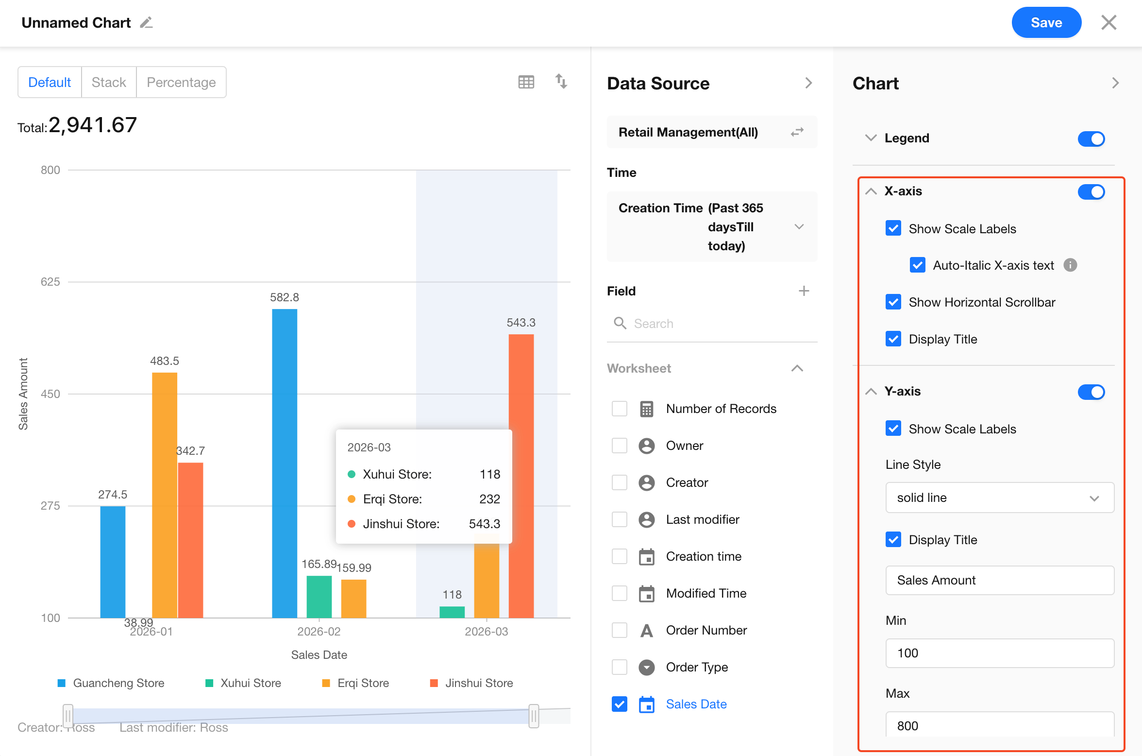
5.3 X-axis and Y-axis
Optimize the display of axis labels and lines. Key settings include:
- Show/hide data labels
- Show/hide axis titles
- Auto-rotate X-axis labels when text is too long
- Enable/disable X-axis scrollbar
- Y-axis line style (solid, dashed)
- Set minimum and maximum values for the Y-axis
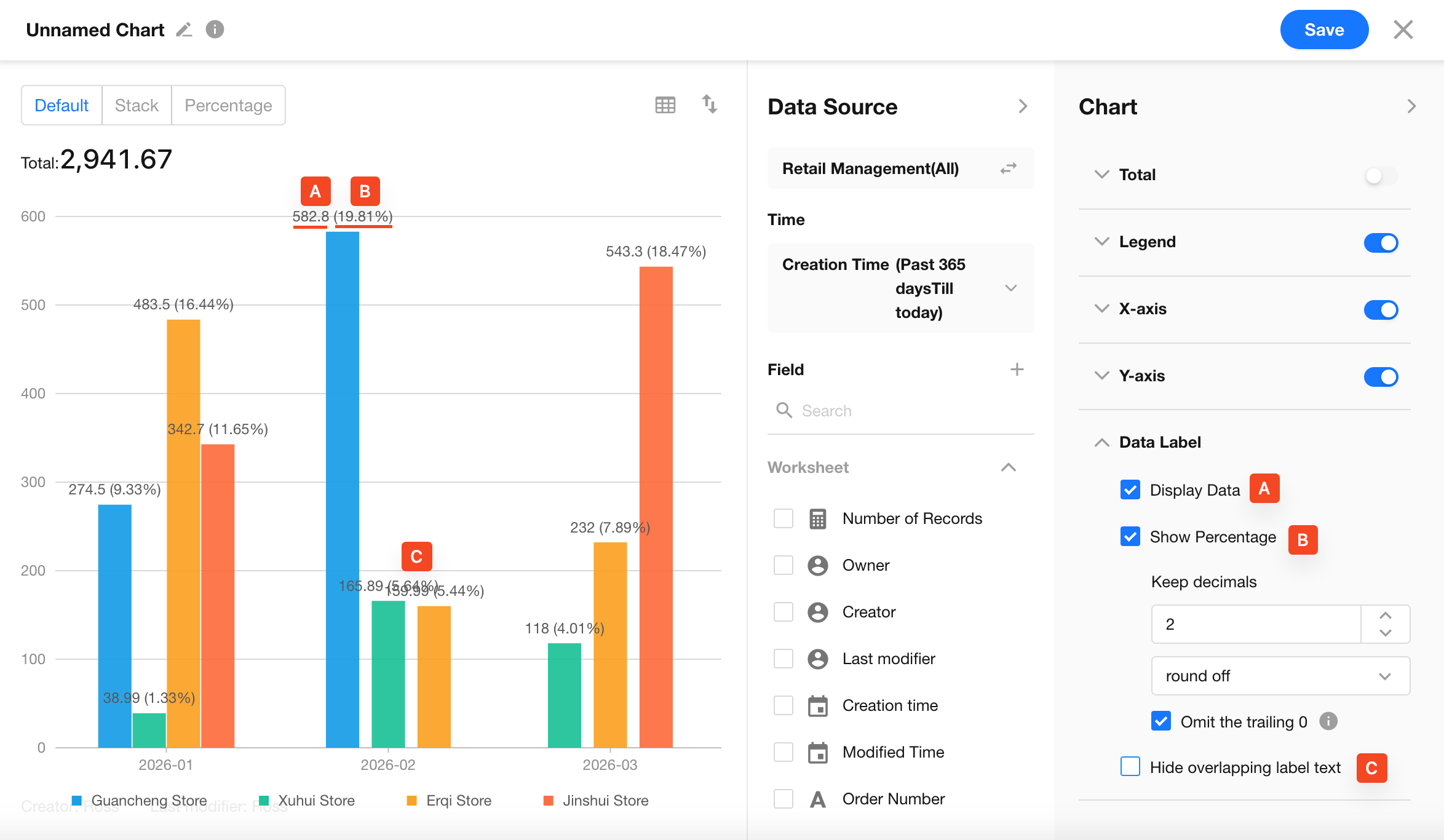
5.4 Data Labels
Data labels display values directly on chart elements (e.g., bars, points, or slices), making it easier to read exact values.
Key settings:
-
Show values: Display metric values on or above chart elements
Data labels can be enabled or disabled independently for the web and mobile apps.
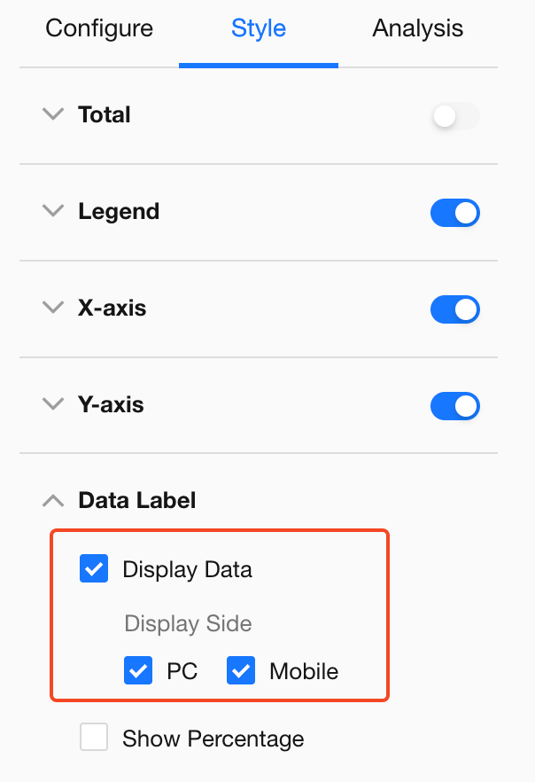
-
Show percentage: Display each item’s proportion of the total
- Commonly used in stacked column charts and pie charts
-
Decimal precision: Customize the number of decimal places and rounding rules
- Option to remove trailing zeros (e.g., display 12.00 as 12)
-
Hide overlapping labels: Automatically hide labels when the chart is too dense
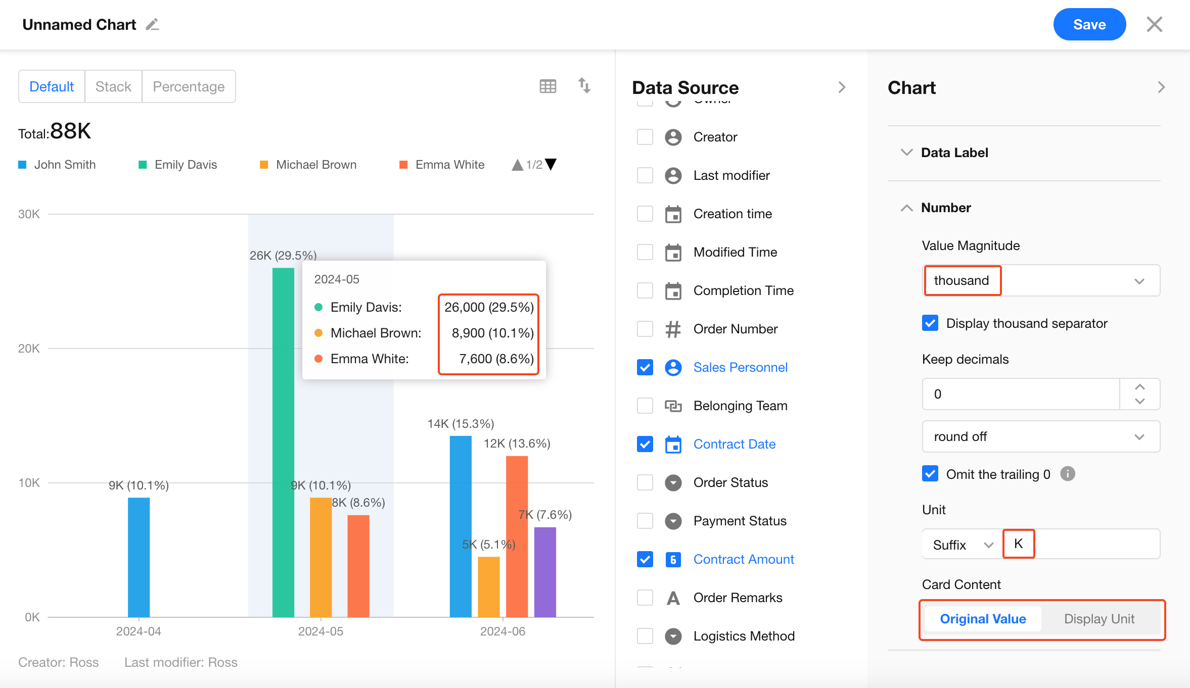
5.5 Values (Data Formatting)
Value settings directly impact how easily users can read chart data.
-
Number scale: Auto, thousand, ten thousand, million, etc.
- If values display as 0, the scale may be too large
-
Thousands separator: Improves readability (e.g., 1,234,567)
-
Decimal and rounding: Customize precision and rounding methods
- Supports standard rounding, round up, and truncate
-
Unit settings: Configure prefixes (e.g., $, ¥) or suffixes (e.g., %)
-
Card content: Values in legend cards can be displayed as raw values or formatted with scale and units
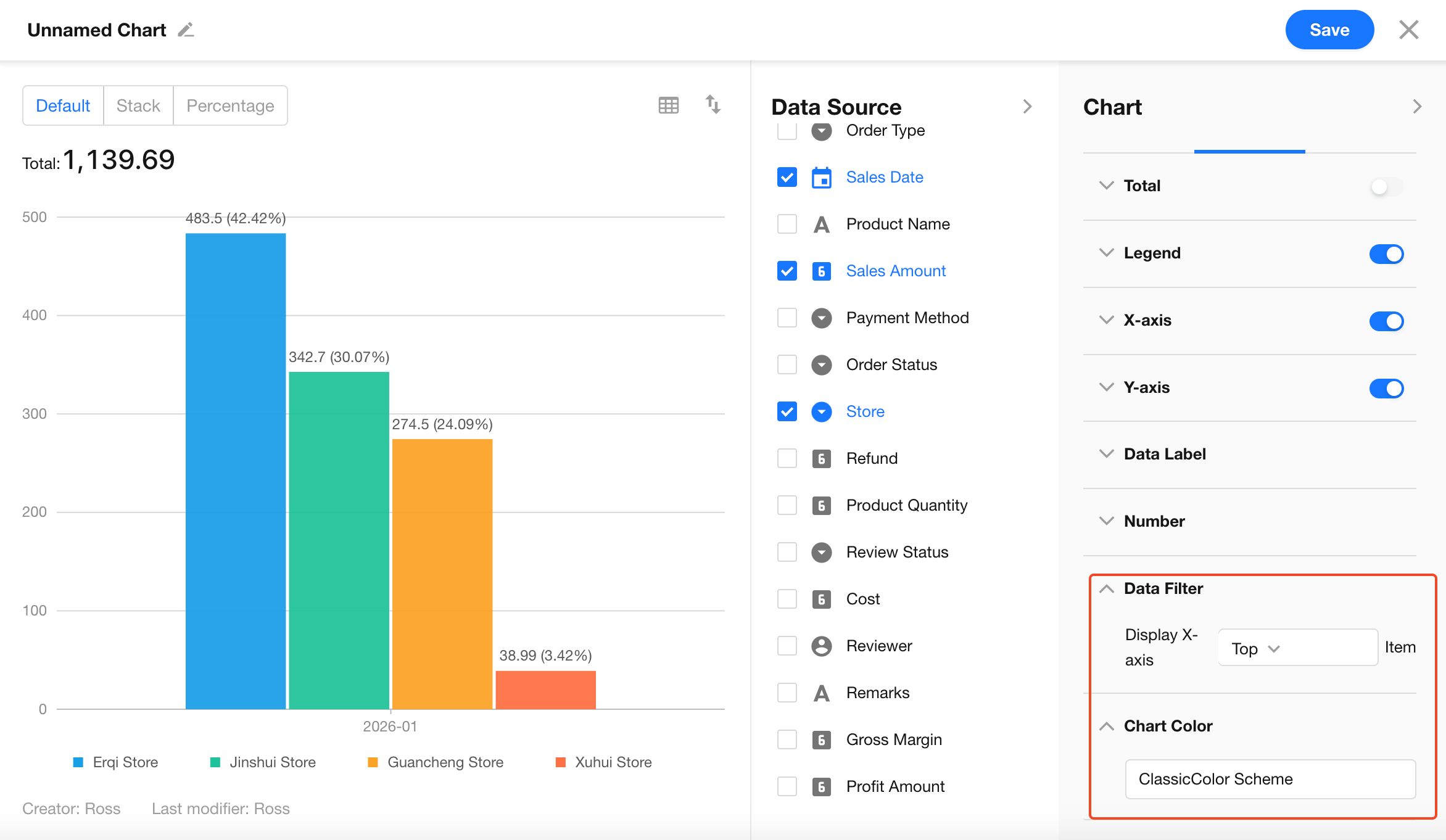
5.6 Data Filtering and Colors
-
Top N filtering: Limit the chart to the top or bottom N items on the X-axis
- Example: Identify “Top Sales Performer This Month” or “Department with Fewest To-do Items”
-
Color themes: Built-in themes such as classic and business styles
6. Analytical Features
Under the Analysis tab, you can configure drill-down interactions and reference lines to explore data in more detail.
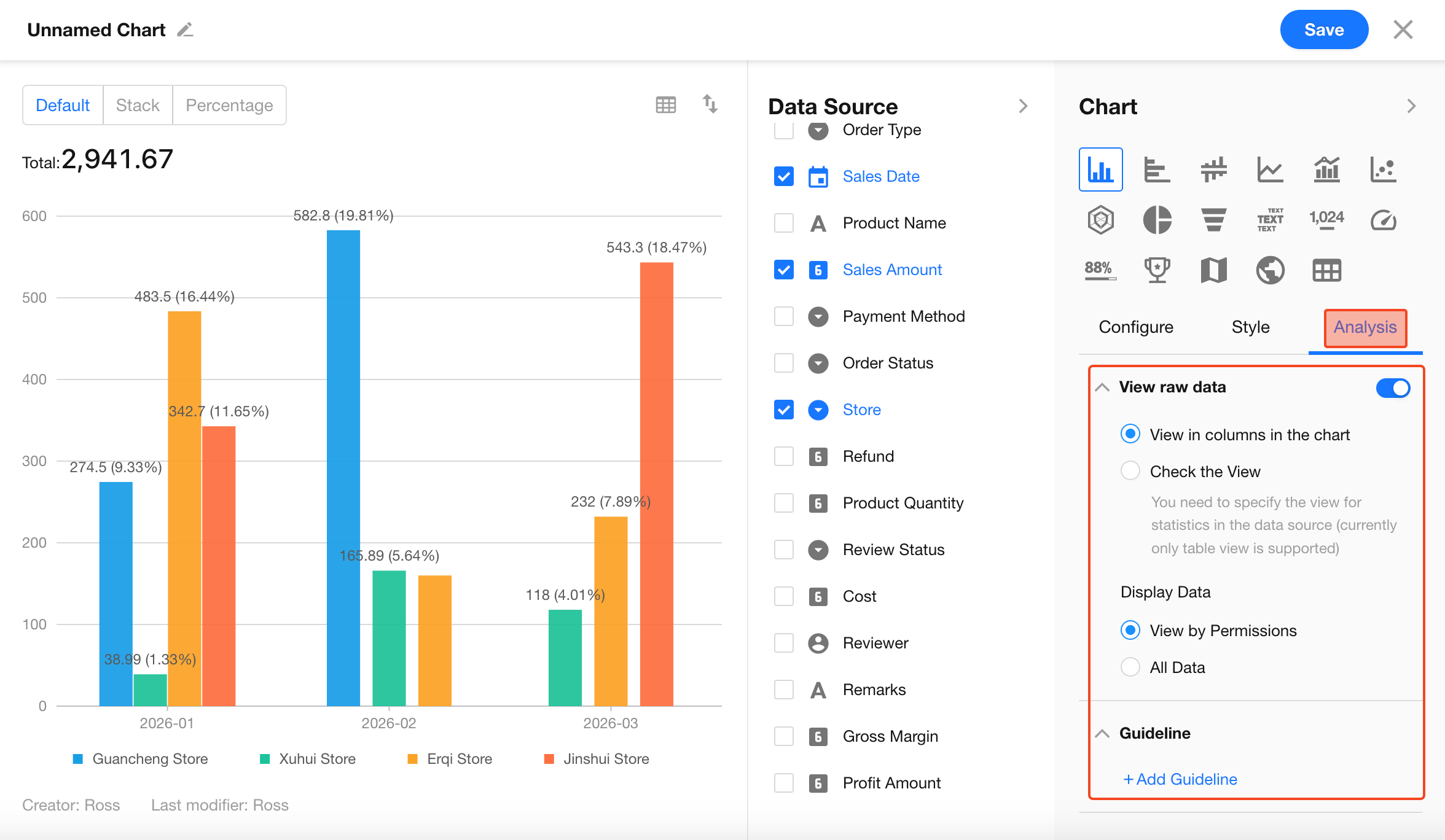
6.1 View Raw Data
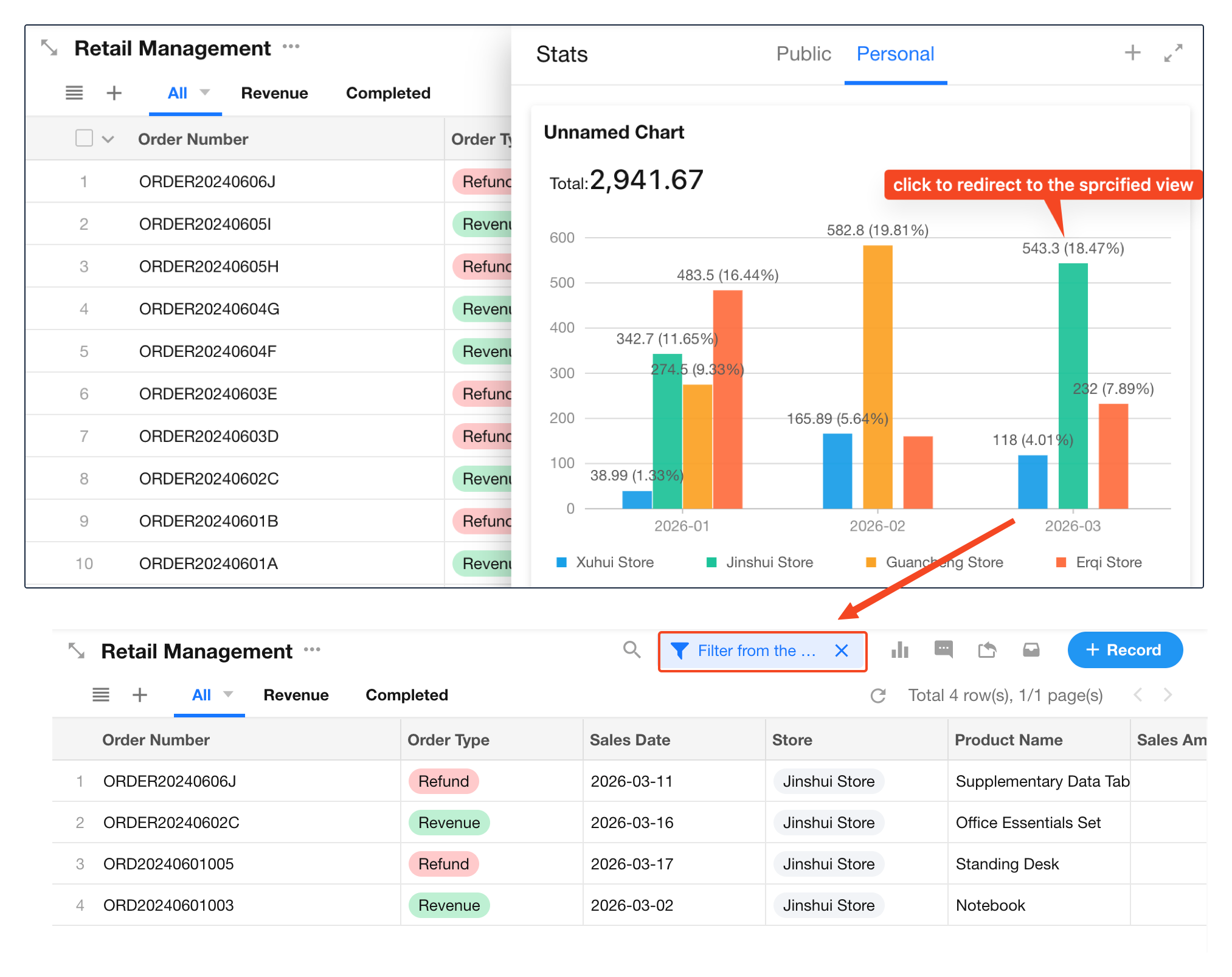
When enabled, users can click a chart element (e.g., a bar or slice) to view the underlying records.
How to view:
After saving the chart, click a chart element in view mode to access raw data.
-
View in panel:
Displays raw data in a table beside the chart without leaving the current page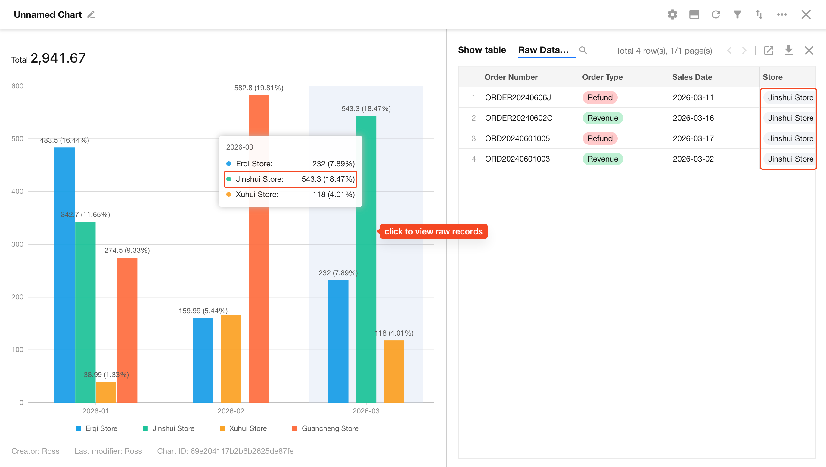
-
Open in view:
Redirects to a predefined worksheet viewNote: This requires selecting a specific view in the Data Source step
Data scope:
- Based on permissions: Users can only view records they have access to
- All data: Users can view all underlying records regardless of permissions
Use with caution; recommended only for non-sensitive data
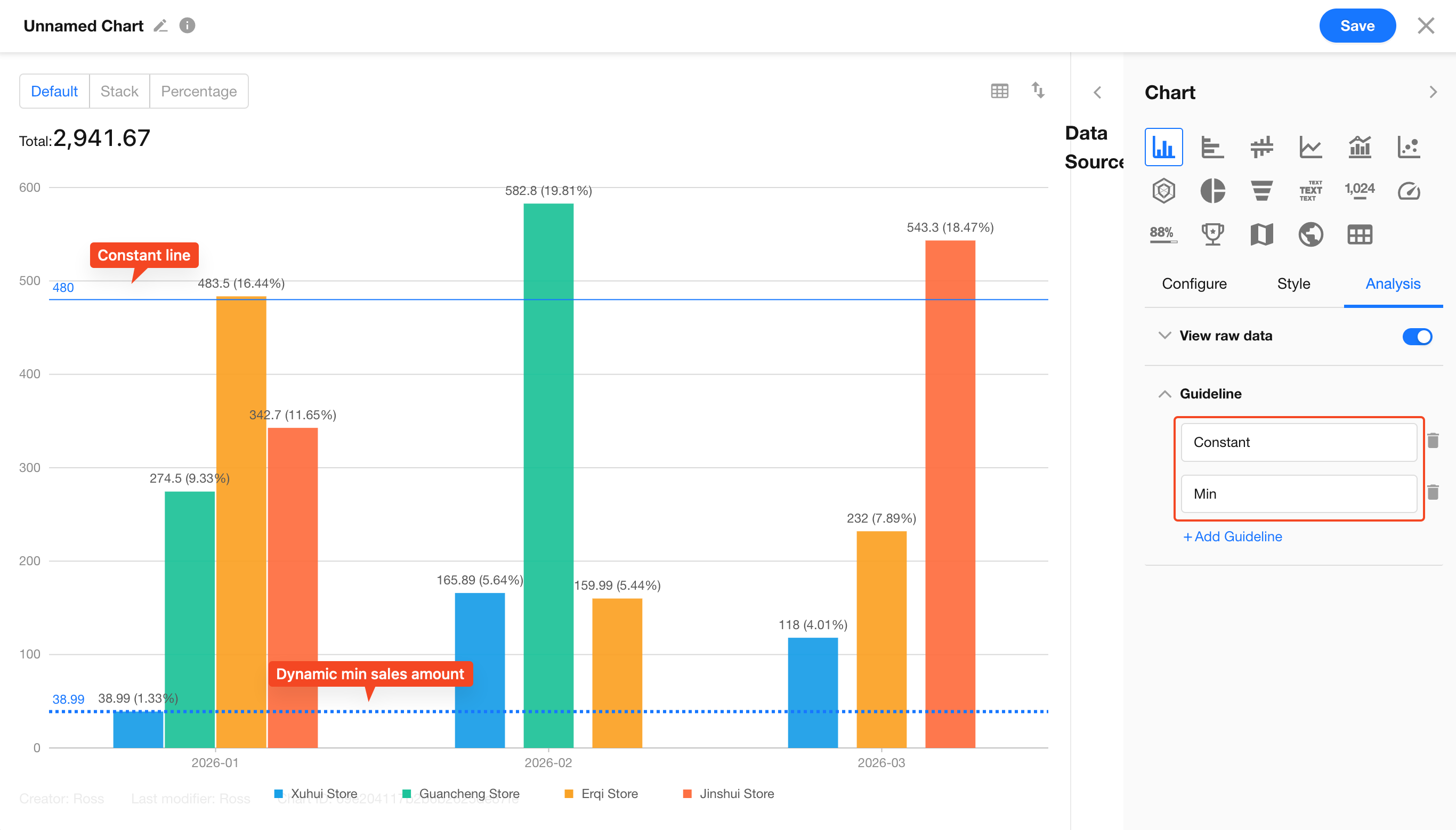
6.2 Reference Lines
Reference lines help users quickly assess whether values meet targets, identify trends, or detect anomalies.
Types of reference lines:
-
Constant line: A fixed value (e.g., sales target of 1,000,000)
-
Calculated lines: Automatically generated based on chart data
-
Min/Max lines: Highlight extreme values
-
Average line: Show the average value
-
Median line: Show the middle value to reduce the impact of outliers
-
Percentile line: Custom percentile thresholds
-
Trend line: Automatically fits a trend line (commonly used in line or column charts)
Configuration options:
- Set name, color, and line style (solid, dotted, dashed) for each line
- Display either the line name or its value on the chart
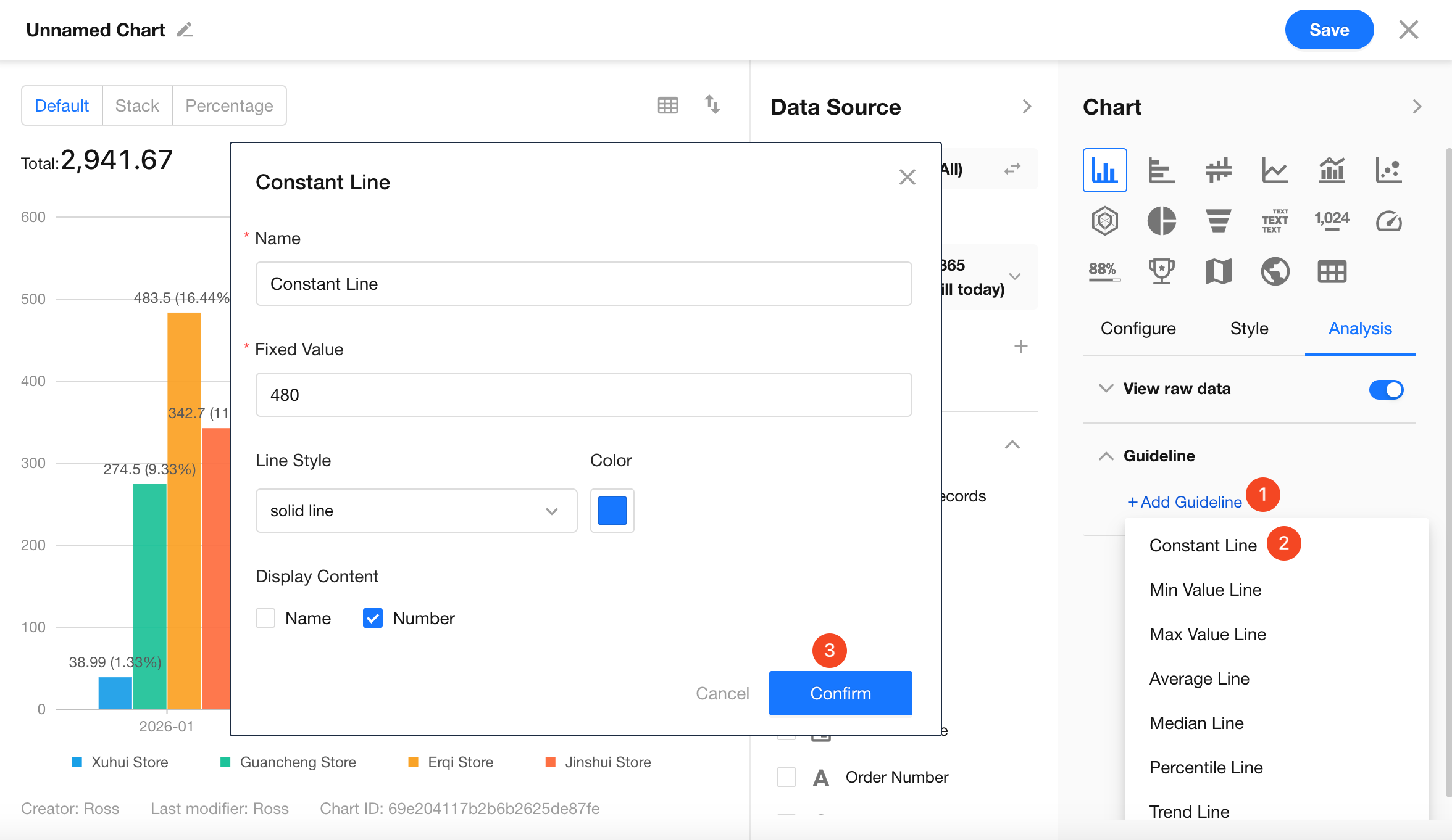
Example: You can enable multiple reference lines (e.g., a constant line at 6K and a minimum value line) to quickly identify which data points exceed targets or fall below expectations.
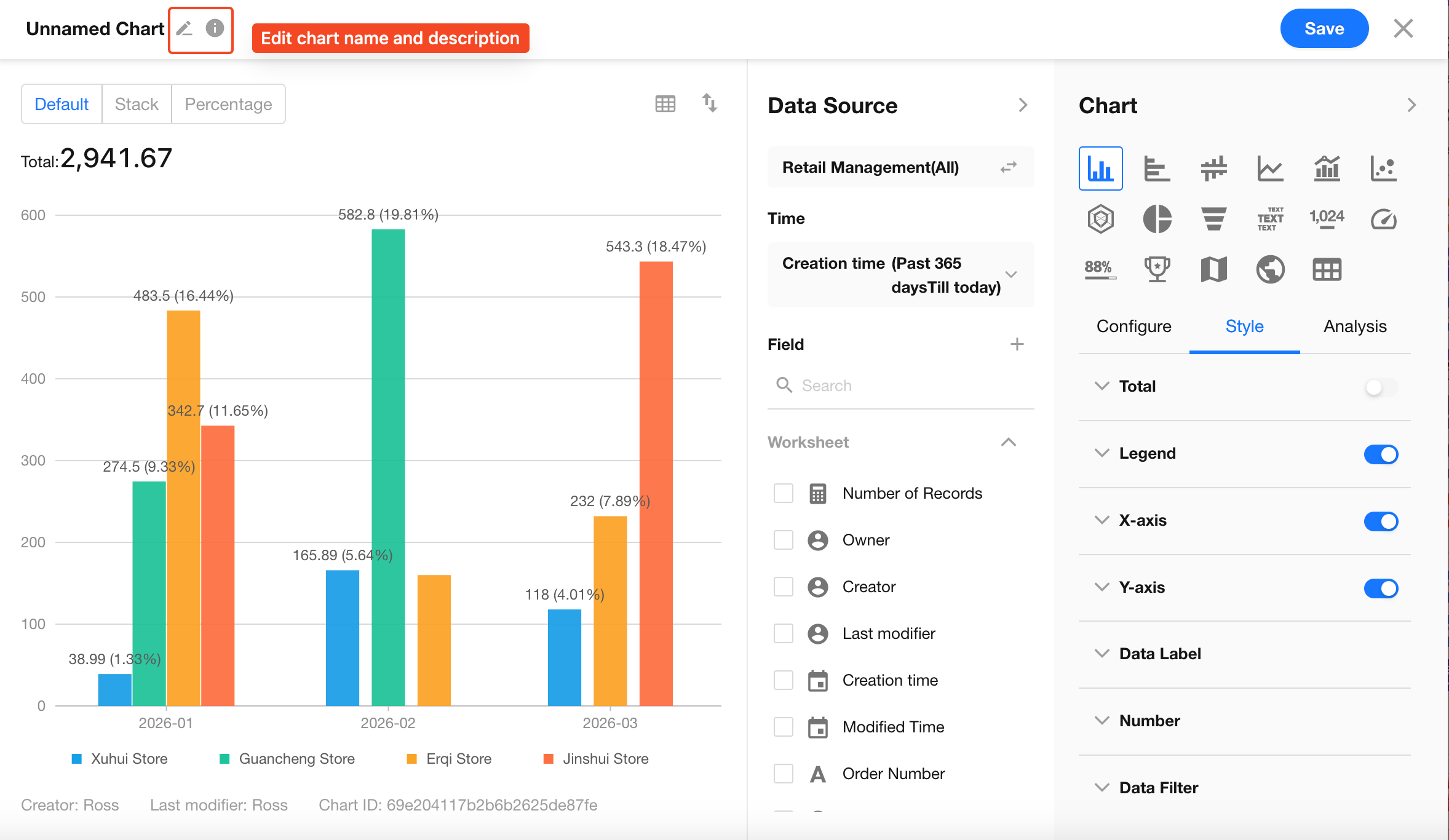
7. Set Name and Save the Chart
Click the edit button in the top-left corner of the chart to set the chart name and description, then click Save to complete the configuration.
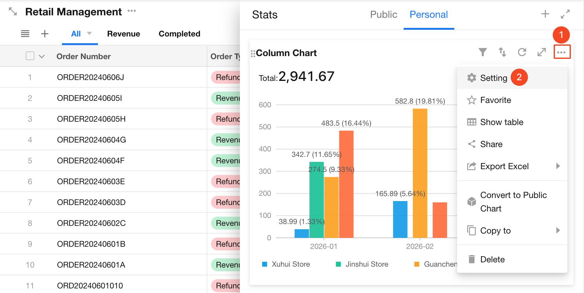
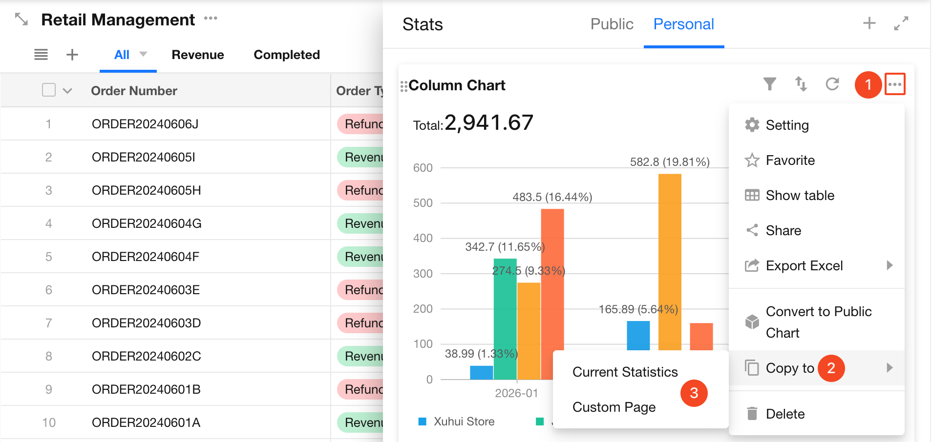
2. Chart Management
1. Modify Chart Configuration
Click the ... (More) button in the top-right corner of the chart, then select Setting to reconfigure it. The configuration process is the same as when creating a chart.
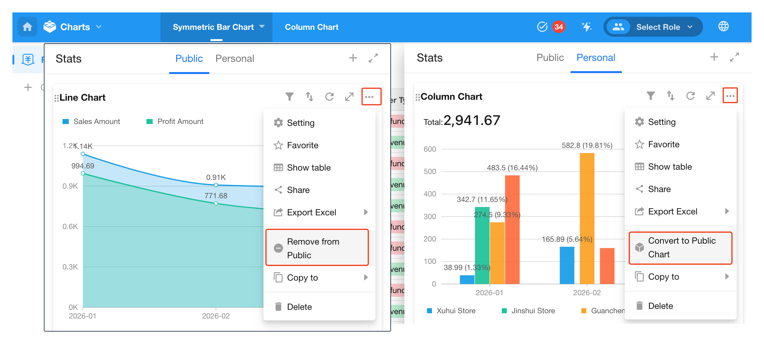
2. Convert Between Personal and Public Charts
You can convert a chart between personal and public in the chart’s More options.
-
Zoom in/out of the chart page
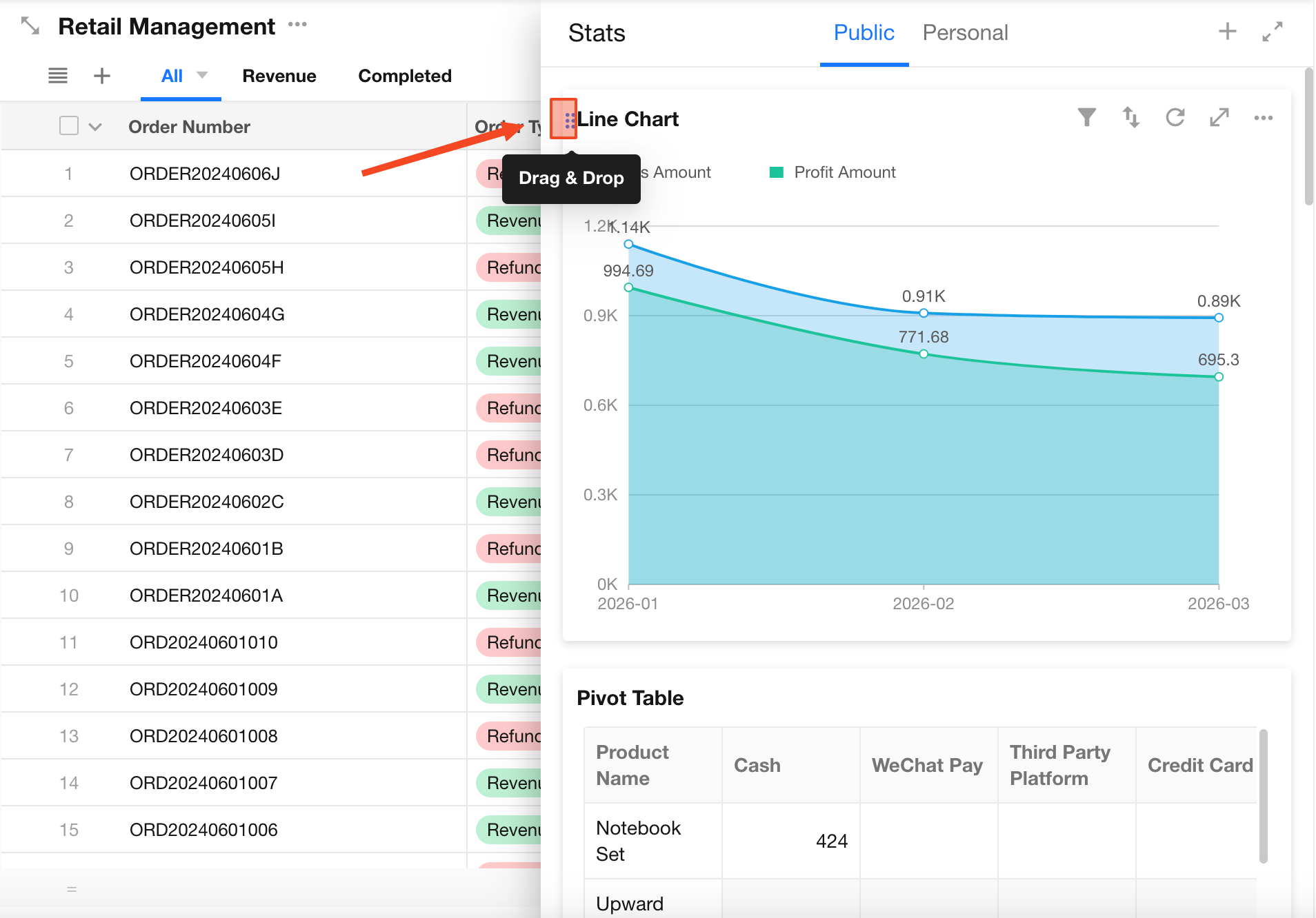
3. Reorder Charts
Application admins can adjust the order of charts. In the chart area, drag a chart using the handle in the top-left corner to reorder it.
This order applies to all application members.
4. Duplicate Charts
Application admins can duplicate charts via the More options. The duplicated chart can be placed in:
- The current worksheet’s chart section
- A custom page in any application within the organization where you are an application admin
5. Enable Chart Sharing
Application admins can enable chart sharing. Once enabled, other members can share charts externally via links or QR codes.
3. User Actions
When viewing charts, regular users can perform actions such as filtering, sorting, exporting, saving as images, and sharing.
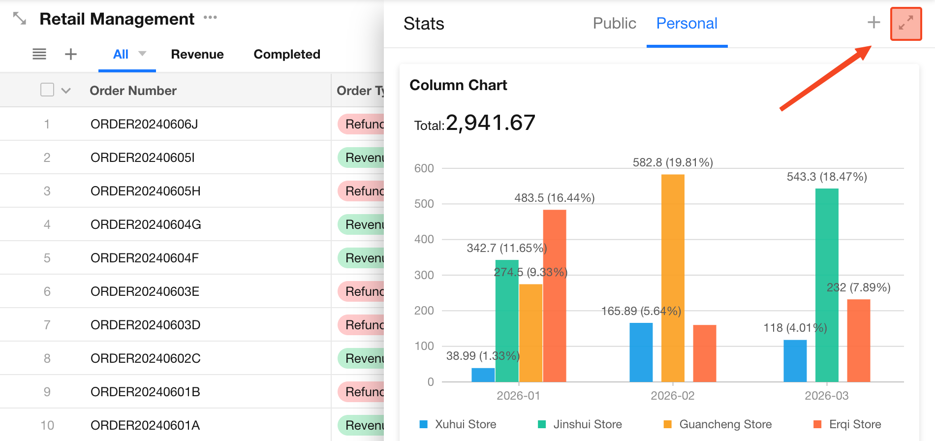
1. Expand Chart Area or Chart
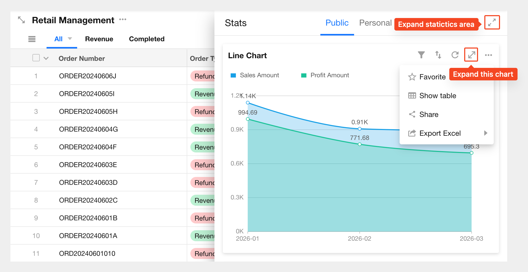
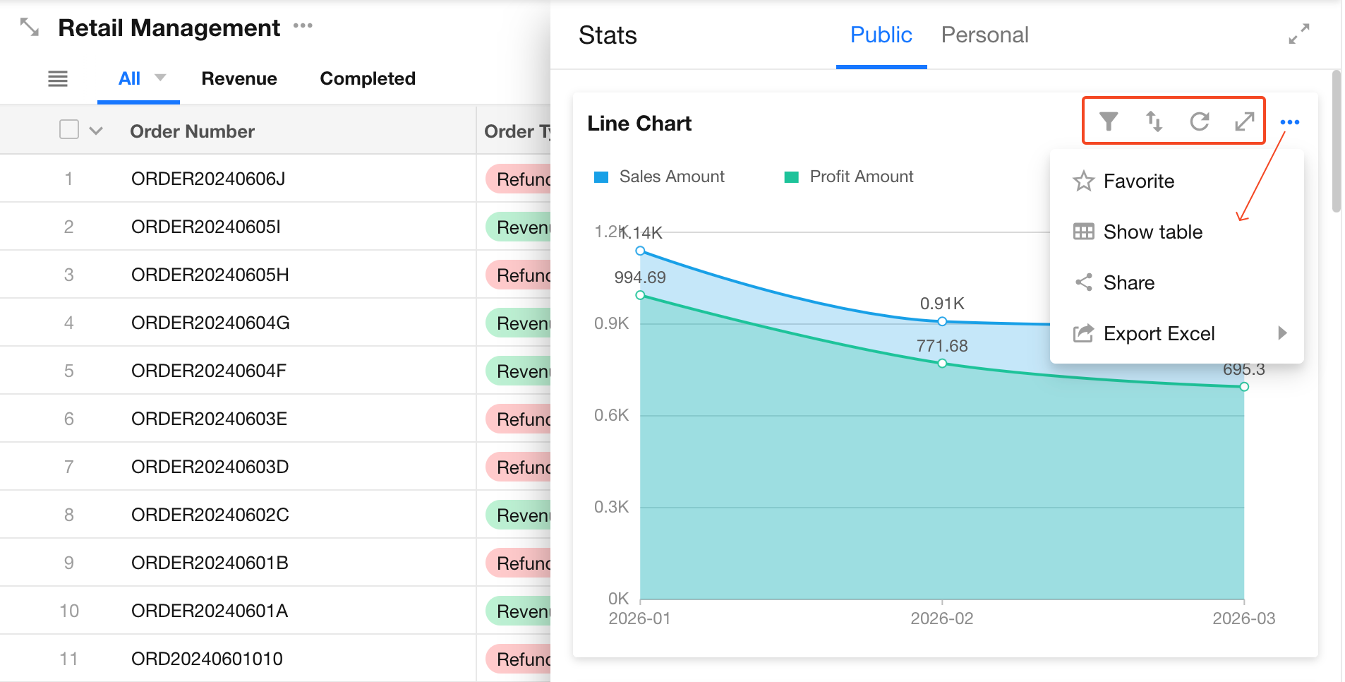
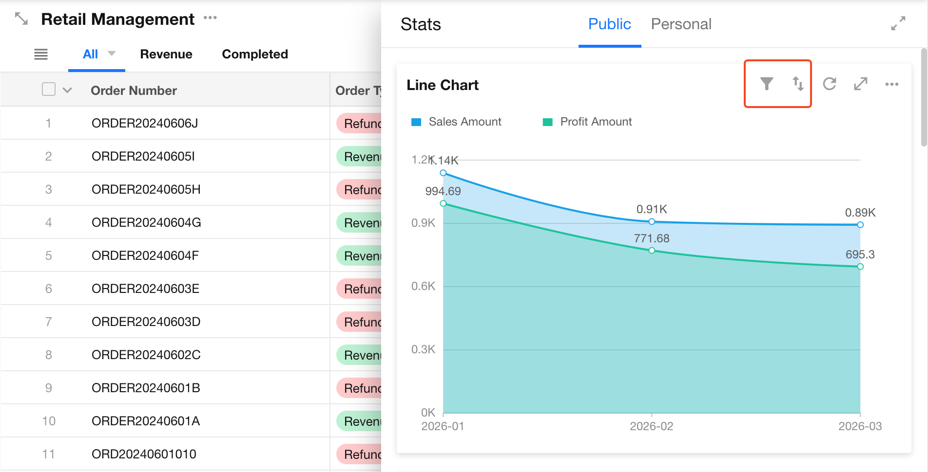
2. Filter and Sort Charts
Filter:
Users can apply additional filters based on the chart configuration set by the application admin. Filtered data will not exceed the original data scope.
Sort:
Sort data within a single chart.
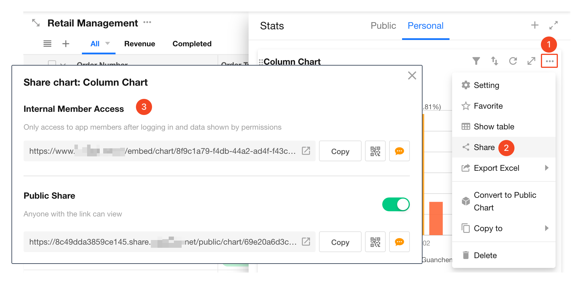
3. Share Charts
Charts can be shared externally. Recipients can view them via a link or QR code without logging in.
Chart sharing is disabled by default. Only application admins, developers, and operators can enable sharing. Once enabled, all application members can share charts externally.
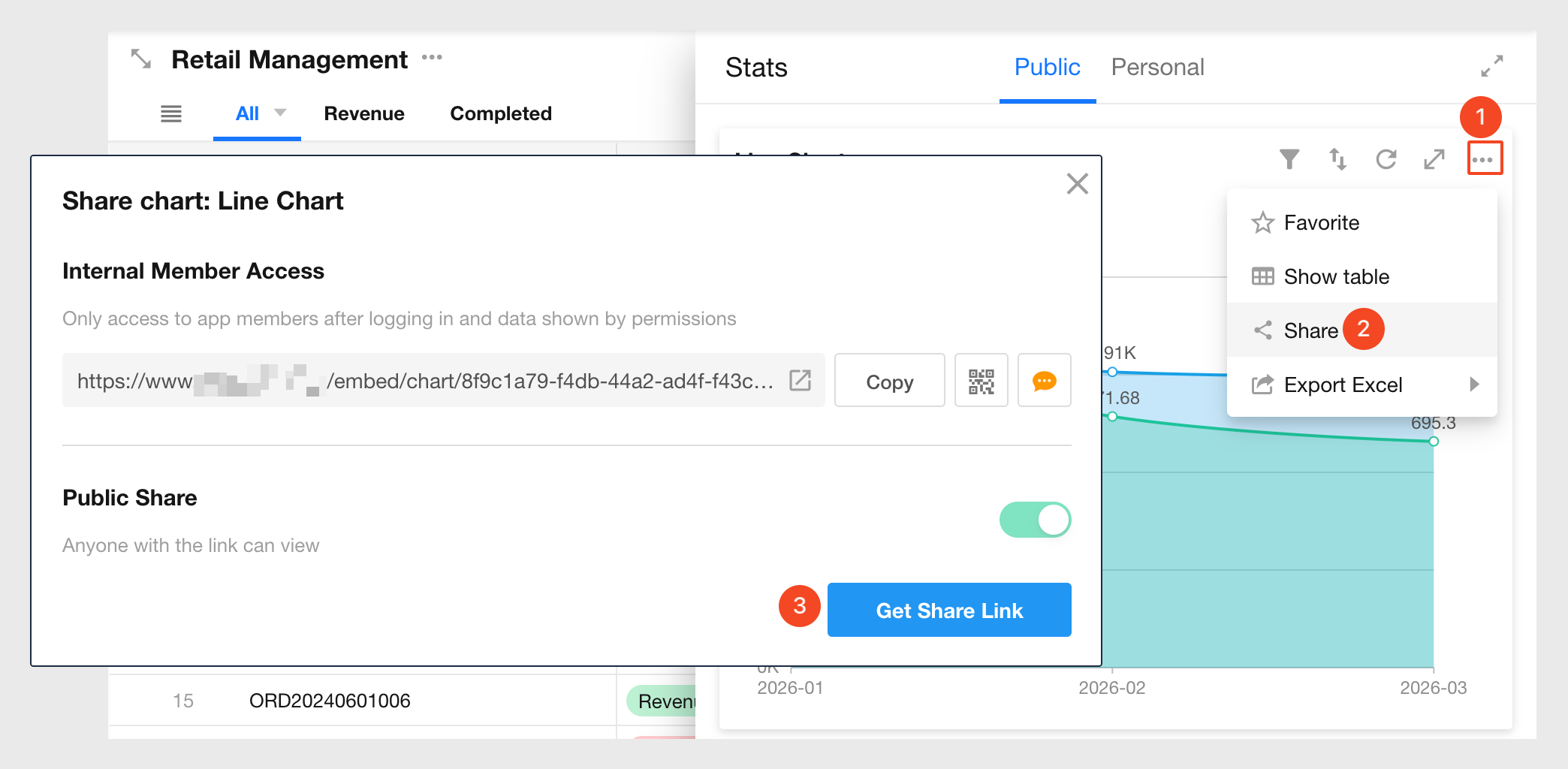
If the chart’s data source is set to Records with view permission only, the chart cannot be shared. The page will display: Unable to generate chart. No permission.
To enable sharing, change the data source to All records.
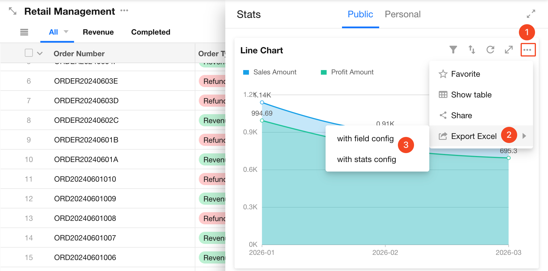
4. Export to Excel
Export chart data as an Excel file. The exported file name defaults to the chart name.
- Pivot tables are exported in their original format
- Other chart types export underlying data (not the visual chart). Each X–Y pair corresponds to one row in Excel
Export options:
- Export raw values
- Export with display units
Example:
If the value is 3000 and the display unit is “K” (shown as 3K in the chart):
- Export with units → “3K”
- Export raw value → “3000”
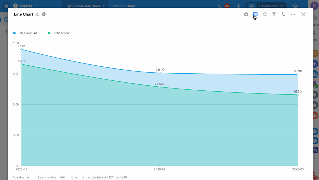
5. View Data in Table Format
Click the table icon in the top-right corner to display chart data in a table alongside the chart. You can choose vertical or horizontal layouts.
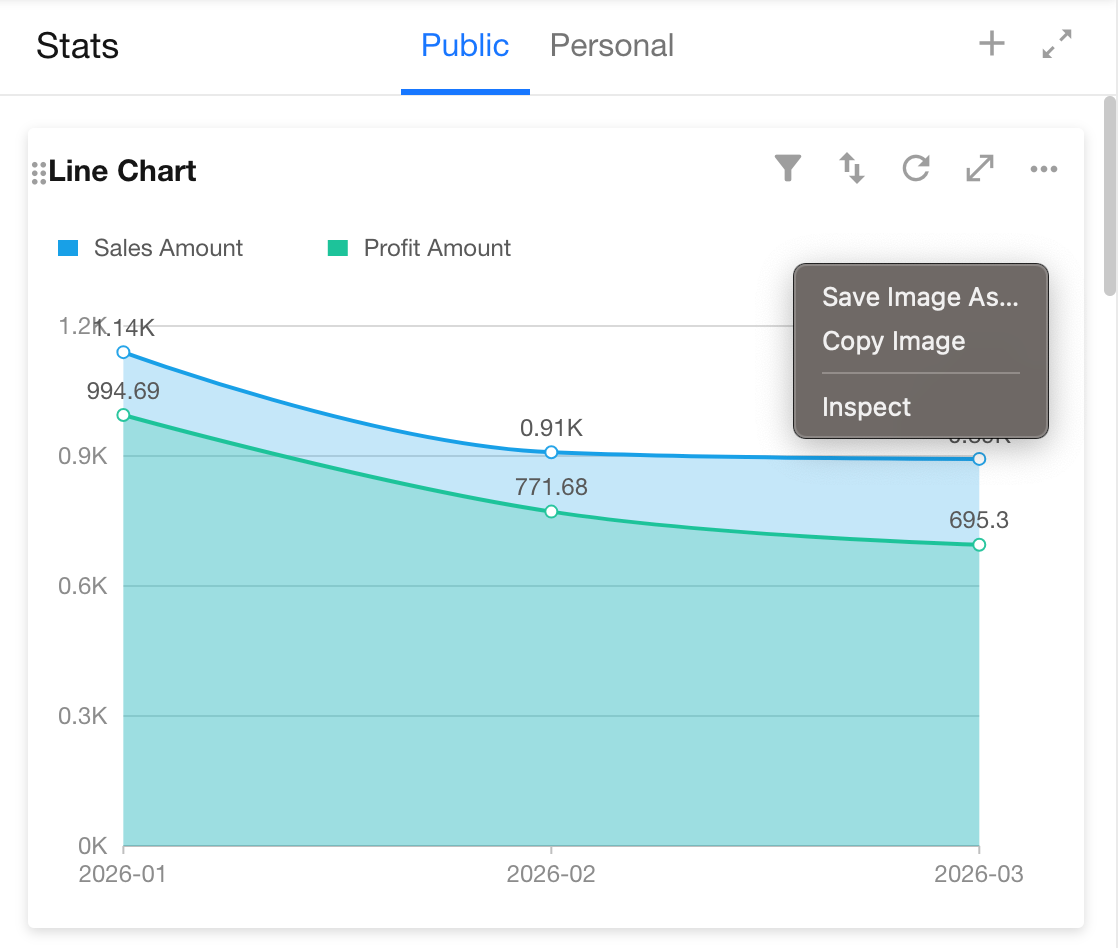
6. Save Chart as Image
Charts such as column or line charts can be saved as images using browser functionality. Right-click the chart and select Save as Image.
Was this document helpful?