Number Chart
A number chart presents a single numerical value (e.g., sum, average, maximum, or minimum) calculated from records that meet specific conditions. It is one of the most intuitive ways to represent key data points.
This article demonstrates how to create a number chart with a simple example.
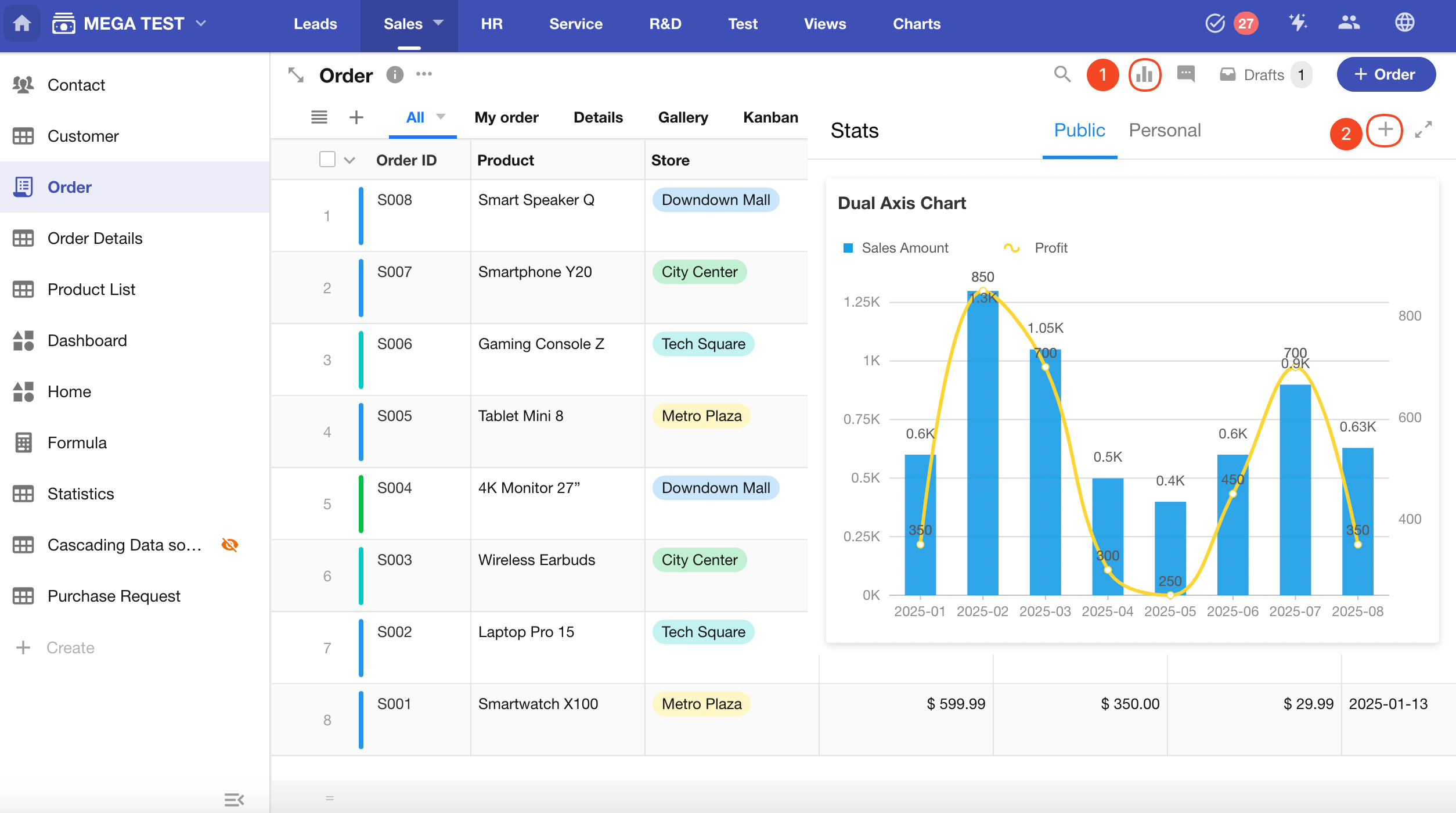
Example: Create a number chart in the Orders worksheet to display the number of new orders added this week
Data Range: Order records created this week
Filter: Creation Time equals This Week
Metric: Product Name, Number of Records
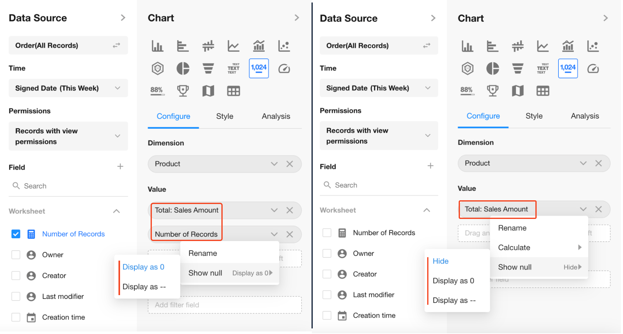
1. Create a New Chart
2. Select the Data Range
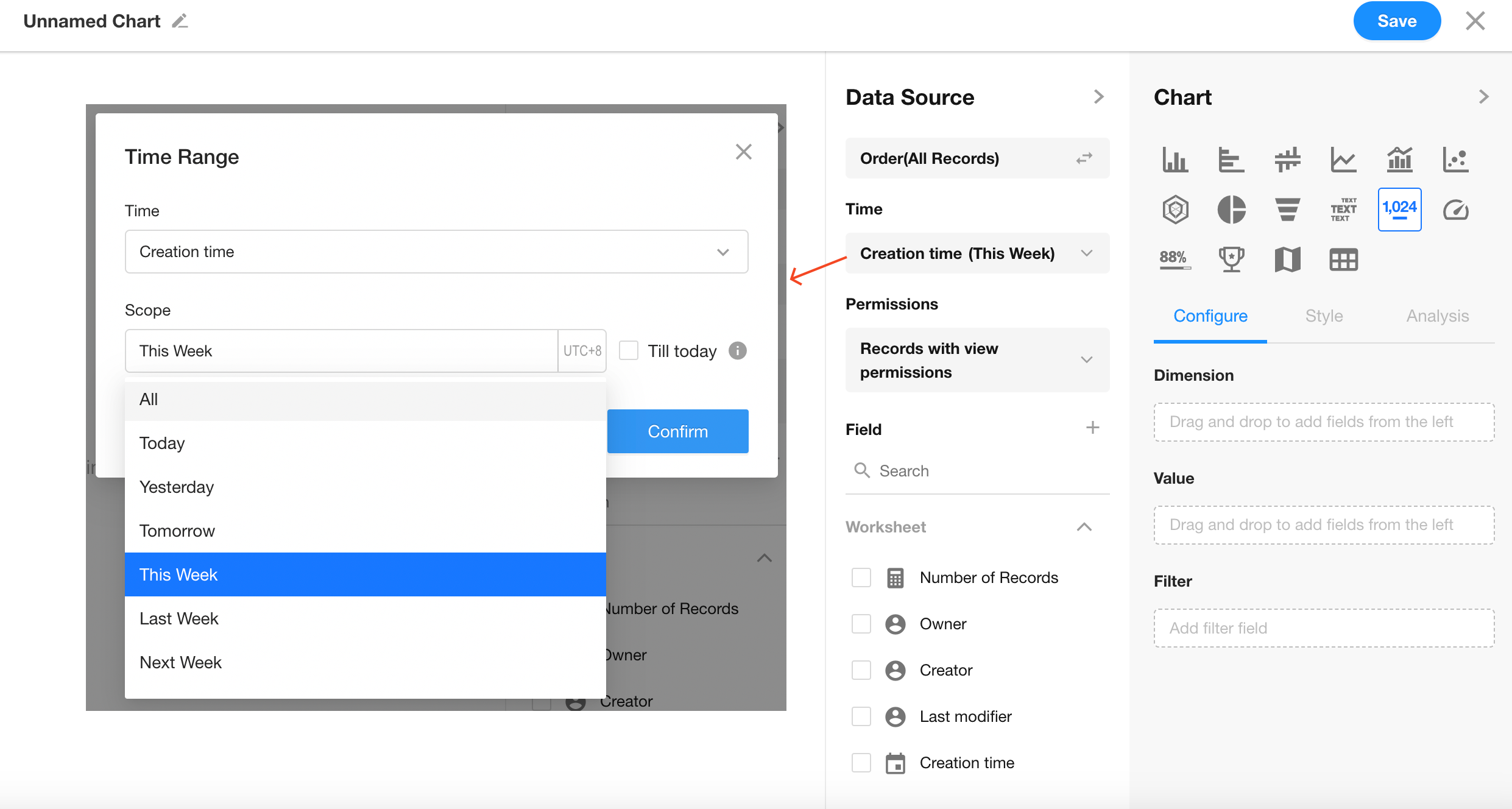
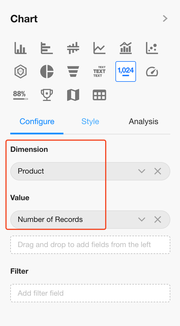
3. Choose Chart Type: Number Chart
Dimension: Product field
Value: Number of Records
You can configure multiple value fields. If a dimension is selected, only the first value field supports MoM/YoY comparison; additional fields do not.
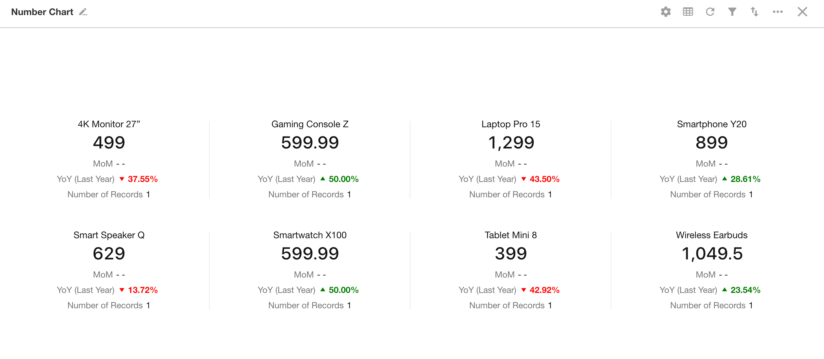
Note: For empty values, you can configure display styles.
- Single value: (Hide / 0 / --)
- Multiple values: (0 / --)
4. Style Settings
Style varies depending on whether a dimension field is selected:
-
With dimension: Option to display Total
-
Without dimension: Option to set icon and background color for the value display
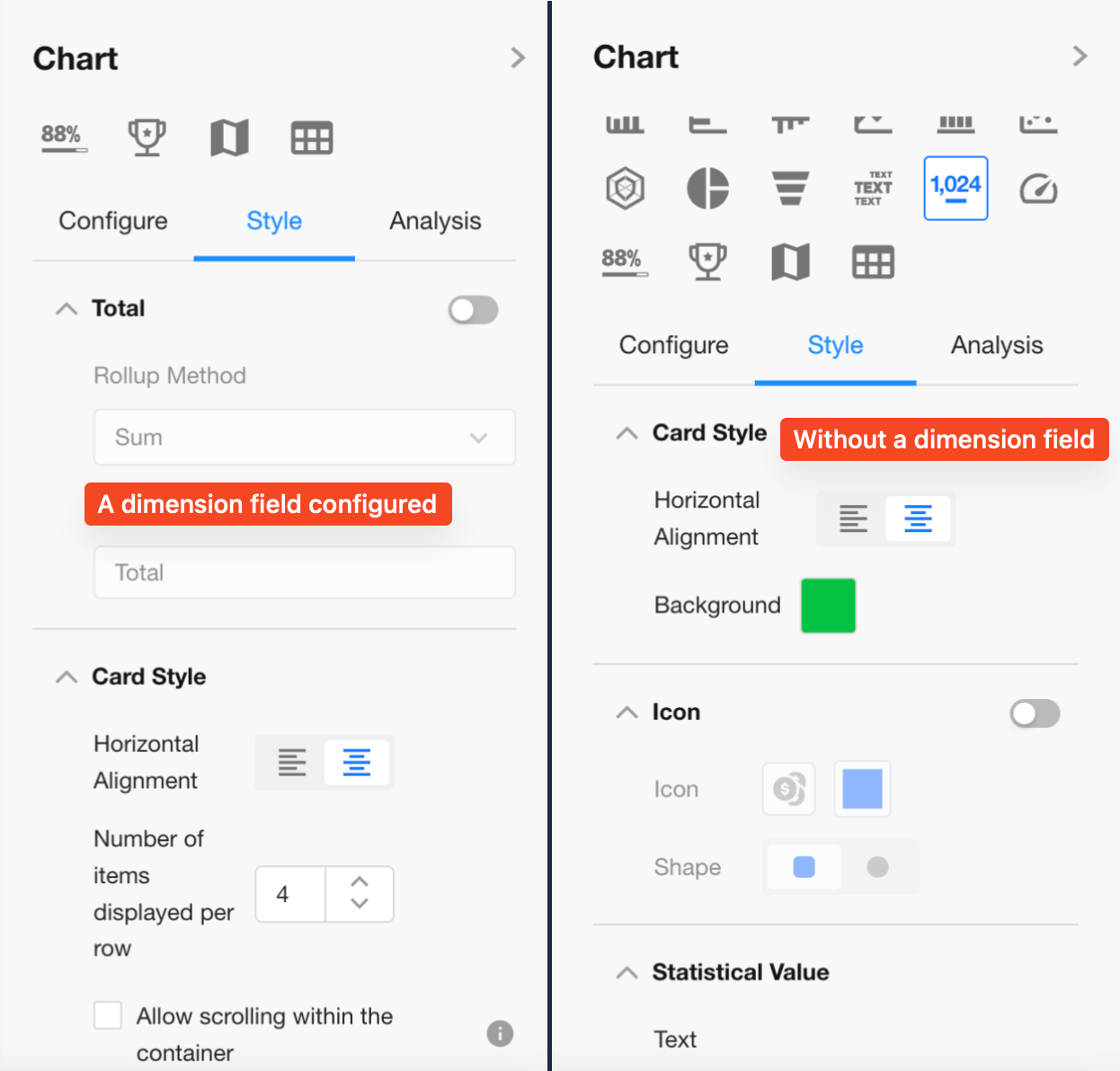
Card Style
-
Set horizontal alignment for value icons: Left-aligned or Center-aligned
-
Configure chart background: solid color or background image
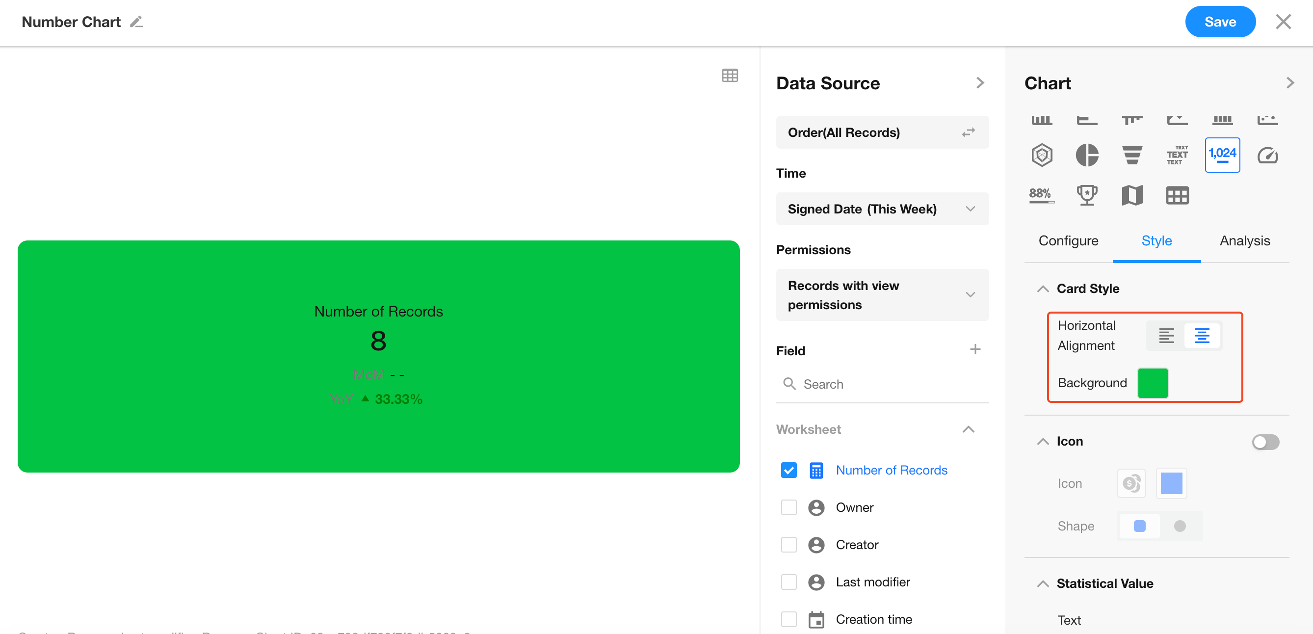
Icons
When no dimension is selected and only one value is displayed, you can enable or disable icons, and customize icon style, color, and shape.
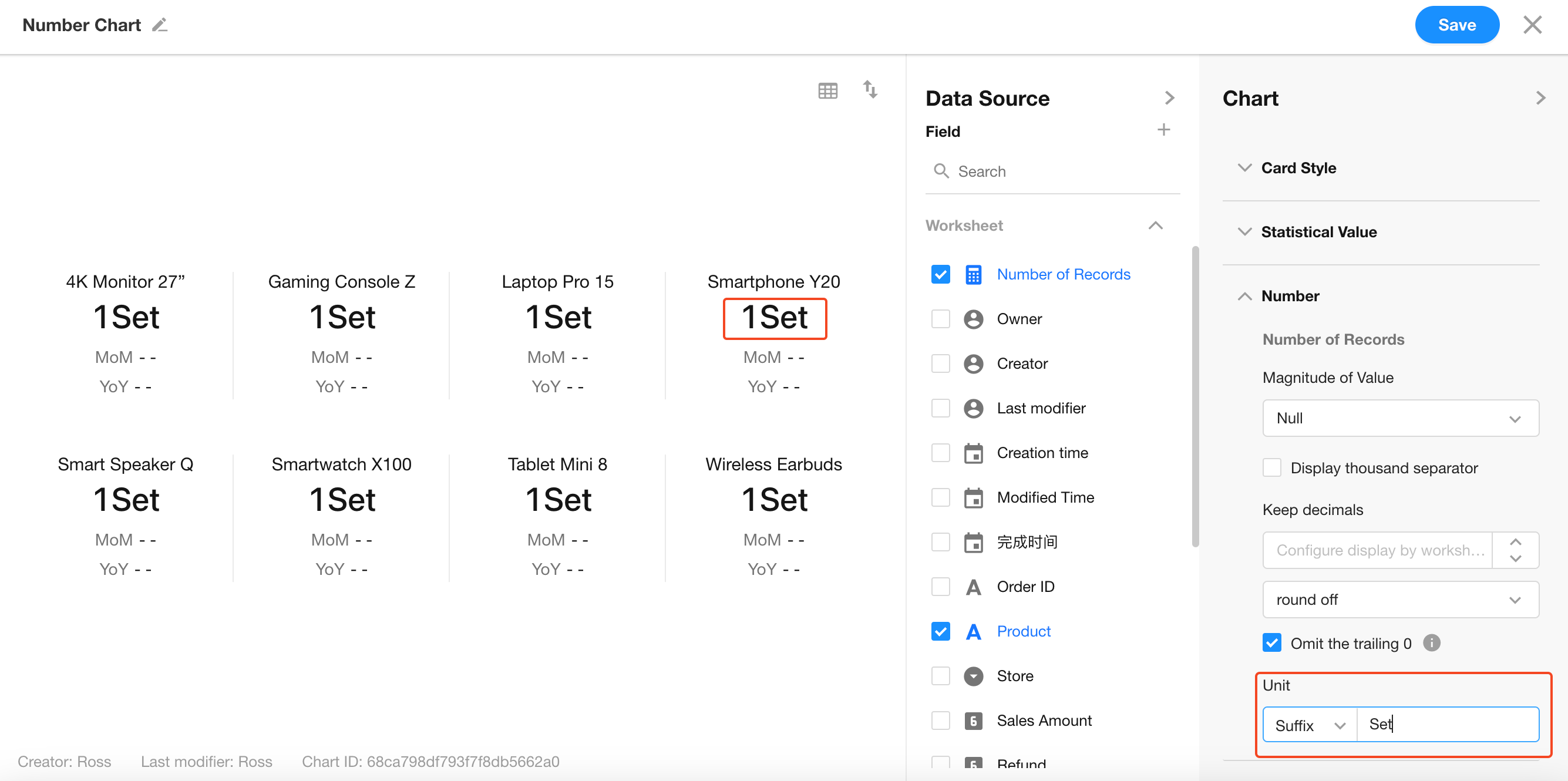
Metric Settings
Adjust the size of numbers and icons, and configure the number color.
Value Display
Set suffixes and decimal places. By default, no suffix is applied.
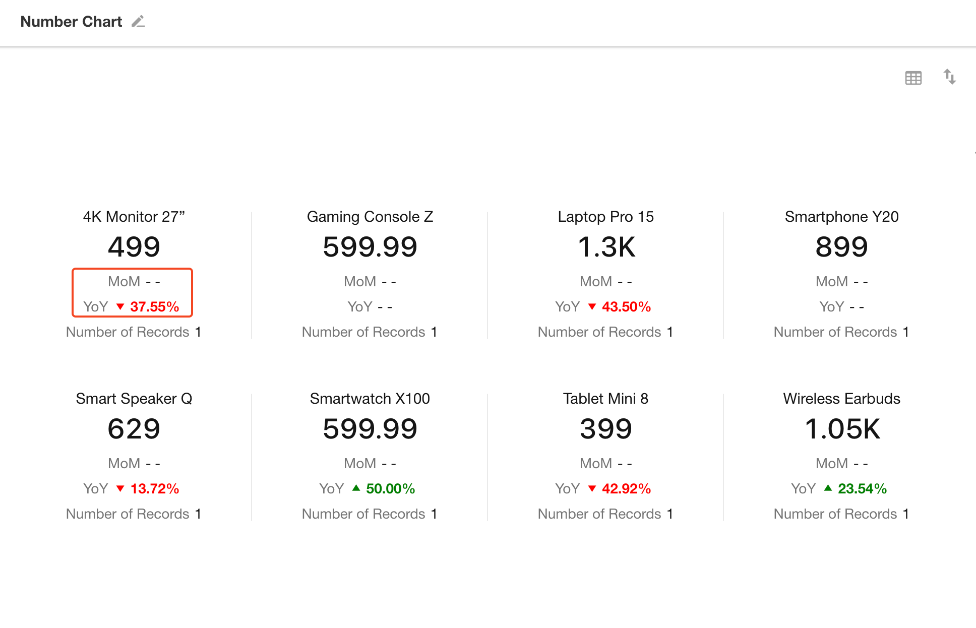
5. Data Comparison: MoM / YoY
MoM (Month-over-Month)
Compares the current period to the immediately previous period, useful for observing short-term changes.
Example:
February sales = ¥1,000,000
March sales = ¥1,300,000
MoM Growth = (130 - 100) / 100 × 100% = 30%
YoY (Year-over-Year)
Compares the current period to the same period in the previous year, ideal for identifying long-term trends.
Example:
Feb 2024 sales = ¥1,000,000
Feb 2025 sales = ¥1,200,000
YoY Growth = (120 - 100) / 100 × 100% = 20%
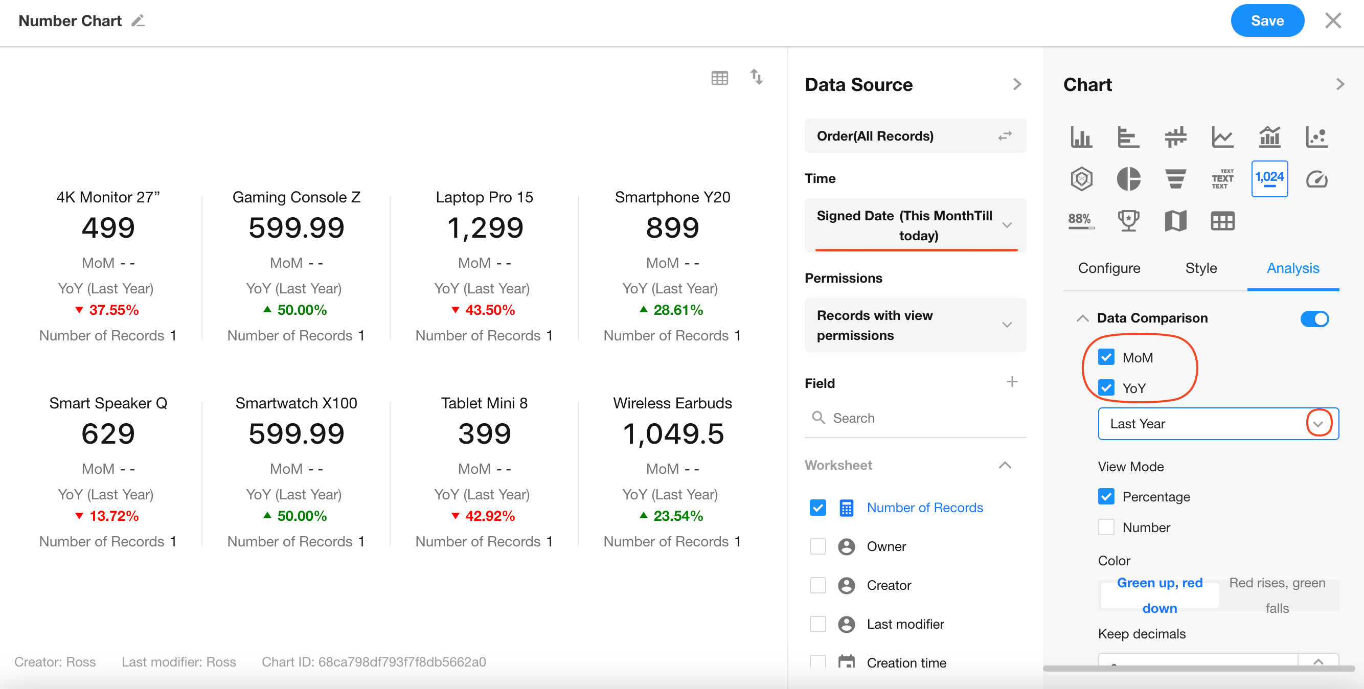
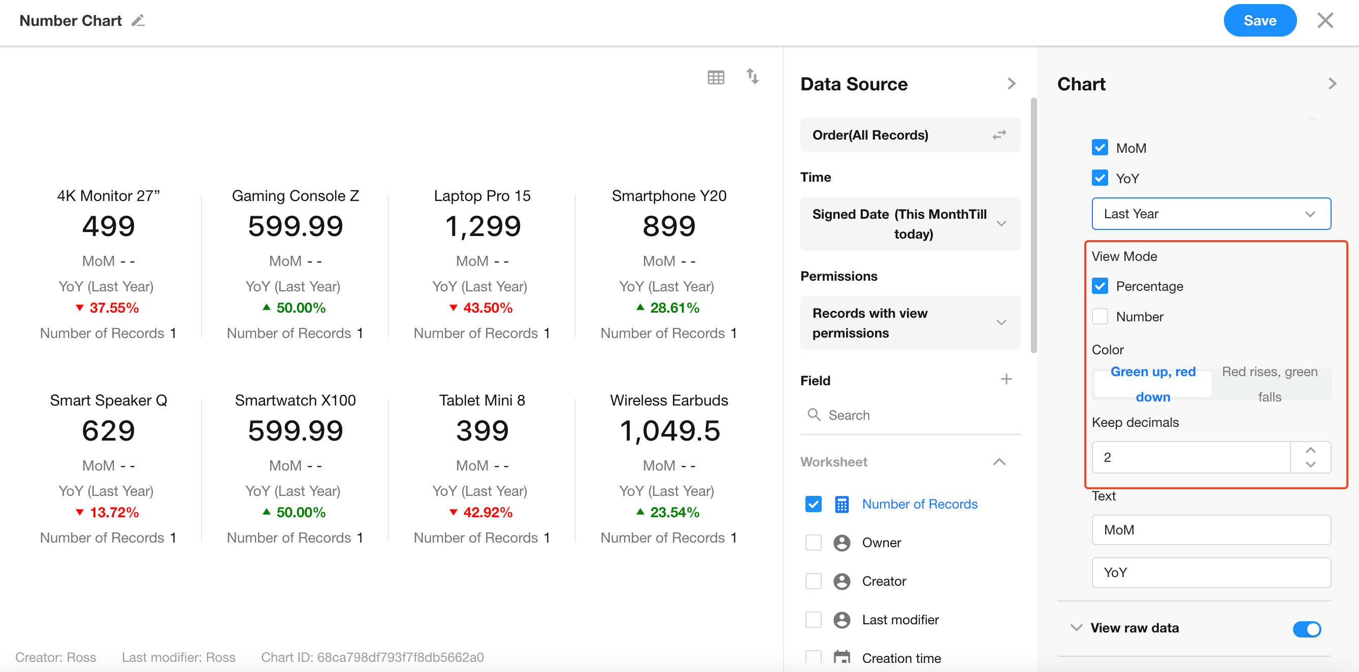
MoM/YoY Display Styles
Customize how comparison results appear — choose from various styles, colors, and labels.
If comparison is not needed, simply click Save to finish.
6. Save the Chart
Was this document helpful?