Dashboard
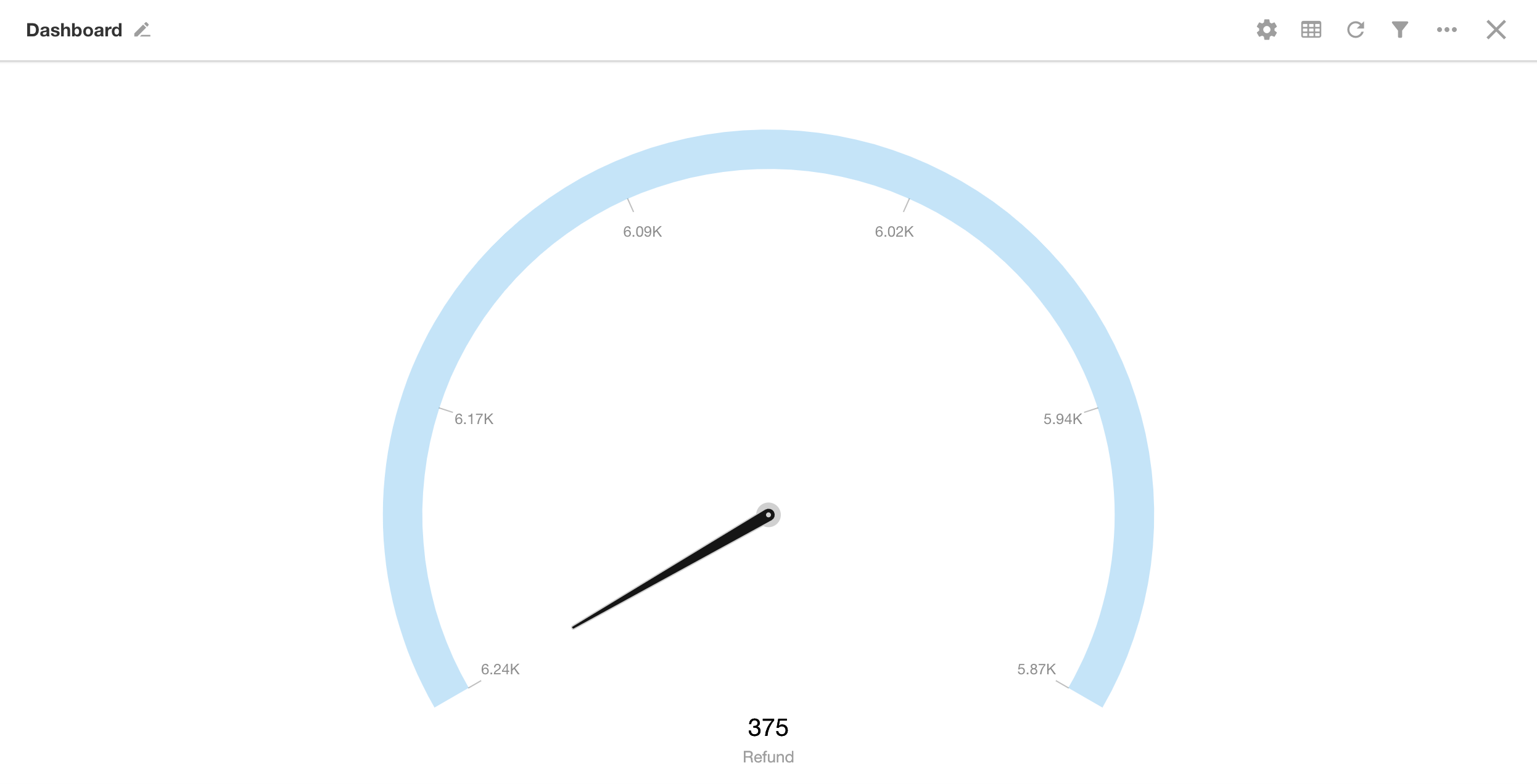
A dashboard resembles a clock face, featuring ticks and a pointer. The ticks represent the scale, and the pointer indicates the current value of a selected metric. It’s commonly used to monitor a specific value range, providing a clear visual of where the data falls within that range.
Below is an example of how to create a dashboard.
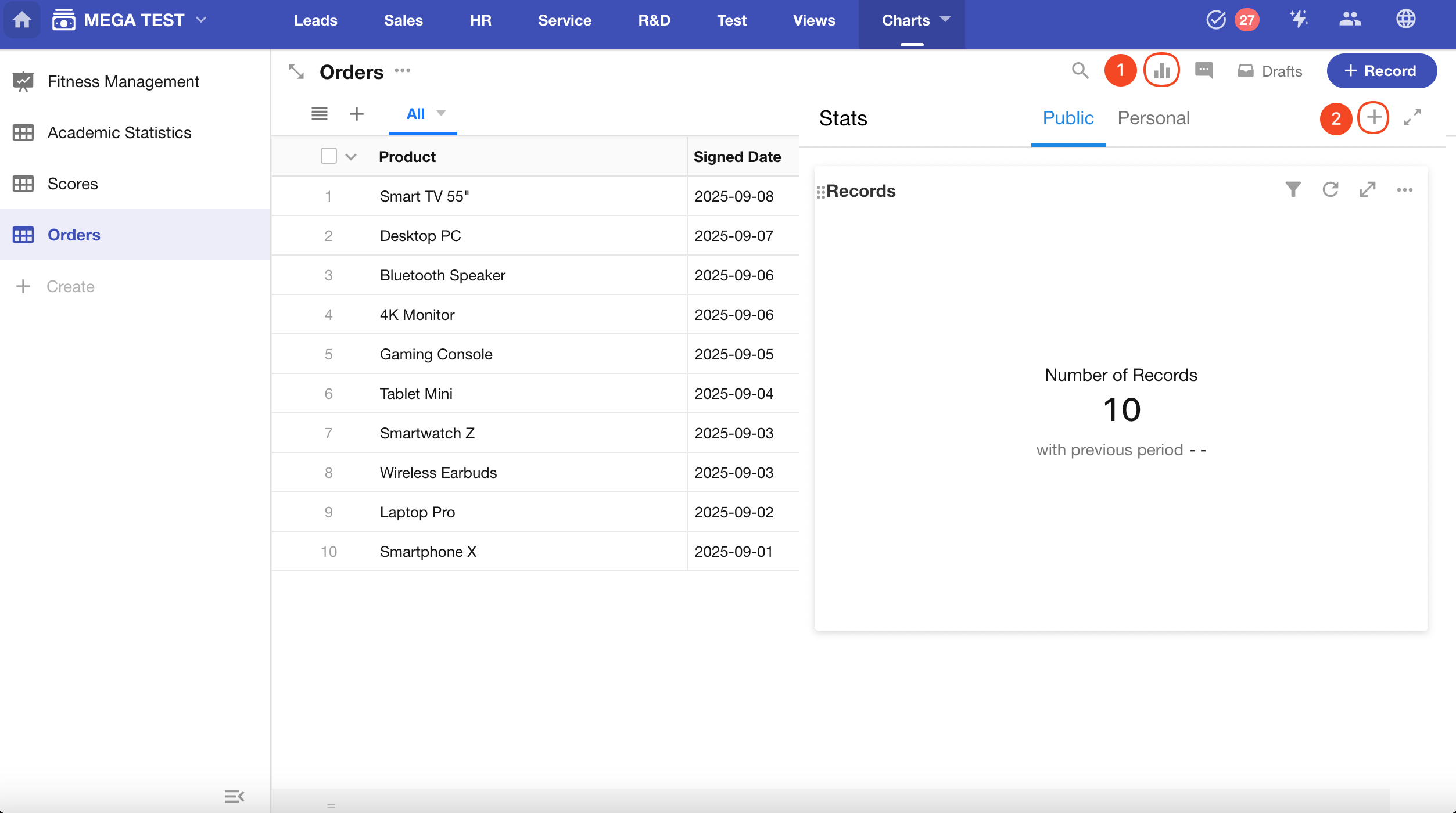
Example: Create a dashboard in the Orders worksheet to monitor the refund amount for product sales this month
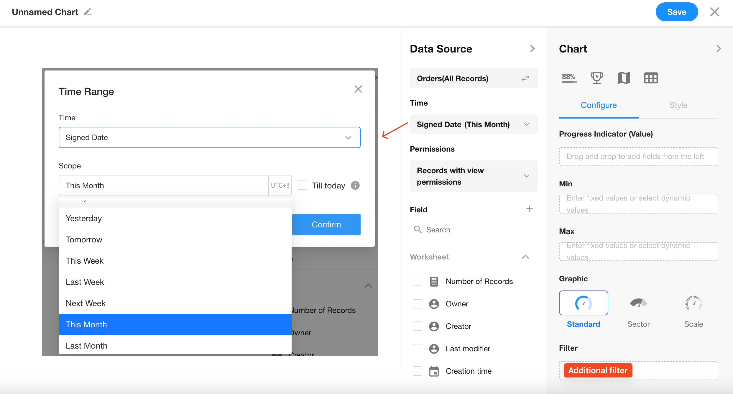
Data Scope: Filter records in the "Orders" worksheet where "Signed Date" is within the current month
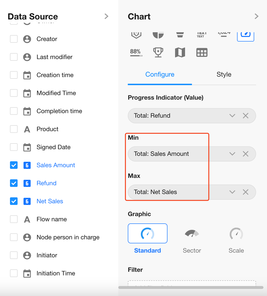
Progress Indicator (Value): Select the "Refund" field
Minimum Value: Select the "Sales Amount" field
Maximum Value: Select the "Net Sales" field
Chart Configuration
1. Create a New Chart
2. Set the Record Filter
You can choose to analyze all records or only those in a specific view (defaults to all records).
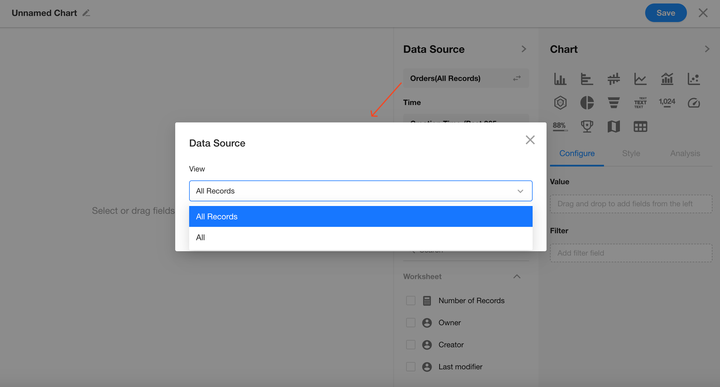
Filter records where "Signed Date" is within the current month.
You can also add additional filter conditions if needed.
3. Set Progress Indicator
Choose the "Refund" field.
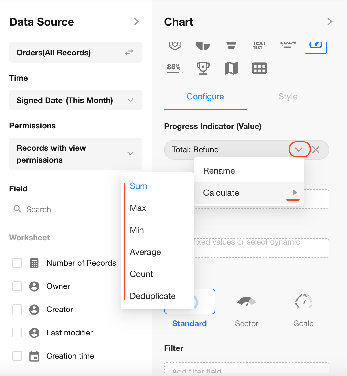
Only numeric or formula fields are allowed as progress indicators.
You can define the aggregation method here (Sum, Max, Min, or Average).
4. Set Minimum and Maximum Values
Select the "Sales Amount" and "Net Sales" fields.
5. Chart Style
Choose from three styles: Standard (default), Sector, or Scale.
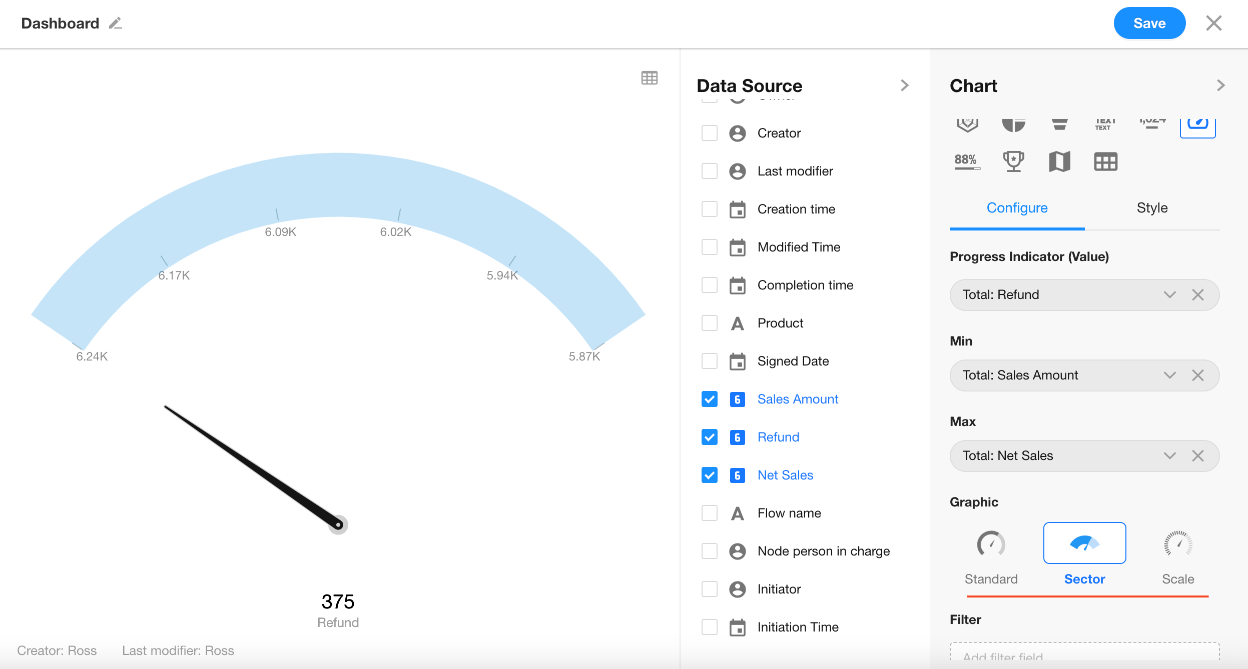
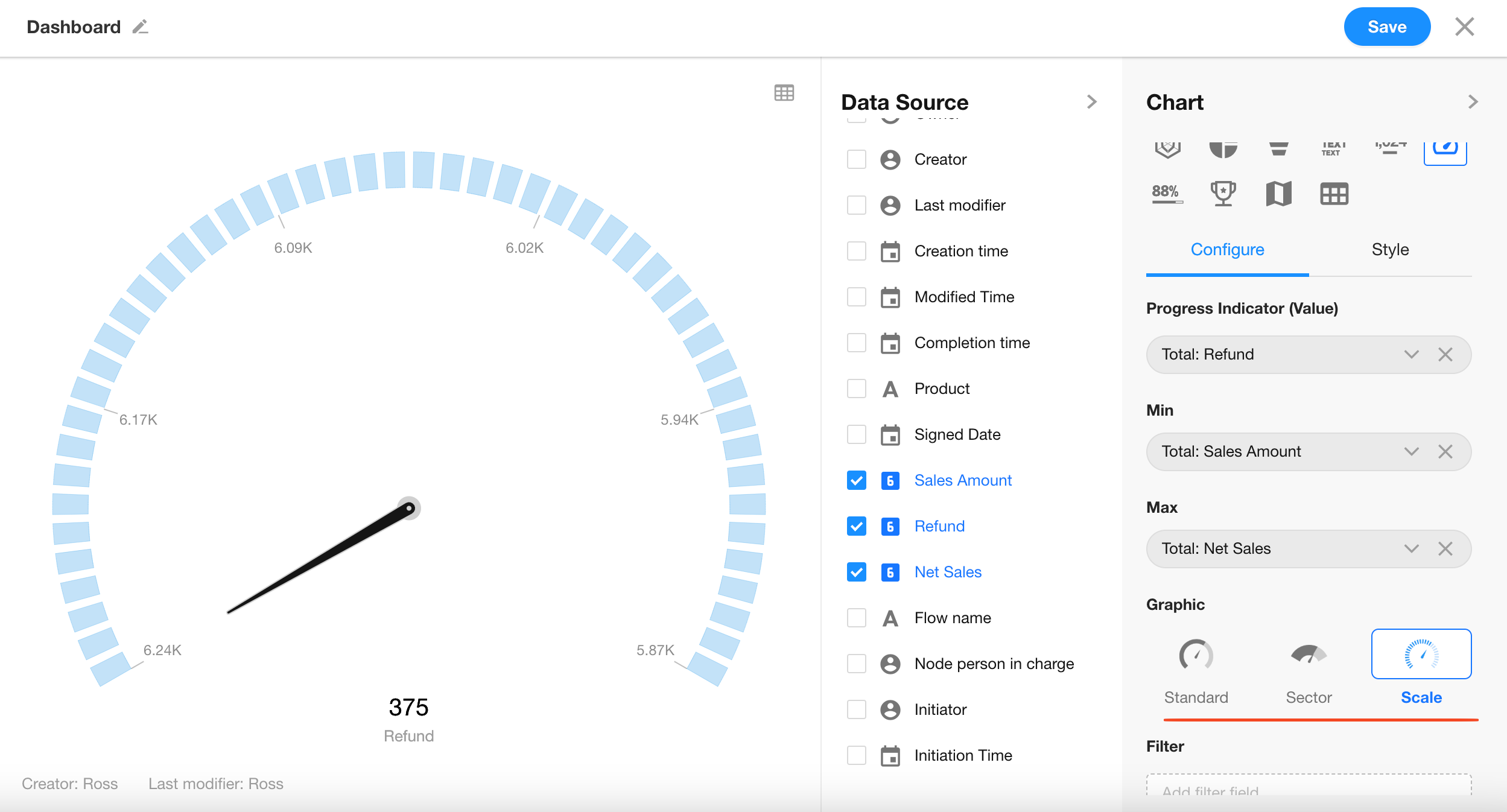
Click the “Save” button to complete the chart setup.
Additional Styling Options
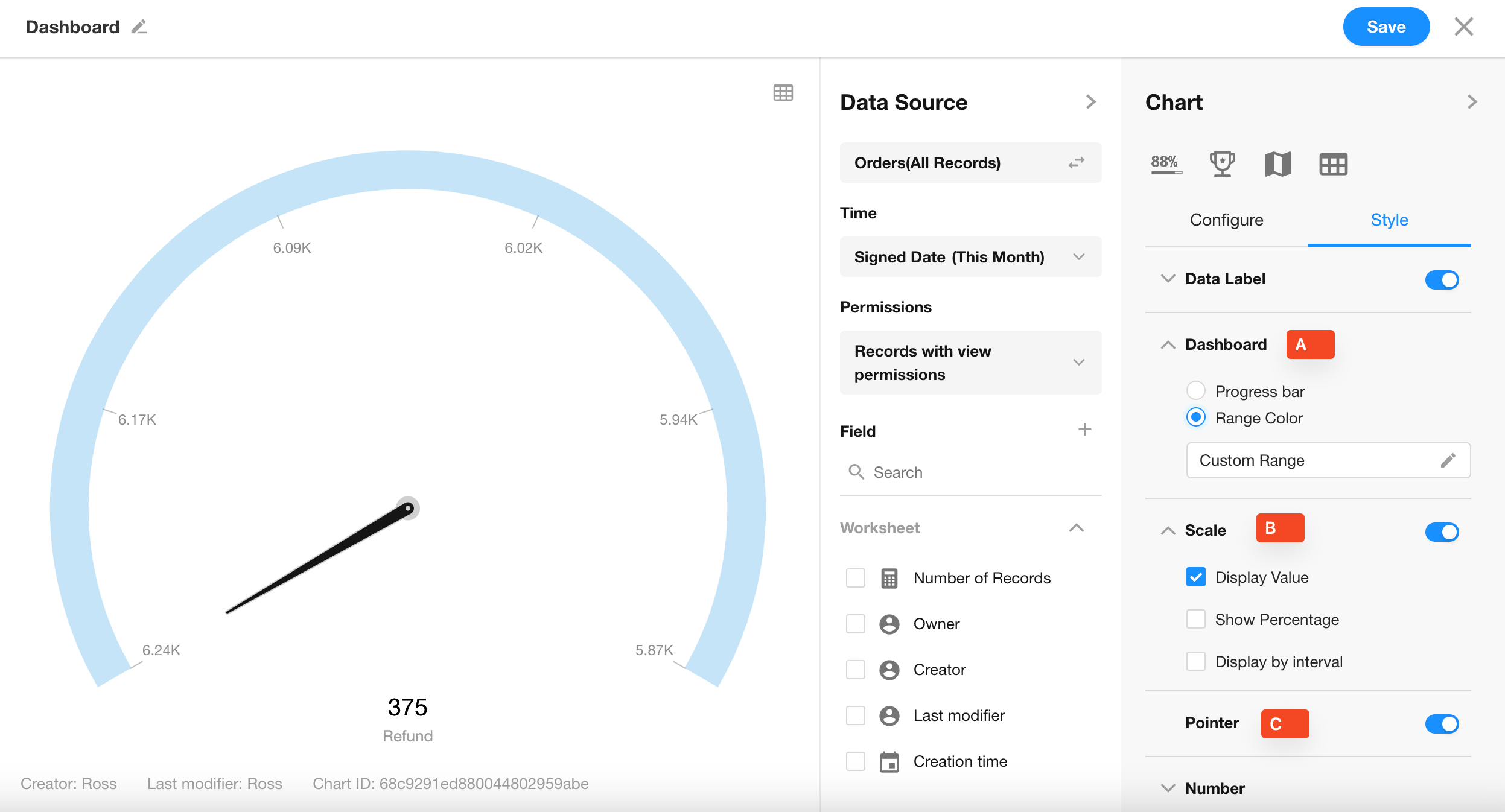
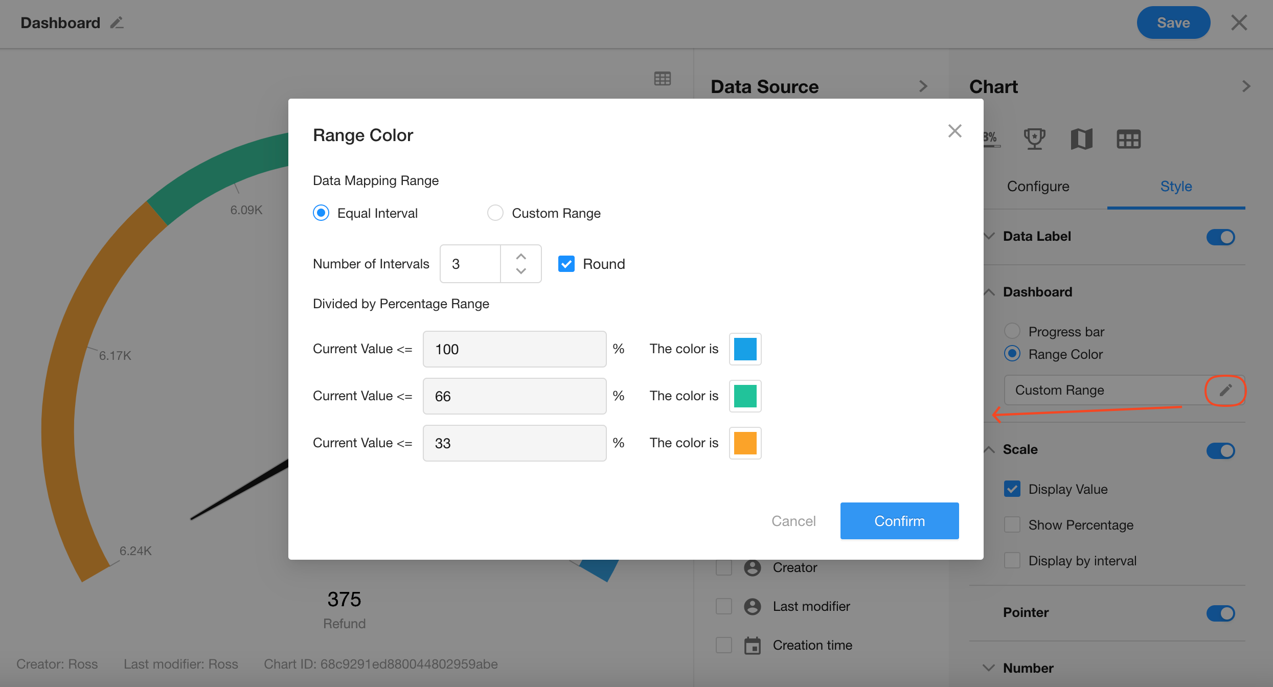
6. A: Dashboard
Customize the progress ranges and colors displayed on the dashboard.
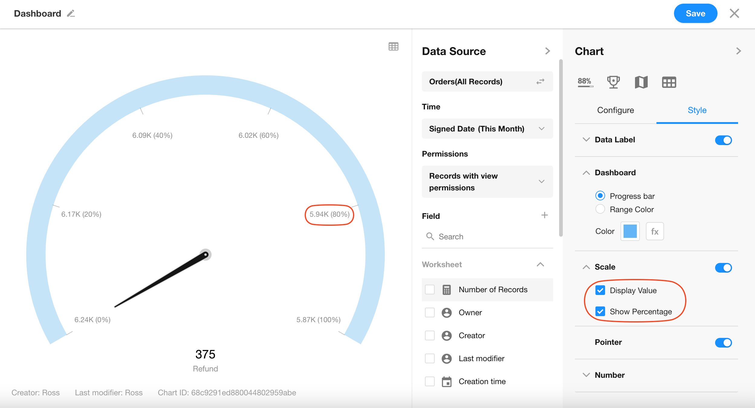
7. B: Scale
Configure how values are shown on the chart—either as raw numbers, percentage format, or hidden.
8. C: Pointer Display
Decide whether to show the pointer on the dashboard.
Was this document helpful?