Pivot Table
A pivot table is an interactive table used to quickly summarize and cross-tabulate large volumes of data. It helps users analyze and organize data from multiple perspectives by grouping and aggregating values dynamically.
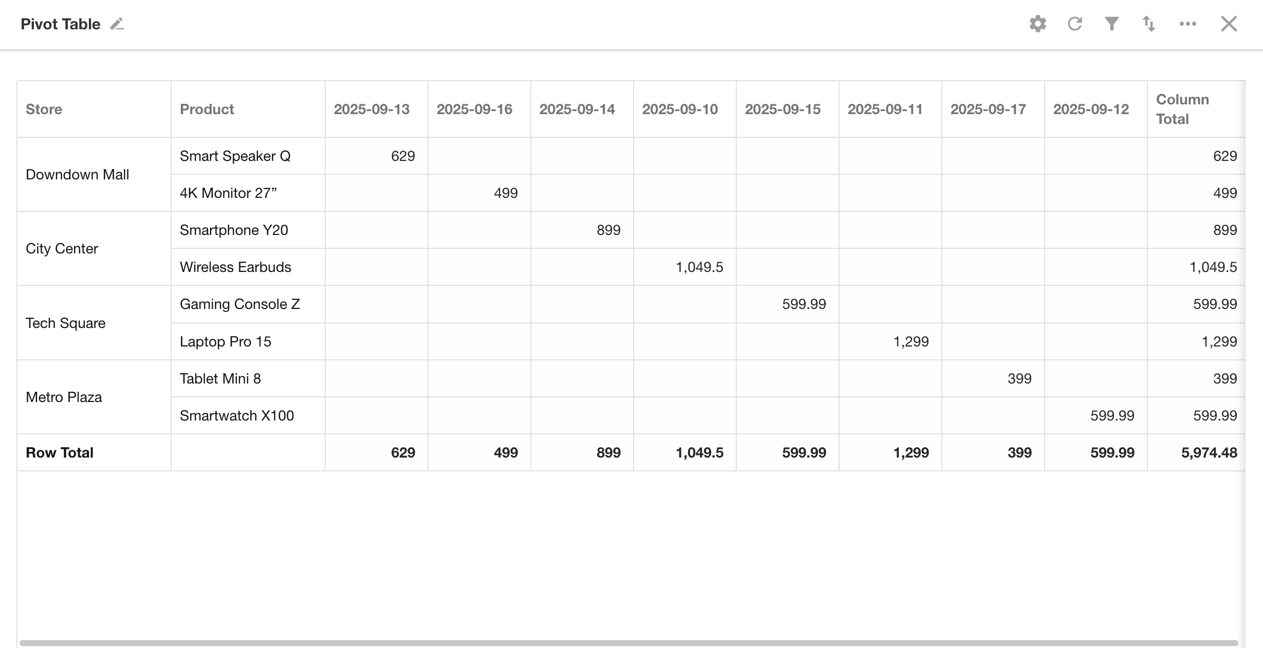
This guide demonstrates how to create a pivot table with an example.
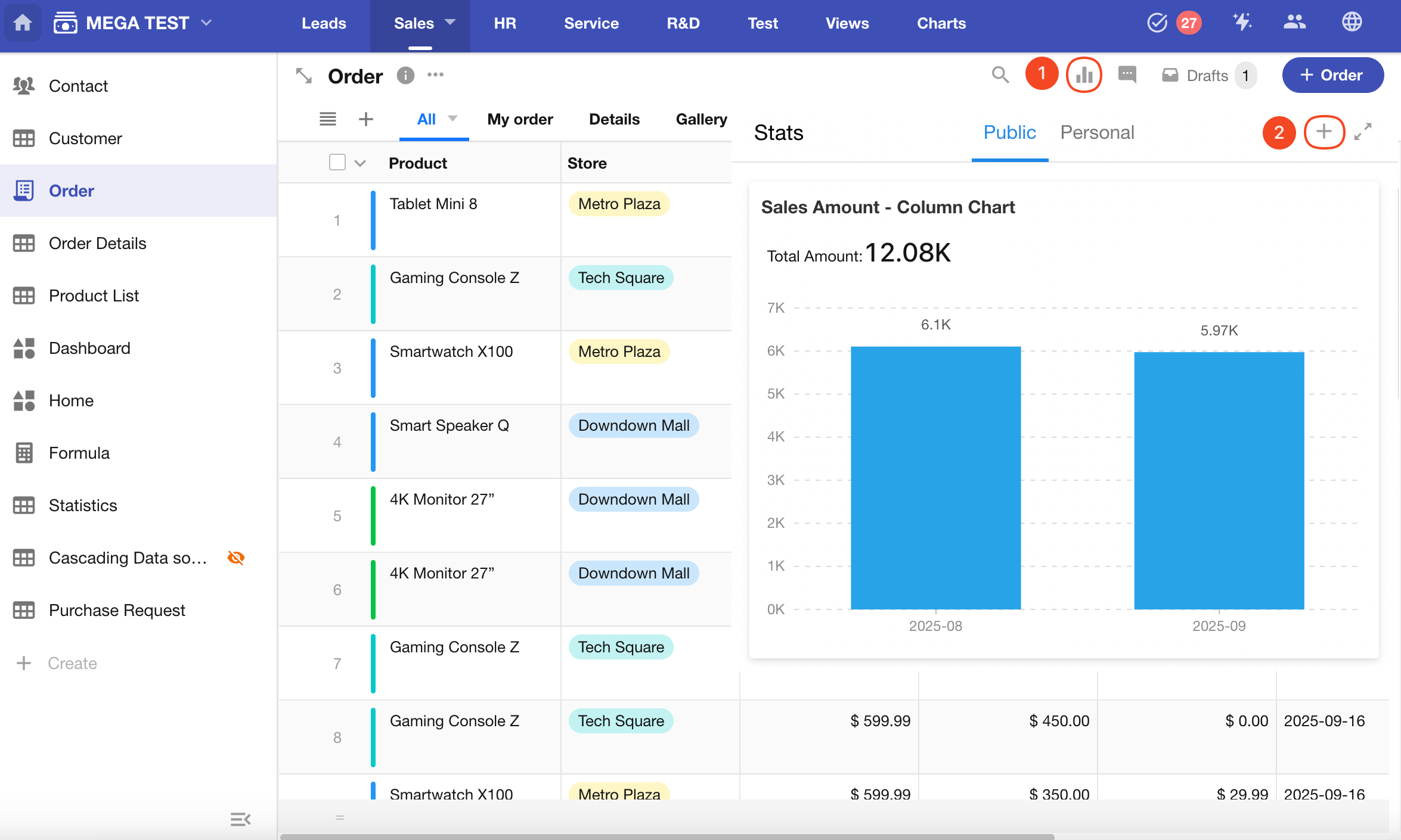
Example: Create a pivot table in the Orders worksheet to summarize this month's sales
Data Range: Order records created this month
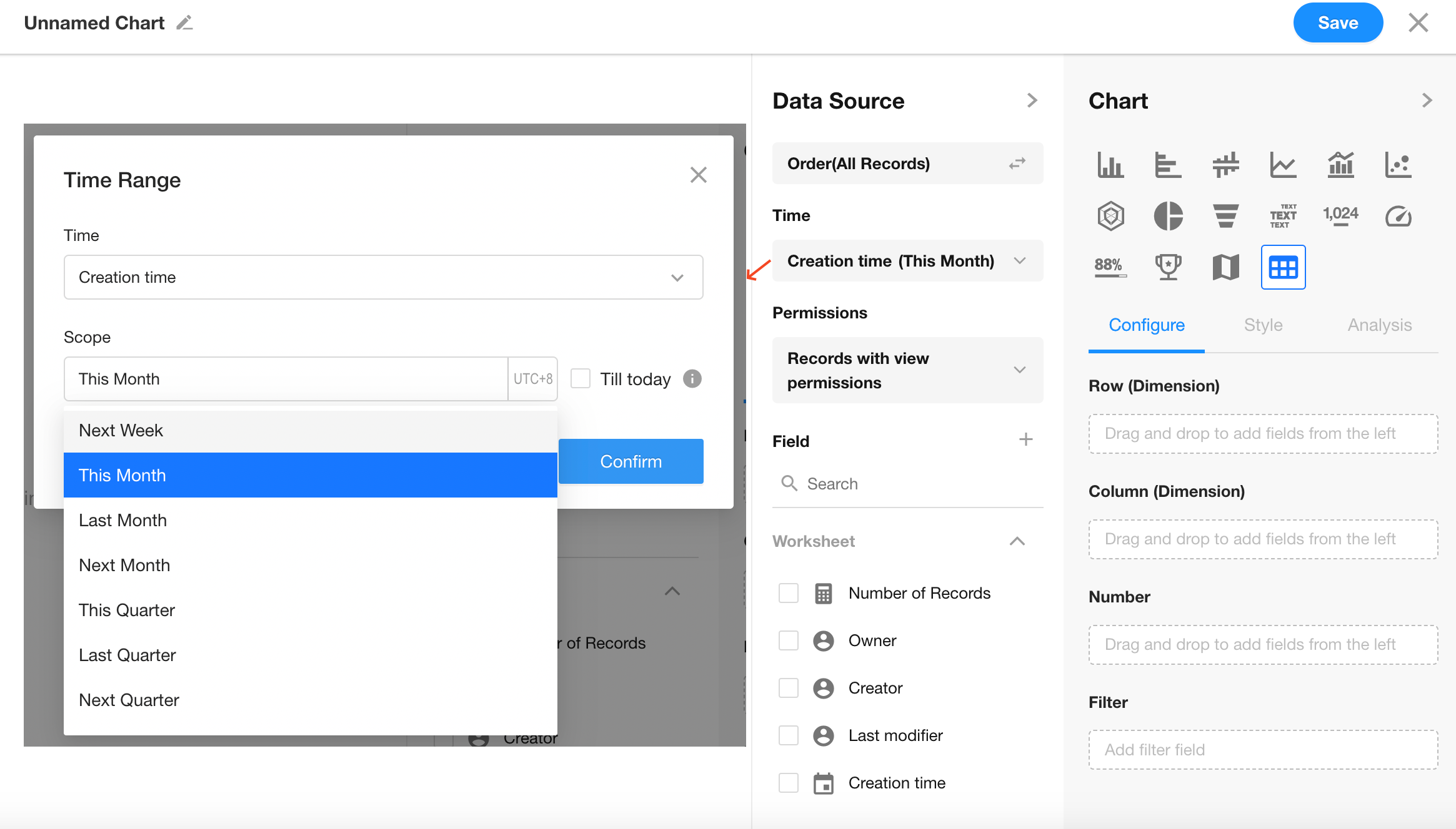
Filter Field: Creation Time
Time Range: This month
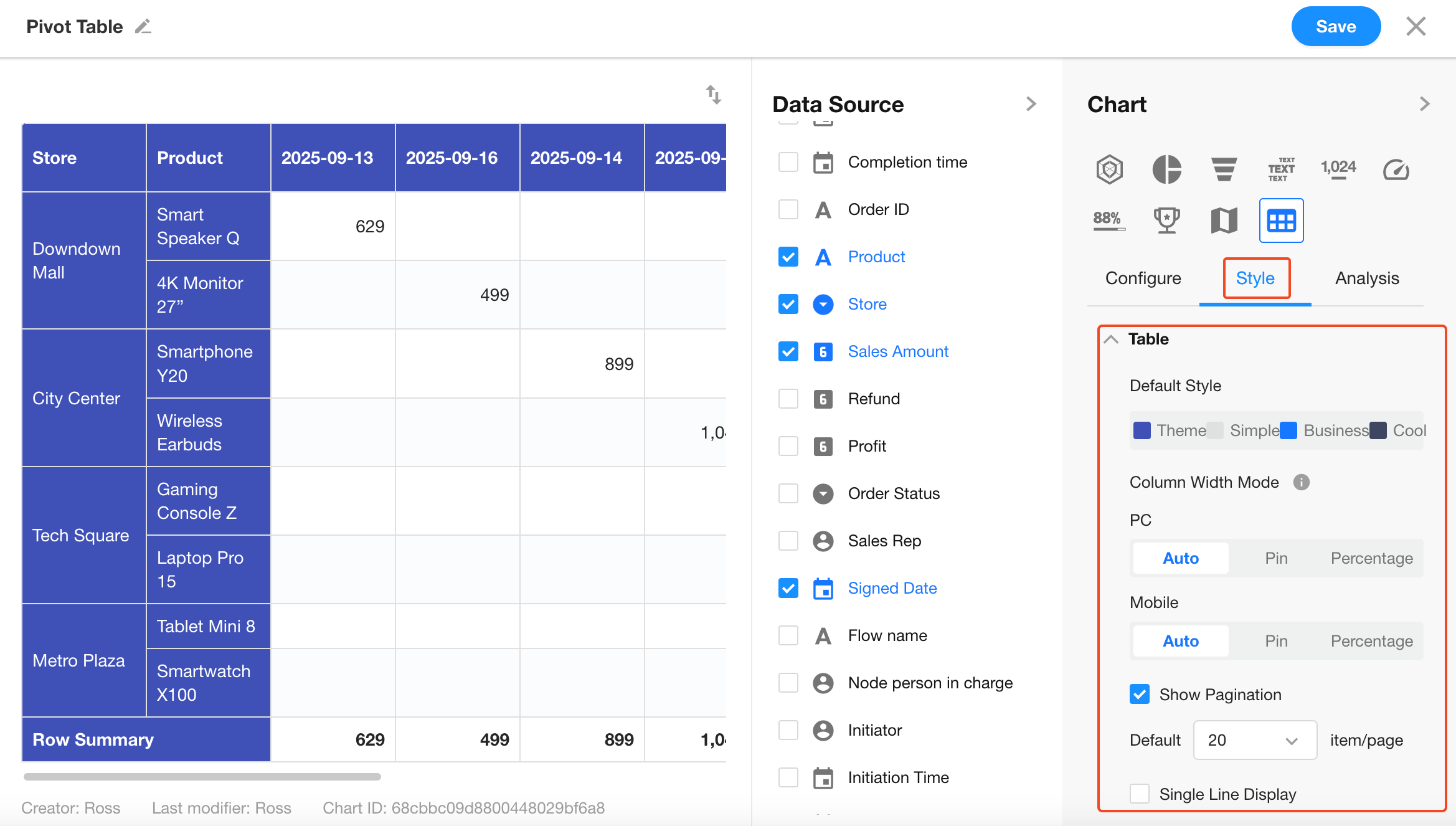
Metrics: Store, Product, Signed Date, Sales Amount
1. Create a New Chart
2. Set the Record Range
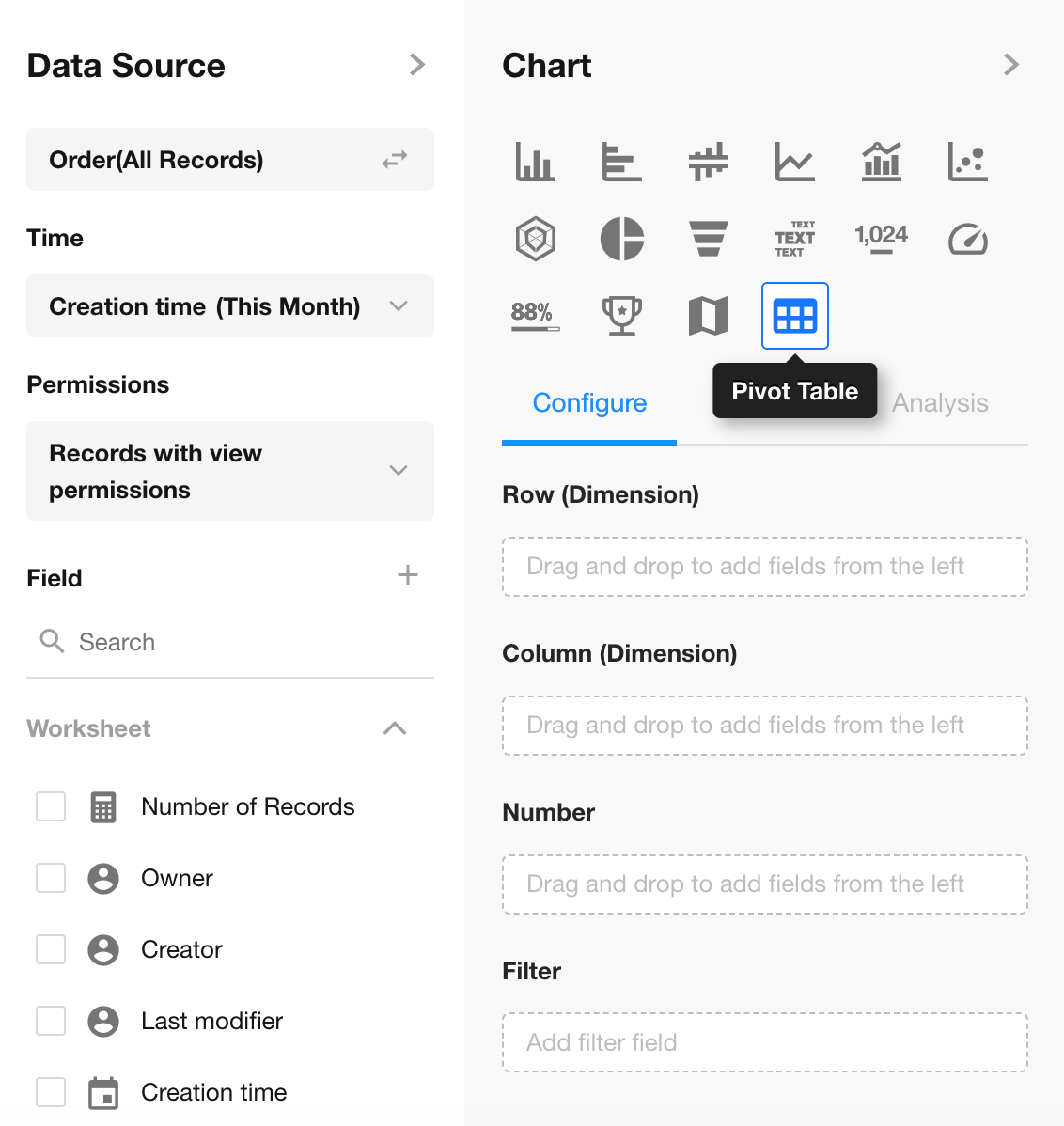
3. Select Chart Type: Pivot Table
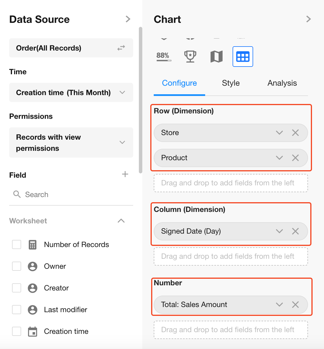
4. Configure Dimensions and Values
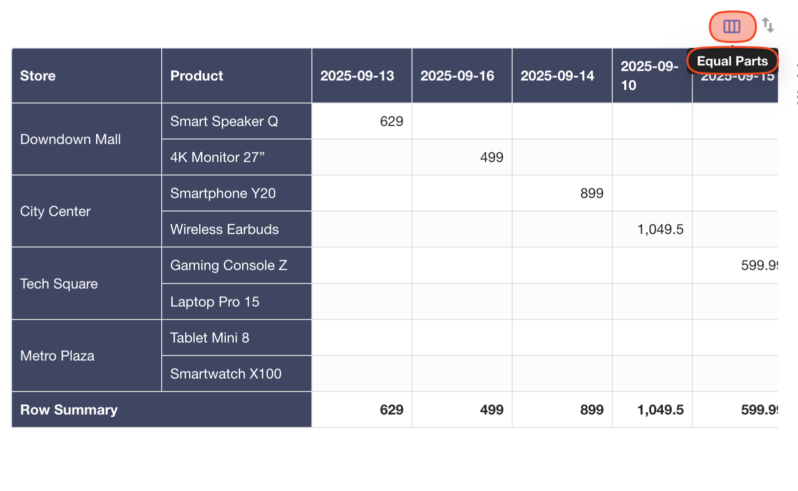
Rows: Store, Product
Columns: Signed Date (Day)
Values: Sum of Sales Amount
If a selected dimension field is from a related record, you can configure display fields of the related worksheet.
5. Table Style Settings
Header Colors
Configure row/column header colors.
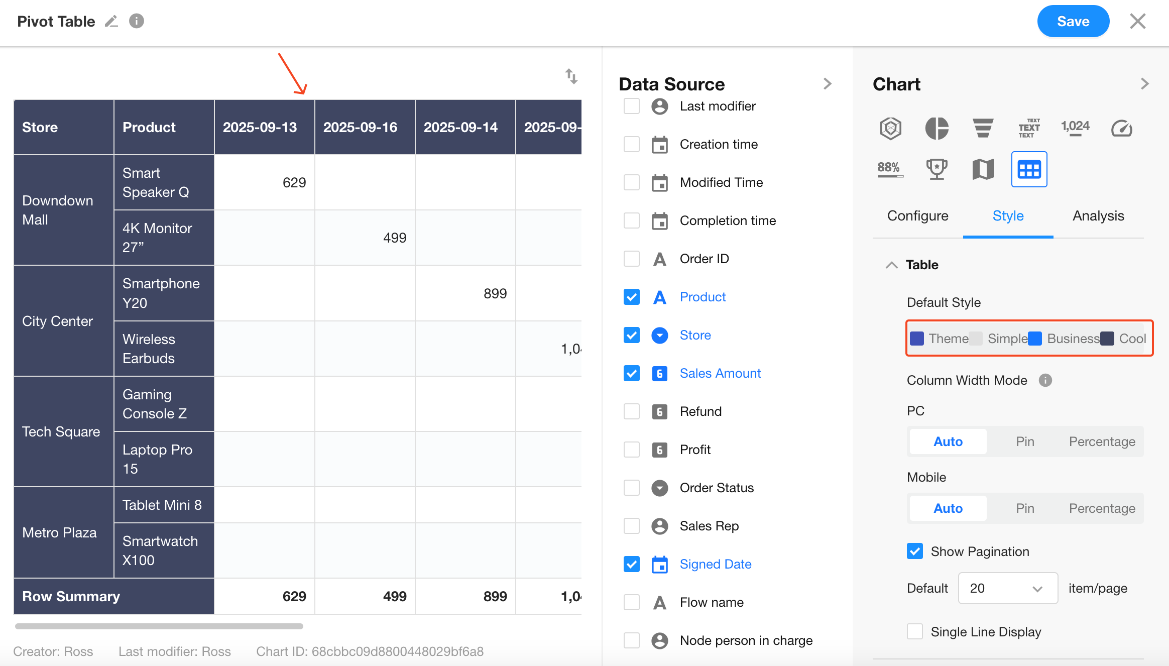
Column Width Mode
Three modes are supported:
-
Auto: Adjusts column width based on content; switches to fixed width when resized manually.
-
Fixed (Default): Fixed column width; enables horizontal scrolling for many columns.
-
Percentage: Columns are sized by percentage; useful for fewer columns and responsive layouts.
On mobile, only Fixed and Percentage modes are supported. Default is Fixed Width.
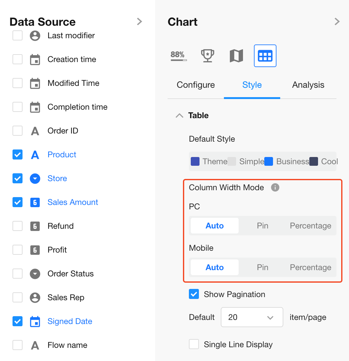
When using Fixed or Percentage mode, the quick "Equal Parts" button is available for easy adjustment.
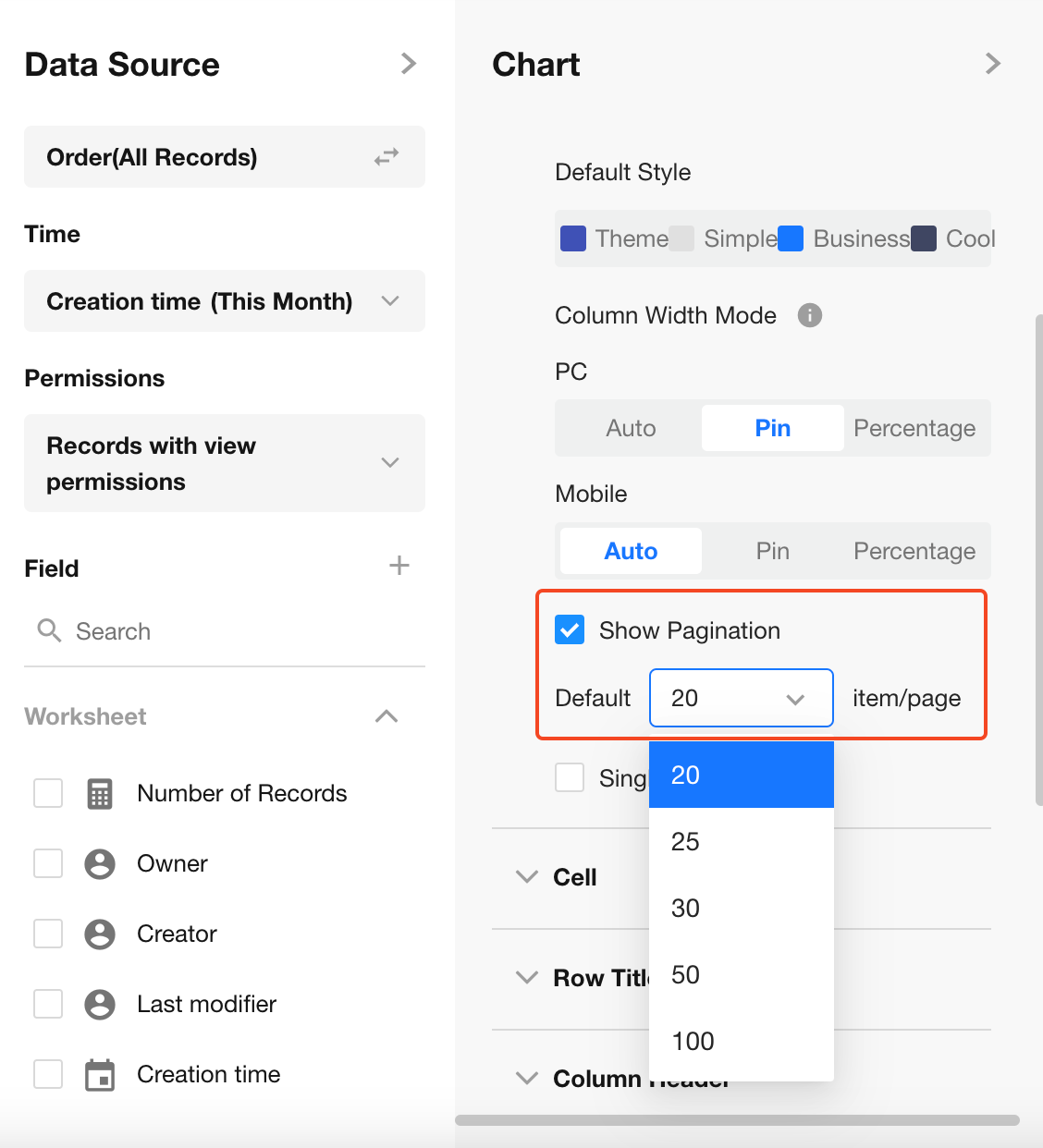
Paginated View (Enabled by Default)
To avoid page crashes when loading large volumes of data without filters, pagination is enabled.
Up to 100 rows per page.
Single Line Display
By default, pivot tables auto-adjust row height to display full content. Enable Single Line Display to fix row height and show only one line.
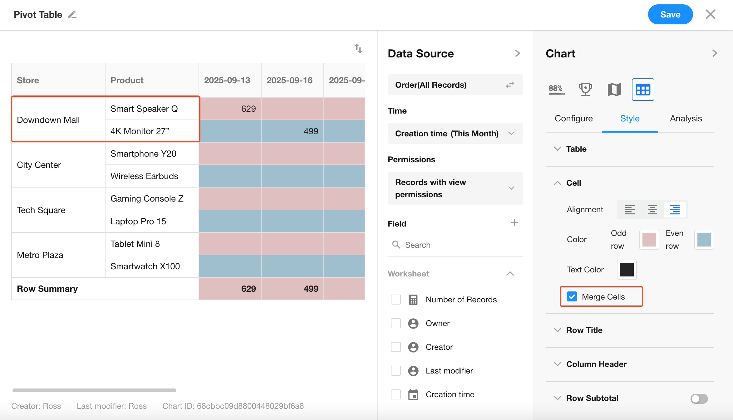
6. Cells
Configure cell background color, font color, and display style within the pivot table.
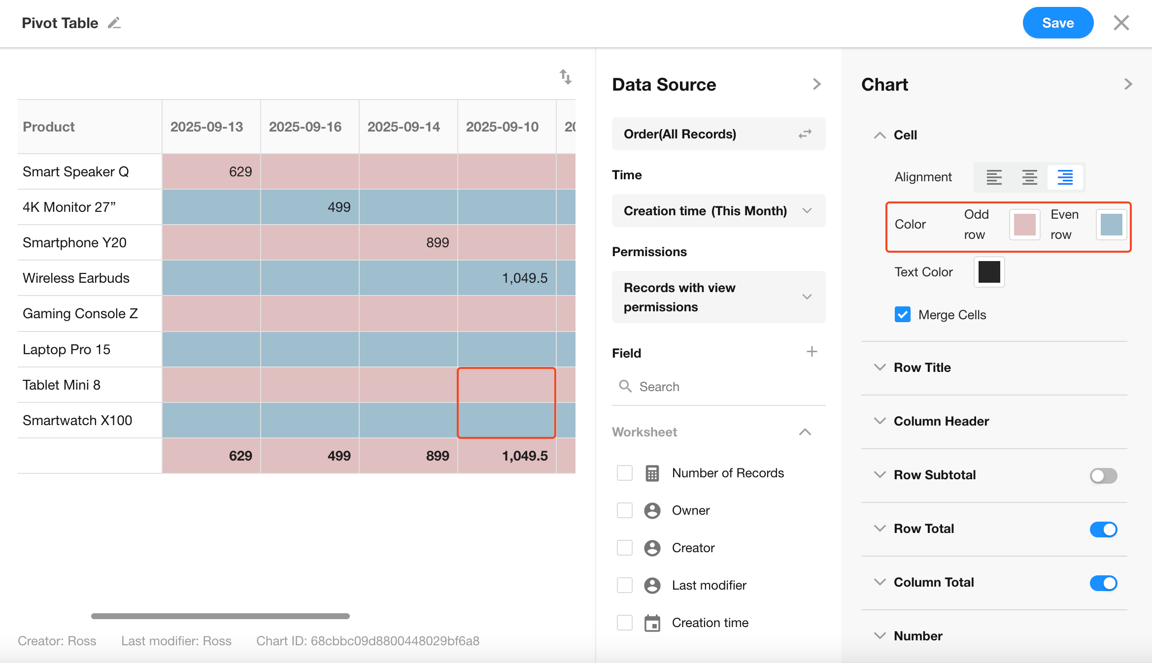
You can choose whether to merge cells in the table. Merging is enabled by default.
When exporting the chart to Excel, the merge settings will also be applied.
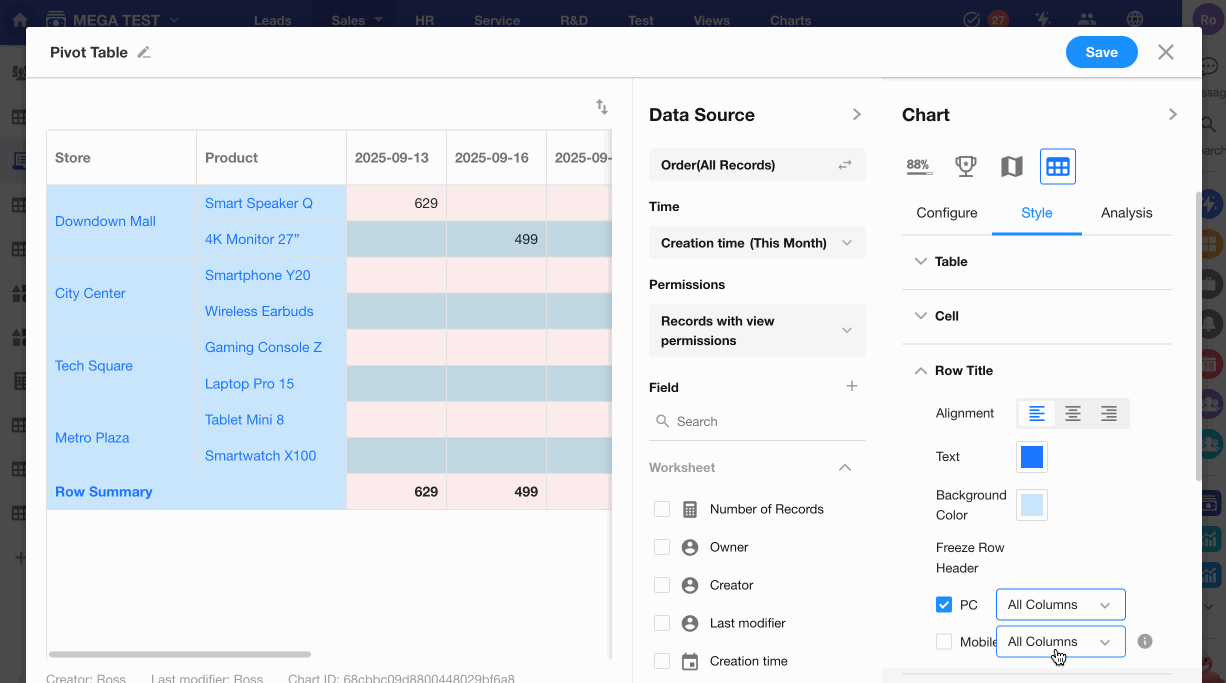
7. Row/Column Headers
You can customize the header colors, alignment, and background independently, even when using a preset table style.
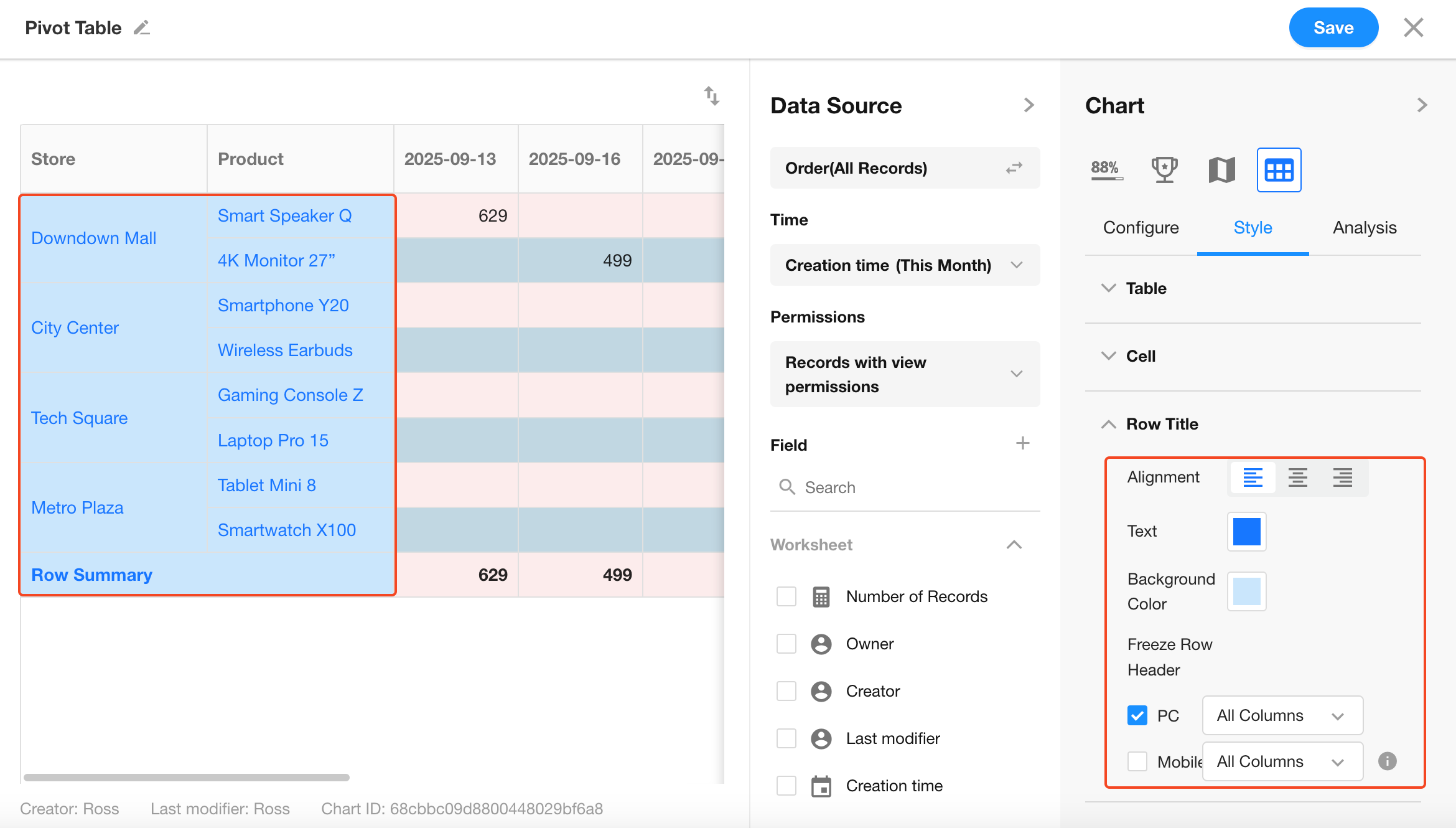
You can choose whether to freeze row/column headers on desktop or mobile.
By default, all headers are frozen. Minimum freeze: 1 column.
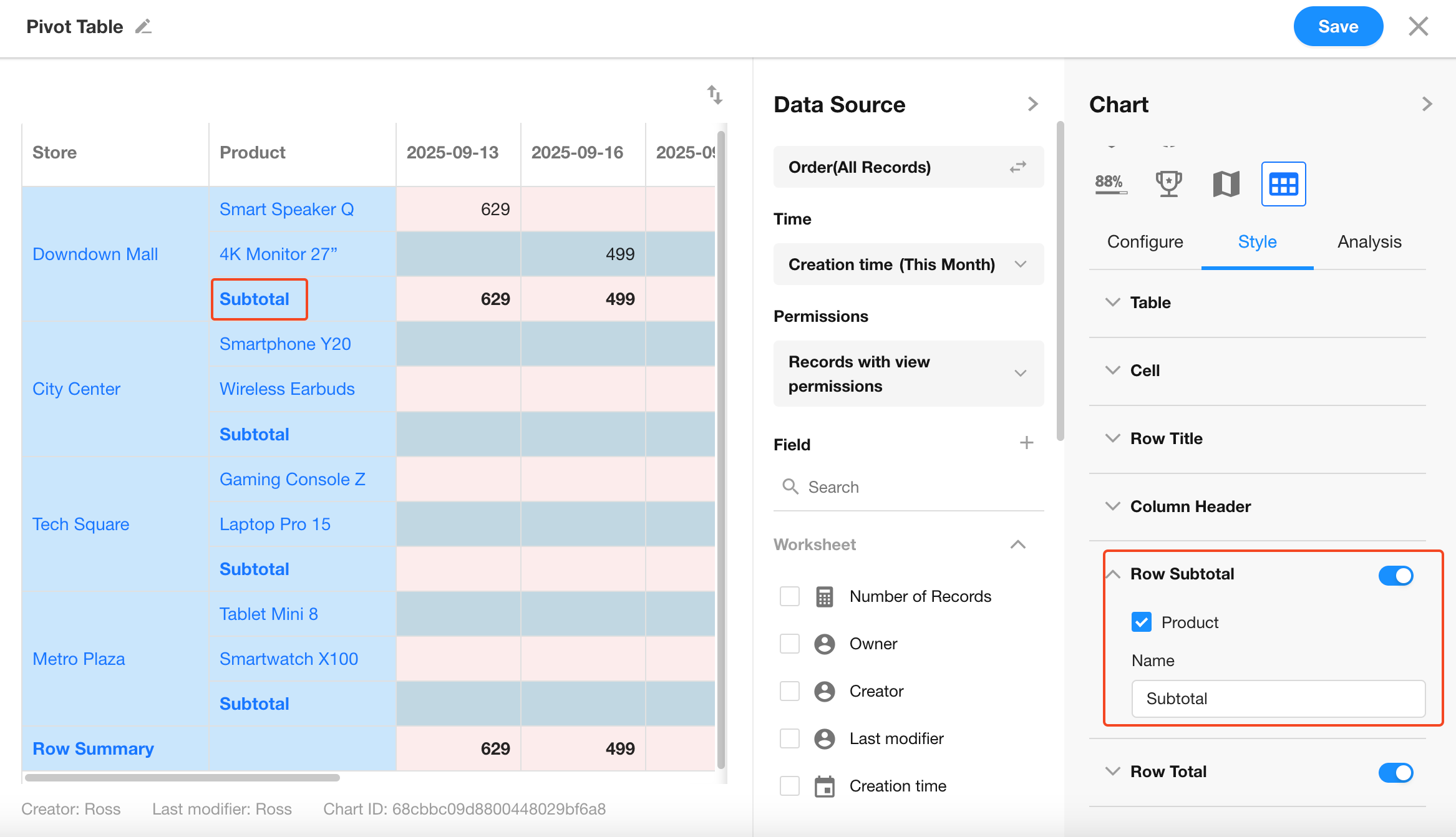
8. Subtotal
When enabled, subtotals will be shown for each group within the same dimension.
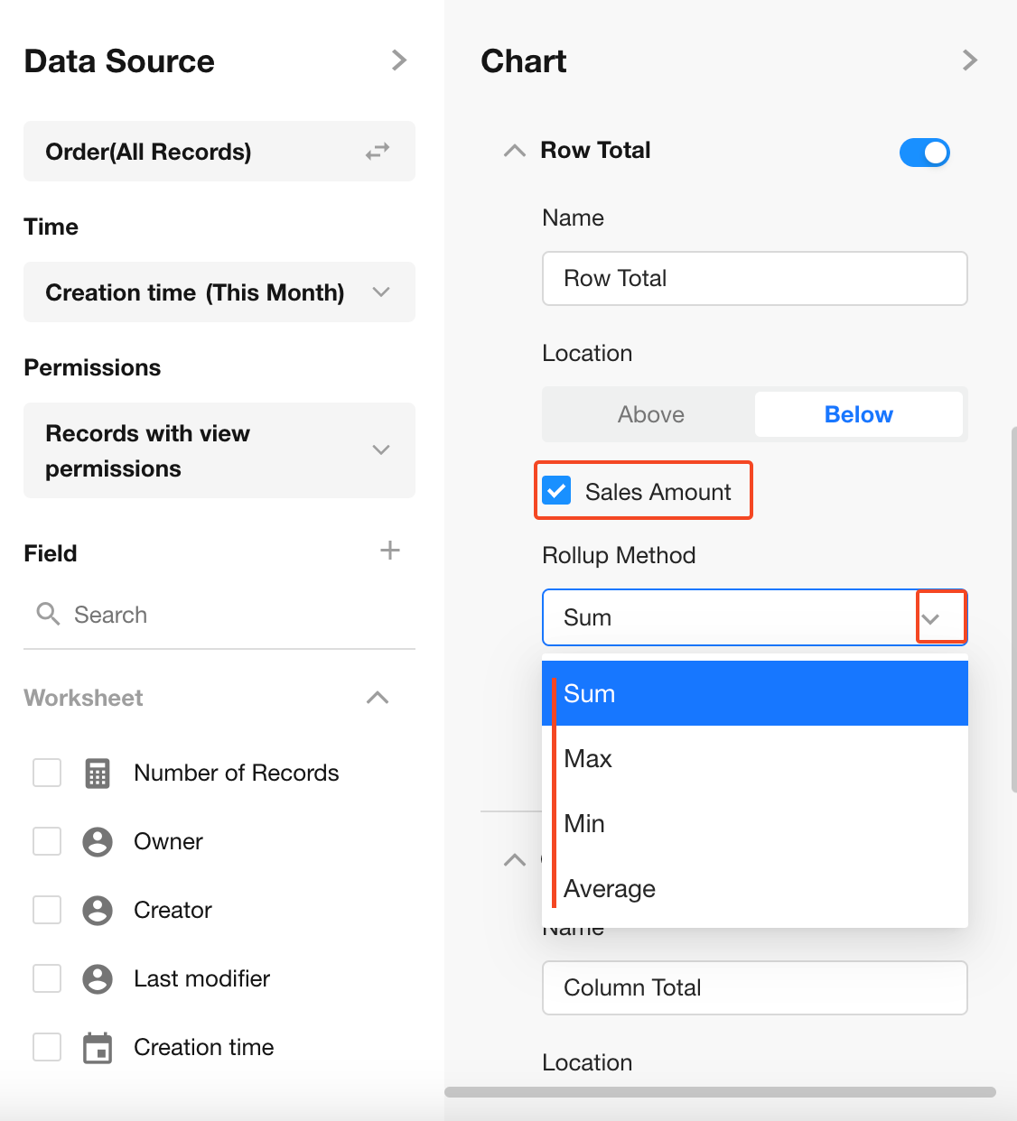
9. Row/Column Totals
Enable to display totals for rows and columns, and configure their placement.
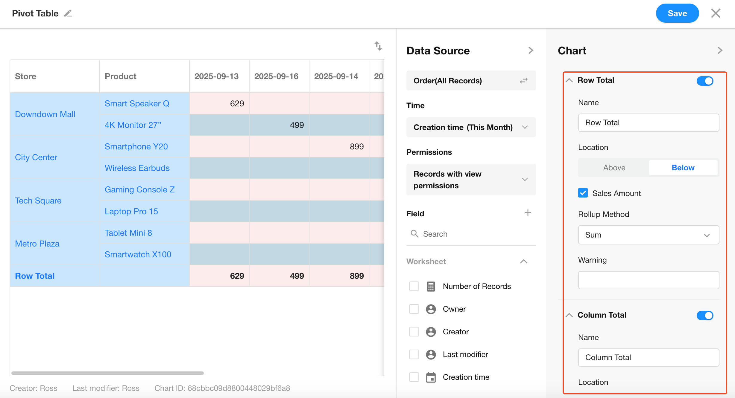
You can select different aggregation methods (Sum, Avg, etc.) per field.
Name: Click to edit the display name of the total.
Hint: Add a prefix label or note before the value.
Position: Choose where the total column/row should appear.
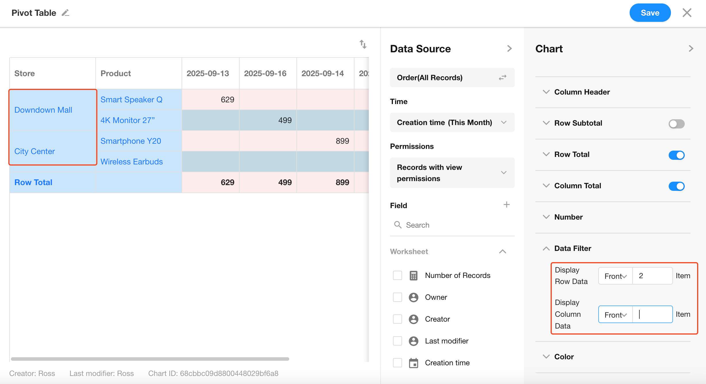
10. Data Filtering
You can limit the display to only show the top X rows/columns based on value.
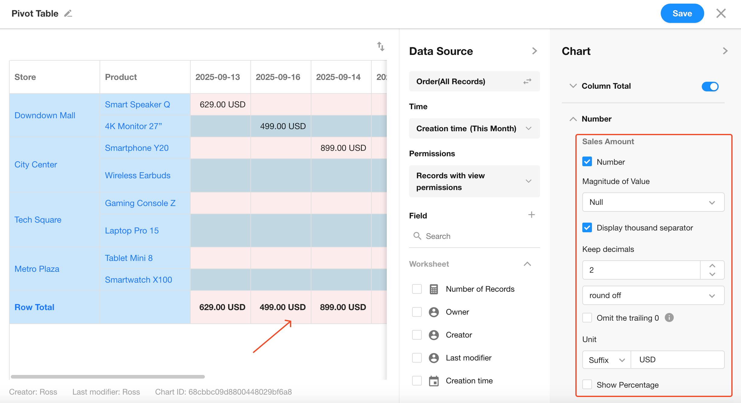
11. Display Unit
For numeric fields, you can configure value suffixes or units to display.
Default is automatic.
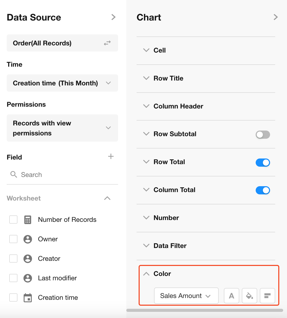
12. Colors
Configure dynamic color styling based on the selected value field, including:
- Font color
- Background color
- Whether to show data bars
Preview:
13. Save Chart Configuration
Click the Save button to finish and apply the chart settings.
Was this document helpful?