Scatter Chart
A scatter chart displays data points plotted on the chart using X and Y values. It shows the overall trend of how a dependent variable (Y-axis) changes with respect to an independent variable (X-axis). It also helps to visualize the data distribution across dimensions and color groups.
Below is an example of how to create a scatter chart.
Example: Track Weight Trends for Fitness Users
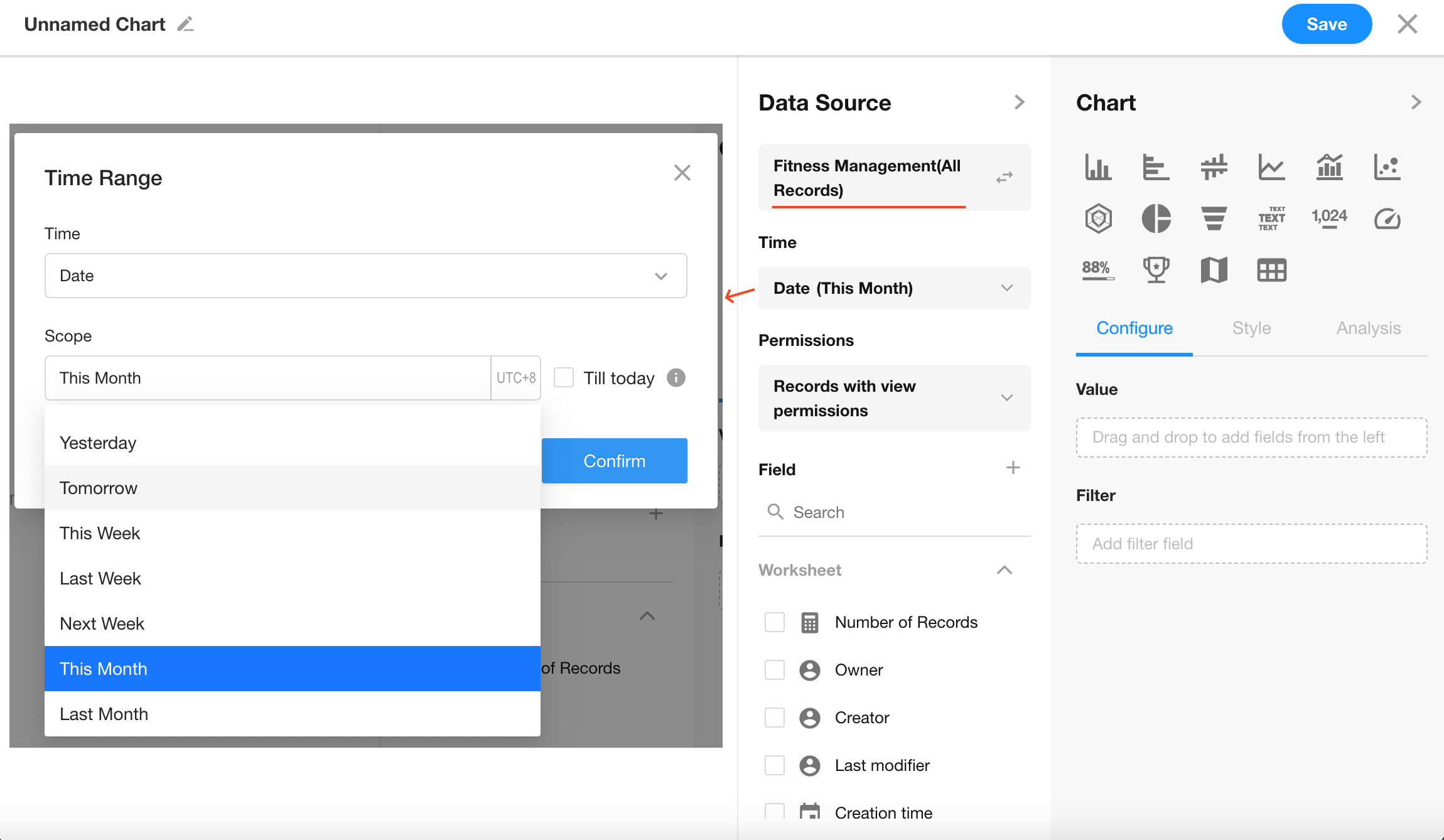
Data Scope: Filter records in the Fitness Management worksheet where the “Date” is within the current month
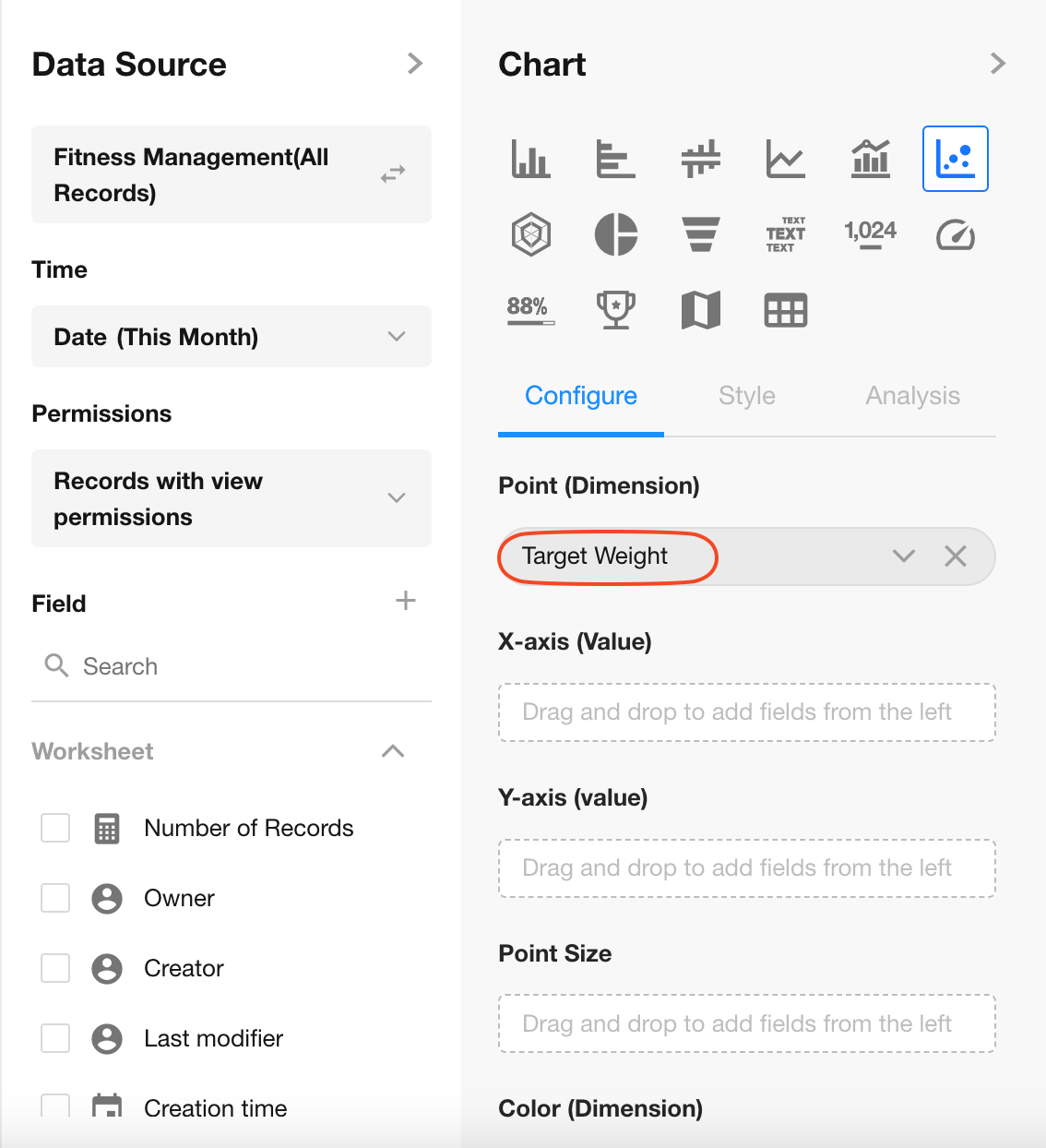
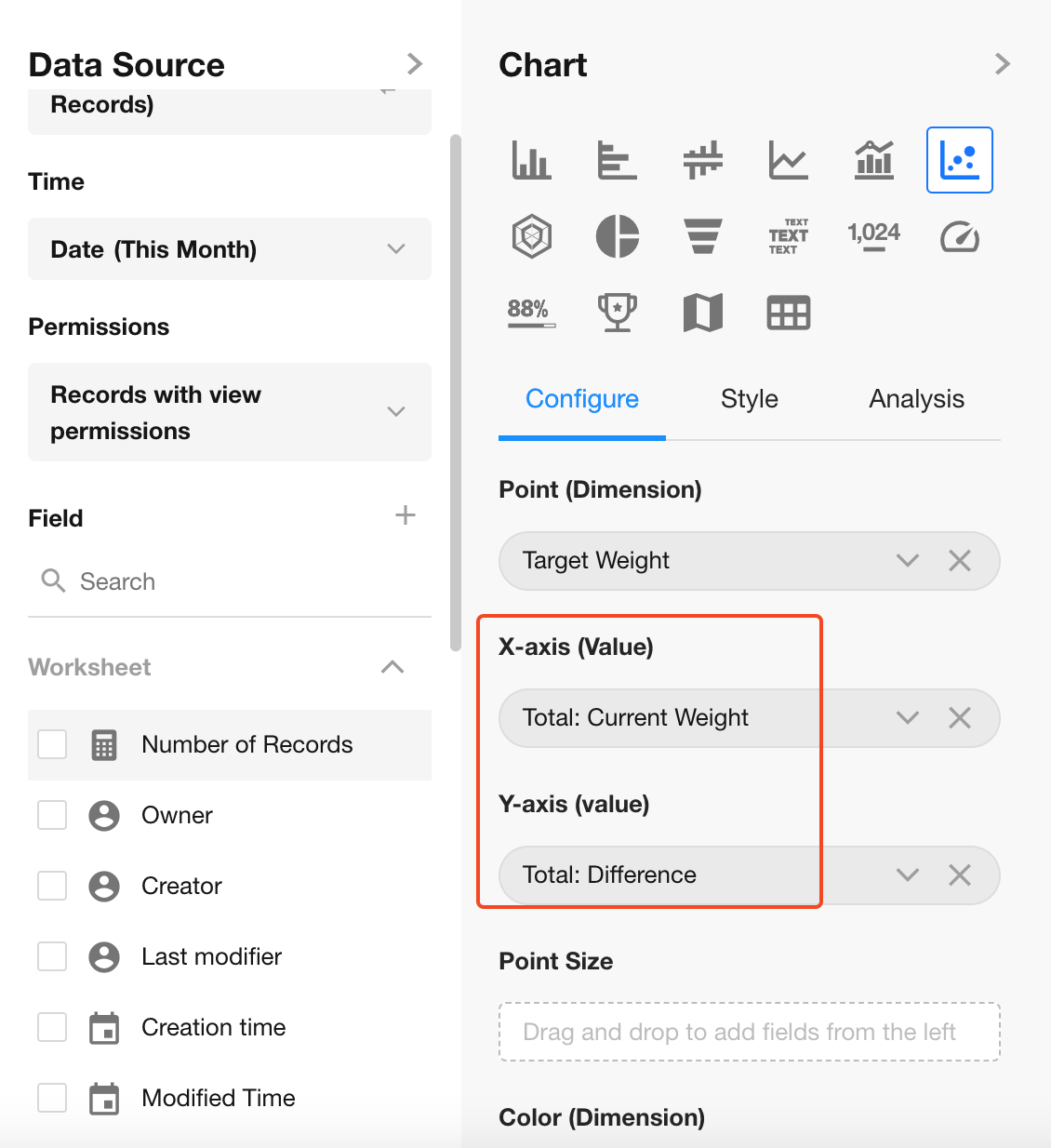
Point Dimension: "Target Weight"
X-Axis: "Daily Weight"
Y-Axis: "Diffrence", weight deviation from goal"
Chart Configuration
1. Create a New Chart
2. Set the Data Scope
Filter records in the “Fitness Management” worksheet where the “Date” is within the current month.
3. Select the Chart Type: Scatter Chart
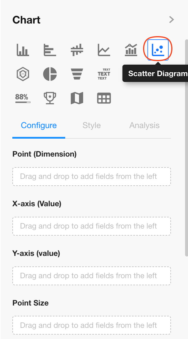
4. Set the Point Dimension
Select the "Target Weight" field.
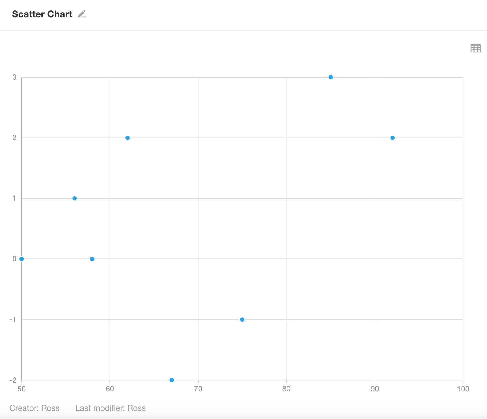
Note: The maximum number of data points allowed is 1,000.
5. Configure X and Y Axes
Set the statistical fields:
- X-Axis: "Daily Weight"
- Y-Axis: "Diffrence"
6. Point Size
The point size is determined by a numeric field. It can be the same as the X or Y field.
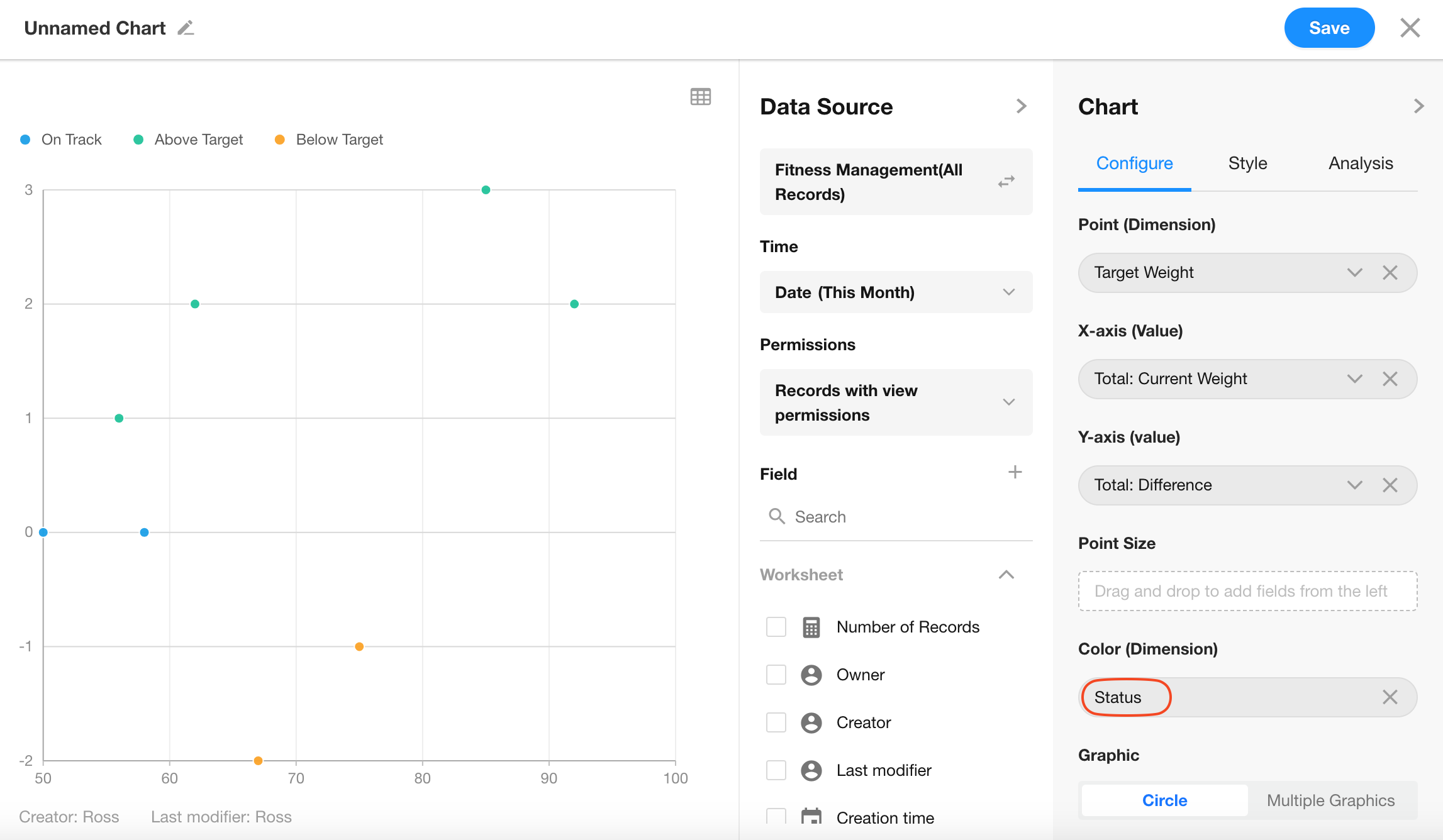
7. Color (Dimension/Value)
You can choose an option-type field to apply color to data points.
Click Save to finish chart configuration.
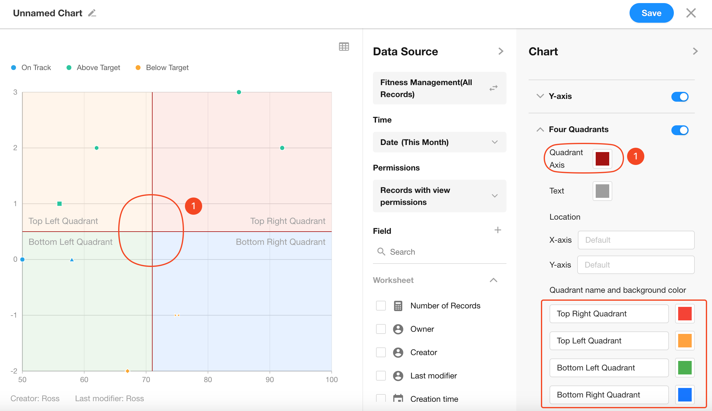
8. Quadrants
You can optionally configure quadrant lines, including custom colors and labels for each quadrant.
Was this document helpful?